
How to Style Colorful Wall Decor for a Vibrant Home
Your walls say something about you, whether you intend them to or not. Blank, beige, or cluttered with mismatched pieces, they can make even a well-furnished room feel incomplete. The good news? Styling colorful wall decor is far less intimidating than most people think. You don’t need a design degree or a massive budget. You need a clear vision, a few smart choices, and the confidence to let your personality lead. This guide walks you through every step, from building your color strategy to hanging your final piece, so your home finally feels like you.
Table of Contents
- Assess your space and set your color vision
- Choose the right colorful wall decor for your style
- Arrange and hang your decor for maximum impact
- Tie it all together with stylish accents and finishing touches
- Our take: Embrace boldness, but keep it personal
- Bring your style to life with colorful wall art from ColorMelt
- Frequently asked questions
Key Takeaways
| Point | Details |
|---|---|
| Start with a vision | Decide on your color scheme and goals before buying wall decor. |
| Mix materials wisely | Use a consistent palette when combining canvas, metal, and wood art. |
| Prioritize placement | Arrange and hang art at eye level for the greatest visual impact. |
| Repeat colors in accents | Coordinate pillows, rugs, or lighting with your core wall decor colors. |
| Express your personality | Choose pieces that genuinely make you happy, regardless of trends. |
Assess your space and set your color vision
Once you’re ready to upgrade those blank walls, start by building your color strategy. Before you buy a single piece of art, spend ten minutes really looking at your room. What color are your walls? How much natural light comes in, and from which direction? Is the space large and open, or small and cozy? These factors directly shape which colors will feel energizing versus overwhelming.
Natural light changes everything. A north-facing room gets cooler, bluer light, which can make warm reds and oranges feel especially rich. A south-facing room floods with warm light all day, making cool blues and greens look crisp and refreshing. Ignoring this is one of the most common mistakes people make when choosing wall decor.
Once you understand your room’s light, decide on the emotional result you want. Do you want bold and dramatic? Playful and eclectic? Calm and harmonious? Your answer shapes your entire color approach. A modern aesthetic wall decor piece in a strong, contrasting palette can anchor a room instantly, while softer tonal art creates a quieter, layered effect.
Building a mood board helps more than most people expect. Pull images from magazines, screenshots from social media, or swatches from paint stores. Look for patterns in what you’re drawn to. Most people discover they have a consistent preference they weren’t fully aware of. Free tools like Canva or Pinterest boards work well for this.
Here are the key things to evaluate before you start shopping:
- Wall color: Will your art contrast or blend with the current paint?
- Room size: Large rooms can handle oversized, bold pieces. Small rooms benefit from lighter palettes or smaller groupings.
- Existing furniture: What colors are already dominant in your space?
- Lighting: Natural and artificial light both shift how colors appear throughout the day.
- Personal taste: Follow color tips for home decor as a guide, but trust your own instincts first.
Pro Tip: Hold a paint chip or printed color swatch against your wall at different times of day before committing to a palette. Morning and evening light can make the same color look completely different.
Choose the right colorful wall decor for your style
With your color scheme in mind, the next step is choosing decor that captures your desired vibe. Not all wall art materials perform the same way, and understanding the differences helps you pick pieces that look great and last.
| Material | Color vibrancy | Best for | Care level |
|---|---|---|---|
| Canvas | Warm, rich tones | Living rooms, bedrooms | Low |
| Metal | High contrast, bold | Modern, industrial spaces | Low |
| Acrylic | Ultra vivid, glossy | Statement walls, galleries | Medium |
| Wood | Earthy, textured | Rustic, boho, natural styles | Low |
Metal wall art delivers sharp, high-contrast color that reads well from across a room. It works especially well in modern or industrial interiors where clean lines are already a theme. Acrylic wall art takes color to another level entirely. The glossy surface amplifies pigment and adds a luminous quality that canvas simply can’t replicate.

Deciding between a single statement piece and a gallery wall is a bigger decision than it seems. A large statement piece creates immediate visual impact and works well in rooms that need a focal point. A gallery wall, on the other hand, lets you tell a story with multiple smaller pieces. It’s more flexible and easier to evolve over time.
Blending materials adds depth and keeps a wall from feeling flat. Pair a canvas print with a small wood accent or a metal piece alongside a framed photo. The key is keeping a consistent color thread so the mix feels intentional, not accidental.
Here’s what to keep in mind when scaling art to your wall:
- Large walls (over 6 feet wide): Use pieces that are at least 24 inches wide, or group smaller pieces to fill the space.
- Small walls: One focused piece in the 12 to 18 inch range avoids clutter.
- Above furniture: Art should be roughly two-thirds the width of the furniture below it.
- Hallways: Vertical pieces or a horizontal row of small prints work best in narrow spaces.
Explore colorful decor ideas for real-room examples of how different materials and scales play out in actual homes.
Pro Tip: If you’re unsure about scale, cut paper templates in your intended art sizes and tape them to the wall. Live with them for a day before you commit to hanging anything.
Arrange and hang your decor for maximum impact
Choosing pieces is only part of the equation. How you hang them defines the look. Poor placement is the number one reason a beautiful piece of art fails to land. The arrangement process deserves as much attention as the selection.
Follow these steps for a clean, confident hang:
- Lay everything out on the floor first. Arrange your pieces below the wall you’re decorating. Shuffle them around until the grouping feels balanced.
- Measure your wall space. Note the total width and height available. Mark the center point of the wall with a small pencil dot.
- Trace your pieces on paper. Cut paper templates and tape them to the wall with painter’s tape to preview placement.
- Mark your nail points. Use a level and measuring tape to ensure everything is straight before you make a single hole.
- Hang from the center out. Start with your largest or most central piece, then work outward to maintain balance.
- Step back and check. View the arrangement from across the room, not just up close.
A canvas wall hanging works beautifully as a centerpiece in a gallery arrangement, while a bold colorful metal wall art piece can anchor an entire wall on its own.
“The most common hanging mistake isn’t crooked art. It’s art hung too high. Most people hang pieces at eye level when standing, but the sweet spot is eye level when seated in the room.”
For spacing in gallery walls, keep gaps between pieces consistent, typically 2 to 3 inches. Uneven gaps make a curated collection look accidental. For hanging artwork tips, always use proper wall anchors for heavier pieces, especially on drywall without a stud.
Pro Tip: Use a strip of painter’s tape along the top edge of each frame before marking nail holes. It prevents pencil marks on your wall and peels off cleanly.
Tie it all together with stylish accents and finishing touches
Now your wall art is up. Make it pop by coordinating with accessories across your room. Wall decor doesn’t exist in isolation. The pieces that surround it either amplify or compete with it.
Color repetition is the easiest tool you have. Pull one or two colors from your wall art and echo them in pillows, throws, vases, or a rug. You don’t need to match exactly. A deep teal in your canvas print might pair with a dusty blue pillow and a sage green plant pot. The family resemblance is enough.
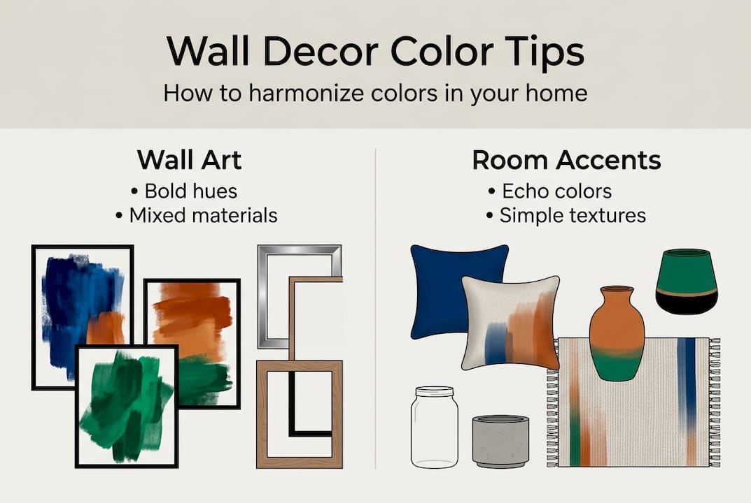
| Room element | How to coordinate with wall art |
|---|---|
| Rugs | Mirror one dominant art color in the rug pattern |
| Pillows | Use accent colors from the art in 1 to 2 pillows |
| Vases or objects | Choose finishes that echo the art’s material or tone |
| Lighting | Warm bulbs enhance warm-toned art; cool bulbs suit cool palettes |
| Plants | Add green as a neutral that works with nearly any color palette |
Lighting is often overlooked but makes a dramatic difference. A picture light mounted above a canvas draws the eye directly to the piece. Track lighting lets you angle beams toward your art from across the room. Even a simple floor lamp positioned nearby can warm up a colorful piece in the evening.
Consider wood wall art as a textural accent alongside softer canvas pieces. The contrast in surface quality adds dimension that a single material can’t achieve. A colorful acrylic print set works especially well when you want a cohesive, high-impact look across a wider wall.
For more real-world inspiration on styling a gallery wall, look at how designers balance negative space. Empty wall areas aren’t wasted. They give the eye a place to rest and make your art feel more intentional.
Mirrors are another underused tool. A mirror near colorful wall art reflects light and color back into the room, making both the space and the art feel larger and more vibrant.
Our take: Embrace boldness, but keep it personal
Here’s something most decorating guides won’t tell you: the biggest mistake isn’t choosing the wrong color. It’s decorating for an audience instead of for yourself. Trends shift fast. What’s everywhere on social media right now will feel dated in a few years. But a space that genuinely reflects your taste? That never goes out of style.
We’ve seen people overload their walls trying to recreate a look they admired online, only to end up with a room that feels like a showroom rather than a home. More pieces don’t mean more personality. Sometimes a single, well-chosen piece of acrylic art in a color that genuinely excites you does more for a room than a dozen carefully curated prints that don’t really speak to you.
Boldness isn’t about using the loudest colors. It’s about making choices with conviction. When you walk into your room and feel something, that’s the goal. Trust that feeling over any trend.
Bring your style to life with colorful wall art from ColorMelt
Ready to put these ideas into action? Here’s where to find colorful wall art that truly stands out. At ColorMelt, we design every piece with vibrant, fade-resistant color and real craftsmanship in mind. Whether you’re drawn to the flowing movement of a cyclone canvas print or the intricate texture of a weave canvas print, our collection gives you a range of styles and materials to match any vision.
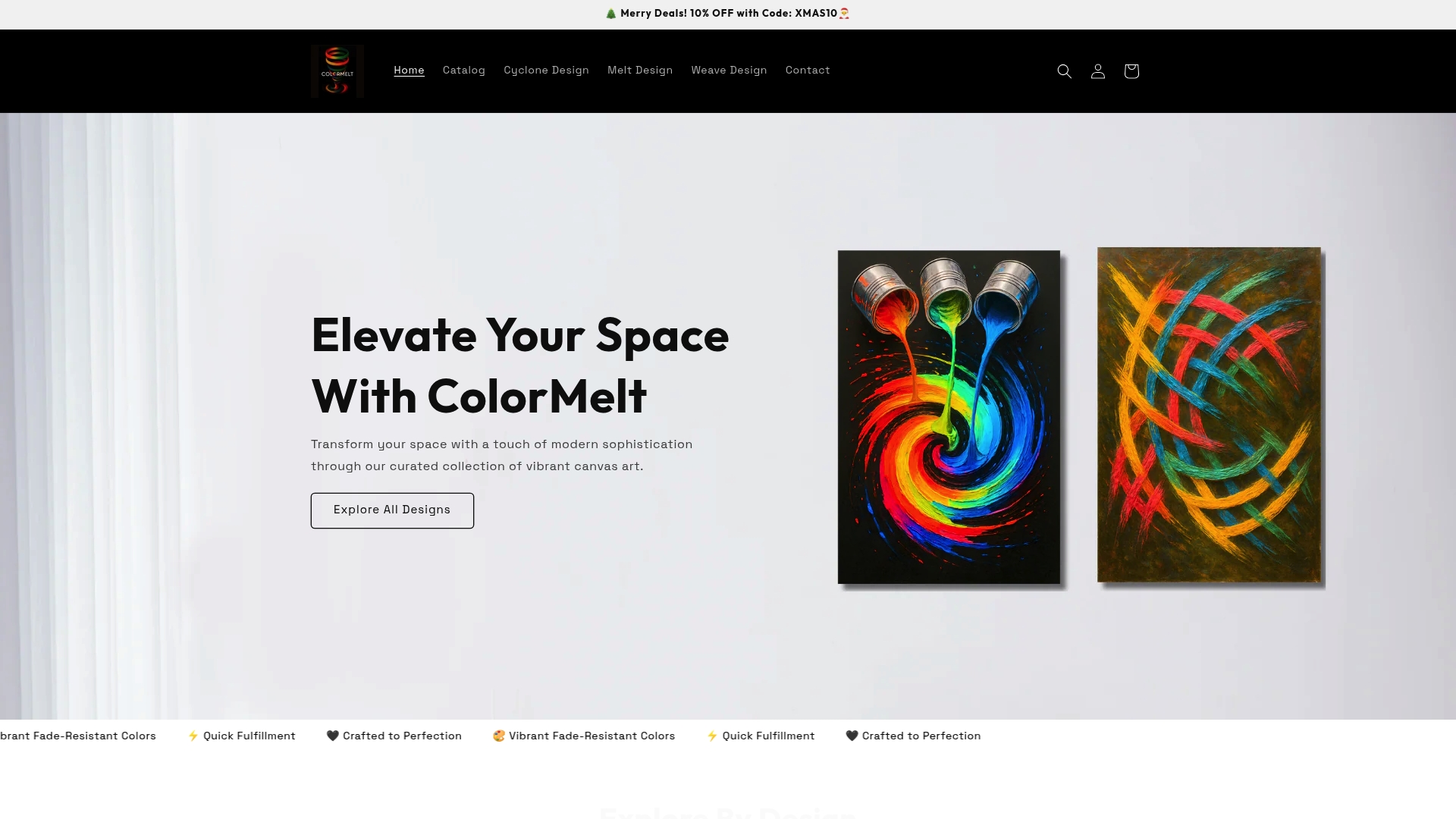
You don’t need to redecorate your entire home at once. Start with one bold piece that excites you, and let it guide the rest. Explore the full ColorMelt collection and find the piece that makes your walls feel like home.
Frequently asked questions
How do I avoid making my space look too chaotic with bright wall decor?
Balance bold wall art by pairing it with neutral furnishings and cohesive accent colors to maintain visual harmony. Professional designers recommend grounding vibrant decor with neutral surroundings for a curated look.
What’s the best way to mix different materials in colorful wall decor?
Combine materials like canvas, metal, and wood by using a consistent color palette and varied textures for depth. Mixing materials adds visual interest as long as there is a consistent thread, usually color or theme.
How high should I hang my colorful wall art?
Hang art so the center is at eye level, typically 57 to 60 inches from the floor for best visual appeal. Experts advise eye-level placement for optimal impact when hanging wall decor.
How can I coordinate pillows, rugs, or accessories with vibrant wall art?
Echo at least one or two wall art colors in your accessories to create a harmonious, intentional design. Designers recommend color repetition in accents for cohesive interiors.
What is the easiest way to update my walls if I’m renting?
Use lightweight framed prints or removable adhesive hooks so you can add colorful decor without permanent damage. Removable hanging tools let renters enjoy vibrant wall art without risking wall finishes.
Recommended
- Vibrant weave Acrylic Print Set - Colorful Triptych Wall Art for Home – ColorMelt
- Colorful Wall Decor Metal Art - Cyclone Design – ColorMelt
- Colorful Cyclone Metal Wall Art – ColorMelt
- Vibrant Acrylic Triptych Wall Art for Living Room - Cyclone Design – ColorMelt
- What Is Bold Wall Art? Energize Your Space With Style
- Modern Home Styling Steps for a Stunning Look