

Gallery Wall Ideas That Transform Any Room
Gallery wall ideas are curated arrangements of framed art, personal objects, and mixed media designed to create a unified focal point in any room. The best displays combine precise spacing, a deliberate layout style, and meaningful personal elements that turn a blank wall into something you actually want to look at every day. Whether you are working with a narrow hallway, a living room accent wall, or a staircase, the principles that separate a polished gallery wall from a cluttered one are consistent and learnable.
1. Why spacing is the foundation of every gallery wall idea
Spacing is foundational to making multiple framed pieces appear as one cohesive composition rather than a random collection of disconnected items. Get this wrong and no amount of beautiful art will save the display.
The industry standard spacing between frame edges is 2 to 3 inches. Spacing tighter than 2 inches makes the wall feel cramped and chaotic. Spacing wider than 4 inches breaks the visual connection between pieces, and the arrangement reads as individual frames rather than a unified display.
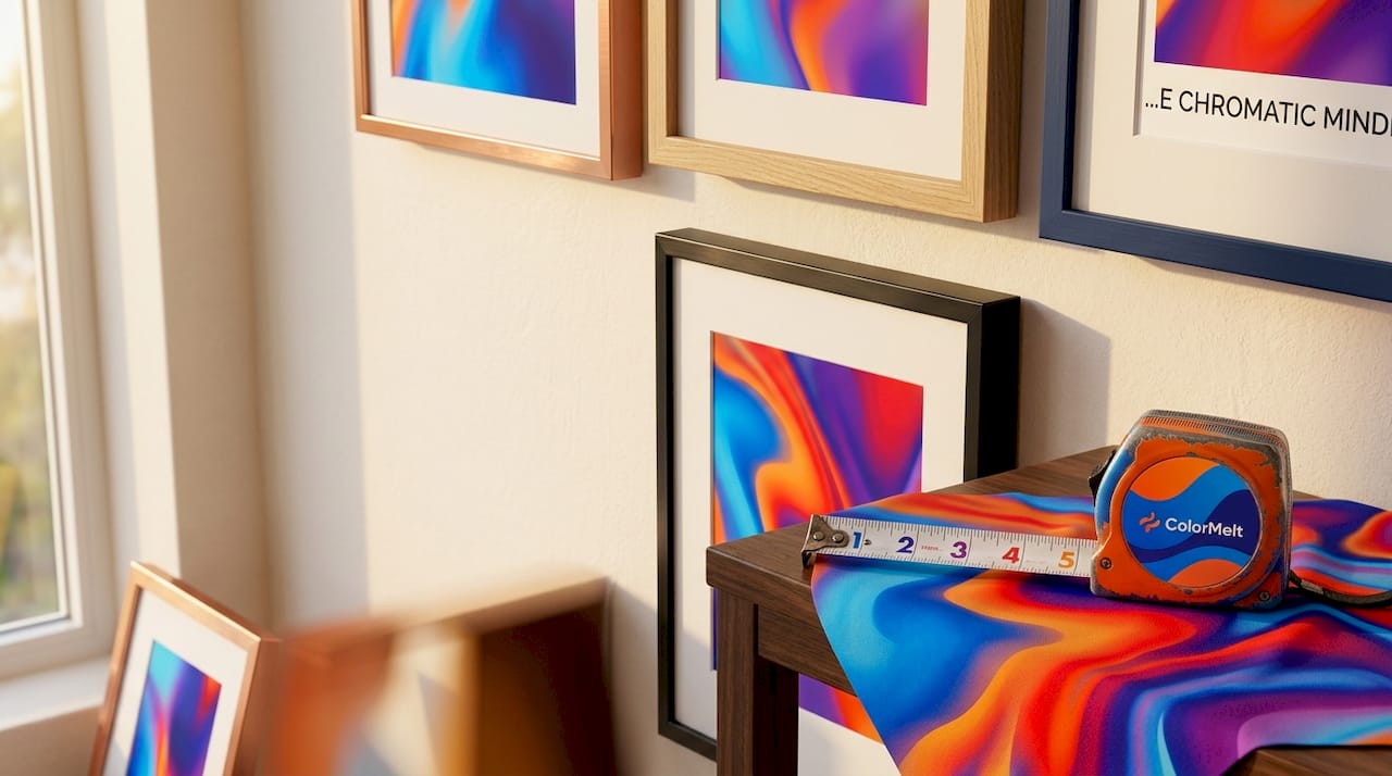
Placement height matters just as much as spacing. The center of your gallery wall should sit 57 to 60 inches from the floor. That range aligns with average eye level and makes the display feel comfortable and inviting rather than awkward to view.
One detail most beginners miss: always measure spacing from the outer frame edges, not from the mat window or the print itself. This keeps your geometry accurate across frames of different sizes.
| Spacing Rule | Measurement | Effect |
|---|---|---|
| Too tight | Less than 2 inches | Cramped, cluttered appearance |
| Ideal range | 2 to 3 inches | Cohesive, balanced display |
| Too wide | More than 4 inches | Disconnected, scattered look |
| Wall coverage | 60 to 70 percent max | Breathing room, visual focus |
Pro Tip: Lay all your frames on the floor first and set gaps with a ruler before touching a single nail. What looks right on the floor translates directly to the wall.
Gallery walls should cover no more than 60 to 70 percent of the available wall space. That negative space is not wasted. It gives each piece room to breathe and keeps the overall display from overwhelming the room.
2. The five gallery wall styles and how to choose yours
The five core gallery wall styles are Grid, Salon, Symmetrical, Asymmetrical, and Themed. Each one suits a different combination of frame types, room aesthetics, and personal taste.
Grid is the most structured option. Frames are arranged in clean rows and columns with identical spacing throughout. It works best with uniform frame sizes and suits minimalist or Scandinavian interiors where order and restraint are the design language. IKEA’s RIBBA frame line is a popular choice for grid walls precisely because the frames come in consistent sizes.
Salon style is the opposite. Frames of wildly different sizes, orientations, and finishes are layered together in an eclectic, collected arrangement. This style suits maximalist rooms and works especially well when you have accumulated art over time rather than buying a matched set. The key is to keep one element consistent, such as a black frame finish or a warm color palette, to prevent the display from reading as pure chaos.
Symmetrical layouts use a central focal point with balanced arrangements on either side. Classic interiors, formal dining rooms, and entryways benefit most from this approach. A large anchor piece flanked by matching smaller frames on each side is the simplest version.
Asymmetrical layouts are dynamic and modern. Frames are arranged in an intentional but non-mirrored pattern that creates visual movement. This style rewards experimentation and suits contemporary or artistic spaces where rigid order would feel stiff.
Themed gallery walls tell a specific story. A travel wall built from maps, postcards, and destination photos. A family portrait wall organized by decade. A botanical wall mixing pressed flower prints with watercolor illustrations. The theme provides the cohesion that spacing and frame style provide in other layouts.
| Style | Best for | Frame types | Room aesthetic |
|---|---|---|---|
| Grid | Minimalists | Uniform sizes | Scandinavian, modern |
| Salon | Collectors | Mixed sizes and styles | Maximalist, eclectic |
| Symmetrical | Classic decor | Matched pairs | Traditional, formal |
| Asymmetrical | Modern spaces | Varied, intentional | Contemporary, artistic |
| Themed | Storytellers | Any | Personal, narrative-driven |
3. Creative personalization tips that make your display unforgettable
Incorporating personal items such as handwritten notes, children’s drawings, or heirloom textiles adds emotional warmth that no purchased print can replicate. The rising trend in 2026 is to treat gallery walls as layered stories rather than art installations. Designers at Good Housekeeping have called this the “reinvented gallery wall,” where the display becomes a living record of a family or individual rather than a static decoration.
Fabric mats behind art pieces introduce texture and tactile interest that softens an otherwise flat display. A linen mat around a botanical print, or a velvet-backed shadow box holding a piece of jewelry, changes the sensory experience of the wall entirely. You can explore texture in home decor to understand how layered materials add emotional depth beyond what paint or frames alone can achieve.
Three specific personalization moves that work consistently:
- Mix 3D objects carefully. Small shelves, ceramic wall hangings, and woven pieces add dimension. Colormelt’s weave design wall art is a strong example of a textural piece that holds its own alongside framed prints without competing visually.
- Use a consistent color thread. When mixing personal objects with purchased art, pull one color from your room’s palette and repeat it in at least two or three pieces across the display. This repetition acts as a visual anchor.
- Frame the unexpected. A child’s crayon drawing in a quality frame becomes gallery-worthy. A handwritten recipe from a grandparent, mounted and matted, carries more emotional weight than any mass-produced print.
Pro Tip: When adding personal items to an existing gallery wall, photograph the current layout first. It is far easier to plan additions digitally than to fill unnecessary holes in your wall.
For deeper inspiration on building a personalized wall art display that reflects your actual life, the approach of mixing heirloom objects with curated prints consistently produces the most memorable results.
4. Step-by-step: how to arrange a gallery wall without the guesswork
Using paper templates or digital planners before hanging prevents the most common layout mistakes and produces balanced arrangements the first time. Trace each frame onto kraft paper, cut out the shapes, and tape them to the wall with painter’s tape. Rearrange freely until the composition feels right, then mark your nail positions through the paper.
Here is the sequence that works:
- Gather and measure every frame. Record height, width, and the distance from the top of the frame to the hanging hardware. This last measurement is what determines where your nail actually goes.
- Choose your anchor piece. This is your largest or most visually dominant frame. Everything else arranges around it.
- Mark eye level. Measure 58 inches from the floor and mark the center of your intended display. Your anchor piece centers here.
- Build outward from the center. Place your paper templates starting with the anchor, then add pieces outward in all directions, maintaining your 2 to 3 inch gaps throughout.
- Step back repeatedly. View the arrangement from the doorway and from seated positions. A display that looks balanced up close can feel top-heavy from across the room.
- Nail and hang in order. Start with the anchor piece, confirm it is level, then work outward. Use a level tool on every frame, not just the first one.
Auto-layout algorithms offered by tools like GalleryPlanner can generate balanced arrangements quickly across Grid, Masonry, Skyline, and Organic styles. Masonry works well for eclectic collections with varied frame sizes. Skyline aligns frame tops for narrow or linear spaces like hallways. Experimenting with these digital layouts before committing to paper templates saves significant time.
Pro Tip: Renters should use adhesive hanging strips rated for the frame weight rather than nails. Command strips from 3M hold reliably up to their rated weight and remove cleanly from most painted walls.
For a detailed walkthrough of the full wall art workflow, including measurement templates and hardware recommendations, the process becomes significantly less stressful when you treat the planning phase as non-negotiable rather than optional.
Key takeaways
A great gallery wall requires consistent 2 to 3 inch spacing, a deliberate layout style matched to your room, and personal elements that give the display genuine meaning beyond decoration.
| Point | Details |
|---|---|
| Spacing is non-negotiable | Keep frame edges 2 to 3 inches apart and center the display at 57 to 60 inches from the floor. |
| Match style to your space | Grid suits minimalists; Salon suits collectors; Themed walls suit storytellers with specific narratives. |
| Personalize with purpose | Heirlooms, children’s art, and fabric mats add emotional depth that purchased prints alone cannot provide. |
| Plan before you hang | Paper templates or digital tools like GalleryPlanner prevent costly layout mistakes and wasted nail holes. |
| Limit wall coverage | Keep the display to 60 to 70 percent of the wall space to preserve visual breathing room. |
Why the rules exist, and when to break them
Most gallery wall advice treats spacing and layout as rigid formulas. I disagree with that framing. The 2 to 3 inch rule and the eye-level guideline exist because they reflect how human vision naturally processes grouped objects. They are not arbitrary. But once you understand why they work, you earn the right to bend them.
I have seen salon-style walls with 5-inch gaps between certain pieces that worked beautifully because the larger frames created natural visual weight that compensated for the extra space. I have also seen perfectly spaced grid walls that felt completely lifeless because every piece was purchased from the same source in the same week. The spacing was flawless. The soul was absent.
The most memorable gallery walls I have encountered share one quality: they look like they were built over time by someone who actually lived in the space. A framed concert ticket next to a fine art print. A grandmother’s embroidery beside a modern abstract canvas. That combination of the personal and the polished is what separates a gallery wall from a furniture showroom display.
My honest recommendation is this: start with the rules. Get your spacing right, choose a layout style that fits your frames, and hang your anchor piece at eye level. Then, once the structure is solid, start adding the pieces that have nothing to do with design principles and everything to do with your actual life. Those are the pieces people will ask about when they visit.
— Shlomo
Find the right art for your gallery wall at Colormelt
Building a gallery wall starts with finding pieces worth displaying. Colormelt’s wall art collection includes canvas prints, acrylic prints, wood prints, and framed artwork across abstract, floral, cyclone, and weave motifs. Every piece ships with fade-resistant colors and is sized to work within standard gallery wall spacing. If you are mixing purchased art with personal items, Colormelt’s bold, high-contrast designs hold visual weight alongside photographs and heirlooms without overpowering them. Browse the full collection to find anchor pieces and supporting prints that fit your layout style, whether you are building a clean grid or a layered salon wall. You can also find room-by-room styling tips to match specific prints to your existing decor.
FAQ
What is the standard spacing for a gallery wall?
The standard spacing between frame edges is 2 to 3 inches. Spacing below 2 inches looks cramped; spacing above 4 inches breaks the visual connection between pieces.
How high should a gallery wall be hung?
The center of the gallery wall should sit 57 to 60 inches from the floor. This aligns with average eye level and makes the display comfortable to view from a standing position.
What are the best gallery wall styles for small spaces?
Grid and Symmetrical layouts work best in small spaces because their structured, predictable patterns prevent visual clutter. Asymmetrical and Salon styles suit larger walls where the eye has room to move.
How do I keep a mixed gallery wall from looking chaotic?
Repeat one design element at least two to three times across the display, such as a consistent frame finish, mat color, or recurring hue in the artwork. That repetition acts as a unifying anchor across otherwise varied pieces.
Can I include non-art objects in a gallery wall?
Yes. Fabric pieces, woven hangings, ceramic wall objects, and shadow boxes all work within a gallery wall arrangement. Keep their spacing consistent with your framed pieces and tie them to the display through a shared color or finish.