
Vibrant wall art: Colorful ideas for your modern home
Choosing colorful wall art should feel exciting, but for most homeowners it quickly turns into second-guessing. Will the colors clash? Will it look like too much? Will every wall compete for attention? These are real concerns, and they stop people from committing to the bold, expressive interiors they actually want. The good news is that vibrant art does not have to mean chaos. With a few clear strategies around color selection, scale, and placement, you can build a space that feels alive, intentional, and unmistakably yours.
Table of Contents
- How to choose the right colorful art for your space
- Statement wall art ideas: Accent walls, murals, and bold prints
- Color drenching, gallery walls, and maximalist approaches
- Hanging, scaling, and arranging colorful art for intentional impact
- Why coherence beats chaos: Our take on vibrant wall art
- Explore vibrant wall art and creative decor at ColorMelt
- Frequently asked questions
Key Takeaways
| Point | Details |
|---|---|
| Intentional art selection | Choose colorful pieces that fit your wall size and home palette to maximize impact without clutter. |
| Bold focal strategies | Accent walls, murals, and oversized prints anchor color and keep rooms lively yet organized. |
| Cohesive color approaches | Consider color drenching or gallery layouts for immersive, modern vibes—avoid maximalism chaos. |
| Smart art arrangement | Scale, spacing, and placement on unexpected walls help vibrant art look intentional and comfort-enhancing. |
| Explore creative decor | Shop curated wall art collections to personalize your home with bold, modern pieces. |
How to choose the right colorful art for your space
Before you scroll through art collections or start pulling samples, you need a simple framework. The best colorful rooms do not happen by accident. They start with a clear-eyed look at what already exists in your space and what the room is asking for.
Start by assessing three things: wall size, your existing color palette, and the overall vibe of the room. A large open living room can handle an oversized abstract canvas in deep teal and gold. A small bedroom with warm wood tones and cream bedding will feel best with art that echoes those warm undertones, maybe terracotta or dusty rose, rather than competing with them.
Next, limit yourself to two or three dominant colors across your art selections. This does not mean every piece needs to match. It means there is a thread of color logic connecting your choices. When you personalize with art, that thread is what makes the result feel curated rather than random.
Think of colorful art as a focal point, not wallpaper. One statement piece or a clustered gallery wall anchors a room. Spreading art of equal intensity across every wall dilutes the impact and creates noise. Accent walls are a practical way to introduce bold color without repainting an entire room, and they give your art a purposeful stage to perform on.
A few key principles to guide your selection:
- Match intensity to room function. Energetic rooms like kitchens and home offices can handle high-contrast art. Bedrooms and reading nooks benefit from softer, more harmonious palettes.
- Test color in real light. Art colors shift dramatically between artificial and natural light. Hang a print temporarily before committing.
- Anchor with one piece, build from there. Choose your favorite piece first, then layer in supporting elements.
- Restrain yourself on patterns. A solid-color or abstract background in furniture allows patterned art to breathe.
- Use entryways strategically. A bold piece at your front door sets the tone before guests reach any other room.
Pro Tip: If you feel overwhelmed by choice, use the modern decor tips approach of building from a “hero” piece. Pick one art print that excites you, then pull the room’s accent colors directly from it. This single step eliminates hours of second-guessing.
Maximalism done poorly becomes visually stressful and chaotic without a strong foundation. Boldness without restraint reduces comfort rather than enhancing it. The goal is energy and personality, not stimulation overload.
Statement wall art ideas: Accent walls, murals, and bold prints
With your selection criteria clear, you can explore the most effective techniques for making color a central, commanding feature of your home without repainting every surface.
Accent walls remain one of the most accessible and high-impact tools available to homeowners. Accent walls transform rooms when executed with intention and proper wall selection. The key word is intention. Paint a wall deep forest green, hang a single large canvas with complementary abstract shapes, and the result feels like a design decision. The same green on a randomly chosen wall with unrelated art feels like an afterthought.
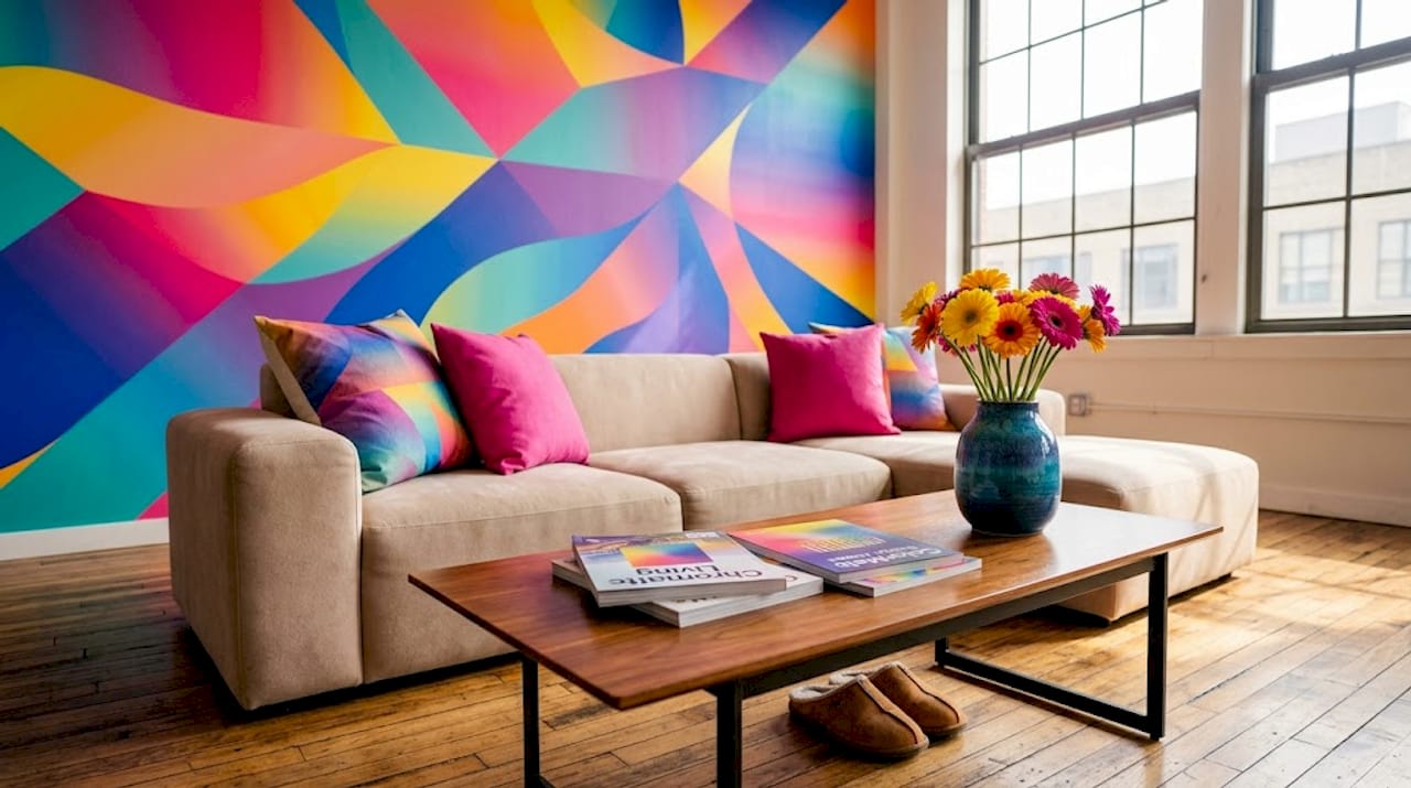
Murals take the concept further. Removable wallpaper murals have made this option accessible even to renters. A botanical mural behind a bed, a geometric cityscape in a home office, or an abstract fluid pour in a hallway can completely reframe how a space feels. The best murals serve as the room’s anchor, making all other decor choices easier because they provide an established mood and color story.
Bold prints and oversized canvases are the fastest way to introduce vibrant color without any painting at all. A single 40x60 inch canvas with a high-contrast abstract design does more for a room’s energy than a dozen small prints scattered across the same wall. Scale matters enormously. When styling colorful decor, one common mistake is choosing art that is too small for the wall. The art gets swallowed by the space, and the color impact disappears.
“A single bold wall or mural can completely shift a room’s energy from neutral and forgettable to dynamic and personal.” This is especially true when the art’s palette is pulled directly from soft furnishings already in the room, creating a conversation between surfaces.
Here is a quick comparison of statement wall approaches:
| Approach | Best for | Time investment | Reversibility |
|---|---|---|---|
| Accent wall paint | Commitment decorators | Medium | Low |
| Removable mural wallpaper | Renters, experimenters | Low | High |
| Oversized canvas print | Quick transformation | Very low | Very high |
| Gallery wall of bold prints | Layered, personal expression | Medium | High |
For floral wall art inspiration, bold botanical prints work particularly well as statement pieces because they carry strong color and organic form simultaneously, making them feel both striking and natural rather than aggressive.
Pair any statement wall with subdued furnishings nearby. A vibrant canvas sings loudest against a neutral sofa. A mural reads cleanest in a room with minimal pattern in textiles and rugs.
Color drenching, gallery walls, and maximalist approaches
The 2026 design landscape offers three primary color-forward frameworks. Understanding how they differ, and where each can go wrong, helps you decide which fits your personality and your space.
Color drenching is the most cohesive approach. It means applying one bold hue across walls, trim, ceiling, and sometimes even furniture to create an immersive, enveloping environment. Think of walking into a room painted entirely in deep navy, including the moldings and ceiling, then furnished with navy and brass accents. The effect is sophisticated, cocooning, and surprisingly calming. Color drenching creates a coherent color story; without restraint, bold approaches tip into chaos. Drenching sidesteps that problem by eliminating competing colors entirely.
Gallery walls offer the most flexibility and personalization. You cluster multiple art pieces on a single wall, varying sizes, frames, and subjects while maintaining a consistent color thread. The key to a gallery wall that looks intentional is pre-planning the layout on the floor before anything goes on the wall. Balance larger anchor pieces with smaller supporting prints. Mix one or two black-and-white images among the color pieces to give the eye a resting point.
Maximalism embraces abundance, many colors, many patterns, many textures all at once. When done well, it feels rich and layered. When done poorly, maximalism can overwhelm senses and become chaotic, reducing the restfulness of a home significantly. The risks are real, and most homeowners discover them the hard way after over-buying.
Here is how the three approaches compare side by side:
| Approach | Definition | Pros | Cons |
|---|---|---|---|
| Color drenching | One hue across all surfaces | Cohesive, immersive, modern | Less flexibility, big commitment |
| Gallery wall | Clustered multi-piece art display | Personalized, evolves over time | Requires planning, easy to clutter |
| Maximalism | Many colors, patterns, and textures | Rich, expressive, bold | High risk of visual stress |
When building a multi-panel canvas arrangement, think like a gallery curator. Every piece should contribute to the story without telling the same story twice. For energizing art ideas, contrast within a controlled palette (deep burgundy against blush, cobalt against cream) delivers more visual energy than simply piling on competing hues.
Pro Tip: If maximalism appeals to you but feels stressful in practice, shift toward color drenching within one room. You get the bold commitment without the pattern overload. Start with one room as your experiment. From there, you can apply canvas styling tips to refine your approach before tackling the rest of your home.
Follow these steps to build your color-forward interior with intention:
- Choose your dominant hue or palette before buying any art.
- Select one anchor piece or wall treatment that leads the design.
- Add secondary art that supports the palette without matching it exactly.
- Introduce one neutral element (a rug, sofa, or throw) to give the eye a break.
- Step back and assess the room as a whole before adding anything more.
Hanging, scaling, and arranging colorful art for intentional impact
Vibrant art on a wall is only half the work. How you hang it, scale it, and arrange it determines whether your home looks like a gallery or a storage room.
Scale is the most frequently misunderstood element. Art should relate to the wall and furniture it lives with. A piece hung above a sofa should span at least two-thirds of the sofa’s width. Anything smaller floats awkwardly in the space, creating a visual gap that feels unresolved. When you choose art with intention, scale is the first decision, not an afterthought.
Spacing between pieces matters just as much as the pieces themselves. Hanging art well depends on scale, spacing, and choosing which walls get the attention, including unexpected ones. A gap of two to three inches between frames keeps a gallery wall feeling intentional. More than four inches and the pieces start to feel unrelated. Less than one inch and the arrangement looks crowded.
Here are practical guidelines for arranging colorful art:
- Vertical stacking limit: No more than two pieces stacked vertically without a horizontal break. Three in a column starts to look like a storage shelf.
- Center line rule: Keep the visual center of your arrangement at eye level, roughly 57 to 60 inches from the floor. This is the museum standard and works in homes too.
- Unexpected placements: Hallways, stairwells, and corners are underused. A single bold piece in a narrow hallway creates a moment of surprise that makes your home feel thoughtfully designed.
- Floor leaning: Large canvases leaned against a wall rather than hung create a relaxed, studio-like feel, particularly effective in living rooms and bedrooms.
| Layout type | Best use case | Key rule |
|---|---|---|
| Single statement | Feature wall, above sofa or bed | Size to span 2/3 of furniture width |
| Gallery cluster | Eclectic rooms, personal collections | Plan on floor first, maintain 2-3 inch gaps |
| Vertical stack | Narrow walls, stairwells | Maximum two pieces per column |
| Floor lean | Living rooms, studio spaces | Large format only, anchor with a lamp or plant |
| Corner arrangement | Underused spaces | Use smaller pieces at varying heights |
The unexpected placement rule is worth emphasizing. Most homeowners default to one prominent wall and leave the rest bare. Introducing a single colorful piece in an entry nook or at the end of a hallway changes how the entire home flows. It creates a journey through the space rather than a single destination.
Why coherence beats chaos: Our take on vibrant wall art
Here is what years of watching people decorate their homes have taught us. The rooms that look amazing in person, not just in photos, share one quality: coherence. Not perfection. Not trendy choices. Coherence.
We have seen it play out the wrong way often. A homeowner loves color, buys art enthusiastically across multiple styles and palettes, and ends up with a living room that feels exhausting to be in. Every wall tells a different story. The eye has nowhere to rest. What started as self-expression turned into a space no one wants to spend time in.
The fix was never to strip out the color. It was to consolidate it. One dominant palette. One or two statement pieces that lead. Supporting art that echoes the palette without competing. When that adjustment happens, the room breathes again. The color feels intentional. Guests stop and notice specific pieces instead of scanning the walls uncomfortably.
Maximalism tipping into overstimulation is the most common failure point we see, and it is almost always the result of adding more without a unifying system. The solution is not going minimal. It is reducing variables by committing to one coherent palette system and letting it guide every decision.
Trend-chasing is another trap. Color drenching is having a moment. Gallery walls have been popular for a decade. Maximalism cycles in and out every few years. The rooms that feel genuinely personal and stand the test of time are built around what the homeowner loves, not what a trend report says. Use trends as inspiration, not instructions. Check modern decor tips for guidance, but filter every idea through the lens of your own comfort and preferences.
Pro Tip: Start with the art that excites you most, the piece you want to live with every day. Build the room’s palette around it. Then introduce accent elements gradually, a throw pillow, a vase, a smaller secondary print. Let the space evolve naturally rather than decorating all at once. This approach almost always produces better results than planning everything from scratch.
Explore vibrant wall art and creative decor at ColorMelt
If reading this article sparked ideas for your own walls, the next step is finding pieces that match your vision. At ColorMelt, we design wall art specifically for homeowners who want color with intention, not chaos.
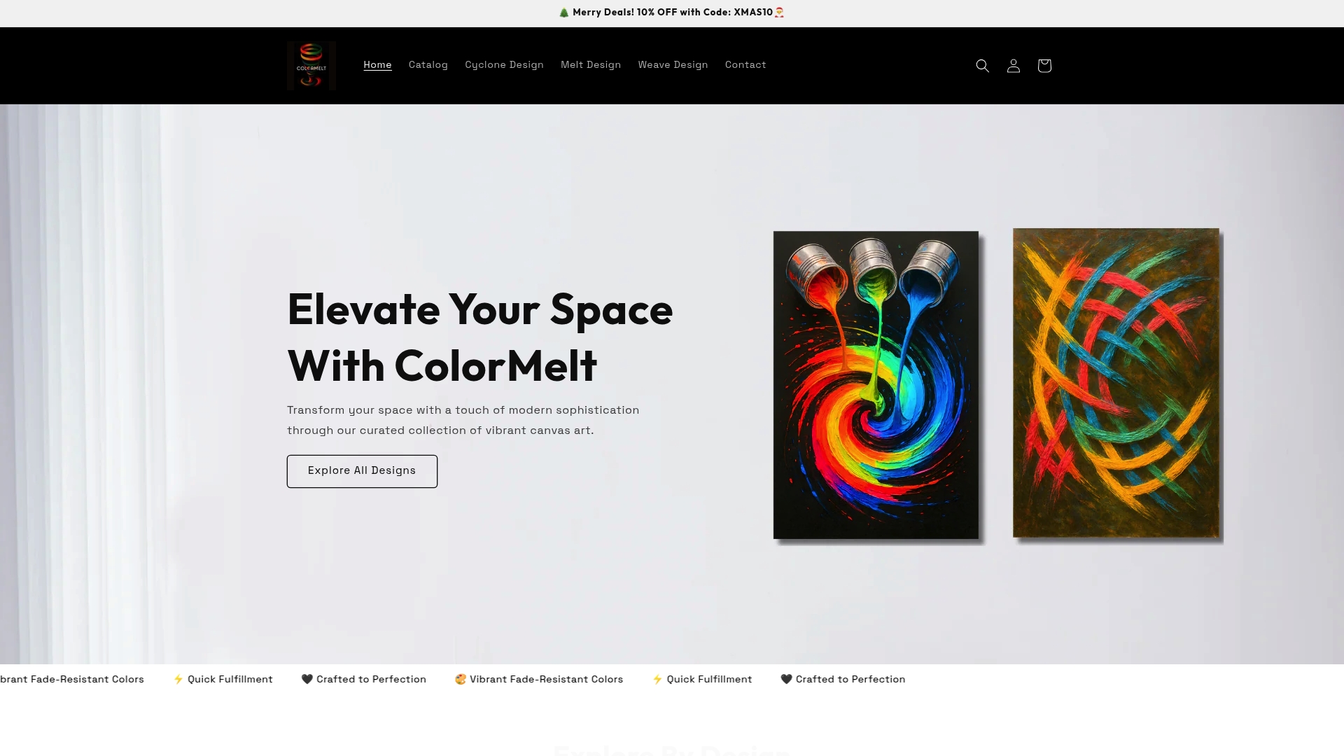
Our wall art collection features abstract, floral, weave, and cyclone motifs in palettes built for modern interiors. Every piece is printed with fade-resistant inks and crafted for lasting quality. Whether you are drawn to a single bold statement piece like the vibrant art canvas print, a textured creative wall hanging, or colorful wall decor that anchors a gallery arrangement, you will find options designed to transform your space from ordinary to genuinely expressive.
Frequently asked questions
What is color drenching in home design?
Color drenching means using one bold color across most room elements, including walls, trim, and ceiling, to create a unified, immersive effect that feels cohesive rather than overwhelming.
How can I avoid overstimulation with vibrant art?
Consolidate your colors into a two or three tone palette, limit competing patterns, and anchor the room with a single bold statement piece. Maximal color without restraint quickly becomes visually stressful, so less truly is more when it comes to variety.
Where should I hang colorful art for maximum impact?
Select unexpected walls like entryways and hallways for surprise moments of color, and arrange art in balanced clusters anchored by one larger piece to create flow and intentionality throughout the space.
Are accent walls still trendy in 2026?
Yes, accent walls remain a popular and practical choice in 2026, particularly when treated as a deliberate focal point paired with complementary art and furnishings rather than an isolated design decision.