
Modern art decor tips to transform your space
Choosing modern art for your home sounds exciting until you’re standing in front of a blank wall, unsure whether that bold canvas will energize the room or throw the whole look off balance. A lot of people buy a piece they love in isolation, hang it up, and feel vaguely disappointed. The art isn’t wrong, the room isn’t wrong, but something just doesn’t click. The good news is that creating a cohesive, vibrant space with modern art isn’t about having a design degree. It’s about understanding a few straightforward principles that make the difference between a room that feels curated and one that feels cluttered.
Table of Contents
- How to select modern art that fits your style
- Avoiding common mistakes in art placement
- Creating harmony: Matching art with rooms and furniture
- Chic ways to display unframed and relaxed modern art
- Comparing display strategies for maximum effect
- Why modern art decor works and how to break the rules
- Discover vibrant modern art collections for your home
- Frequently asked questions
Key Takeaways
| Point | Details |
|---|---|
| Choose bold, cohesive art | Select abstract and geometric pieces with unified color palettes for modern appeal. |
| Match art to furniture and wall | Ensure artwork sizing and placement align with your space’s proportions and main furnishings. |
| Avoid common hanging mistakes | Keep art at eye level and scale pieces to wall and furniture for balanced impact. |
| Embrace relaxed displays | Unframed or casually displayed art adds a contemporary, inviting energy to your room. |
| Break rules for personal expression | Experiment with color and arrangement to create a space that is uniquely yours. |
How to select modern art that fits your style
Modern art is a broad category, and that’s actually one of its best qualities. It doesn’t lock you into one rigid look. What it does require is intentionality. When you’re evaluating a piece, think about three things at once: color, form, and how the work will behave in relation to everything else in the room.
The most practical starting point is color. Abstract, geometric, or bold pieces work best when their palettes echo existing tones in the room, whether that’s the sofa fabric, the rug, or even the wood finish on your shelving. You don’t need an exact match. You need a visual conversation. If your living room leans toward warm terracotta and cream, a canvas with deep orange and gold abstract shapes will feel intentional rather than accidental.
Here are the core criteria to check when selecting modern art:
- Color connection: At least one or two colors in the artwork should appear elsewhere in the room, even in small doses.
- Scale awareness: The piece needs to fit the wall proportionally. A tiny print on a wide open wall looks lonely, not minimal.
- Style clarity: Know whether you want abstract, geometric, weave-textured, or bold floral before you shop, so you’re not overwhelmed by options.
- Media mixing: You can mix canvas prints with wood prints or acrylic panels in the same room as long as the color palette stays unified.
- Visual weight: Dark, dense compositions feel heavier. Lighter, more open designs feel airy. Match the visual weight to the mood you want.
One thing worth clarifying: modern art differs from minimalism in meaningful ways. Minimalist design often calls for strict neutrals, bare surfaces, and very little visual stimulation. Modern design, by contrast, actively welcomes bold accents, vivid color pops, and pieces that demand attention. You’re allowed to go big, go bright, and go layered. That’s not a mistake. That’s the point.
Pro Tip: Before purchasing any piece, hold a large piece of paper cut to the artwork’s dimensions against your wall. Live with it for a day. You’ll immediately know if the scale feels right.
Discovering quality wall art that lasts is equally important because a piece you love shouldn’t fade or warp within a year. And if you want to see how powerfully a well-chosen work can shift a room’s entire mood, modern art’s effect on living rooms is something most people genuinely underestimate until they experience it firsthand.
Avoiding common mistakes in art placement
Even when you pick the perfect piece, hanging it wrong can undermine everything. The most widespread error is hanging art too high. Galleries display work at a standard eye level of roughly 57 to 60 inches from the floor to the center of the piece. Most people hang art several inches above that, usually because it “looks higher” on the wall and feels more prominent. But the result is a room that feels disconnected, like the art is floating away from the furniture instead of anchoring the space.
Here’s a step-by-step approach to getting placement right every time:
- Measure your eye level. Stand in the room and mark 57 to 60 inches up from the floor. This is your center point for any single hanging piece.
- Map the furniture below. Art over a sofa should sit 6 to 8 inches above the back of the sofa. This creates visual unity between furniture and artwork.
- Check the width ratio. The art or grouping should be about two-thirds the width of the furniture it sits above for balanced visual flow.
- Test before you hang. Use painter’s tape on the wall to outline the dimensions of the piece. Step back and evaluate from normal viewing distance.
- Factor in architectural features. A fireplace, window trim, or built-in shelving all affect where the visual “center” of a wall really is.
“The most common mistake isn’t choosing the wrong art. It’s hanging the right art in the wrong place.” Proportion between artwork and the furniture below it is what design professionals consistently emphasize as the most overlooked element of great art placement.
Pro Tip: For gallery walls, cut kraft paper into the exact shapes of each frame, tape them to the wall, and rearrange until the layout feels right before driving a single nail.
For a deeper look at getting placement right in contemporary interiors, these canvas print styling tips cover everything from single statement pieces to full gallery wall setups.
Creating harmony: Matching art with rooms and furniture
Every room has a personality that already exists before any art goes up. Your furniture style, flooring material, lighting type, and existing textiles all contribute to that personality. The goal isn’t to force art into a room. It’s to let the art amplify what’s already working.
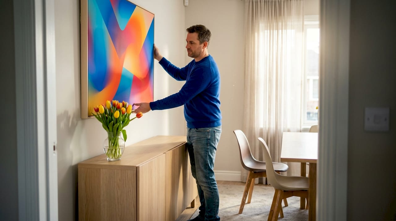
Cohesive color palettes that echo room tones are what make the difference between art that looks placed and art that looks purposeful. A bold geometric canvas in cobalt and charcoal will feel at home in a room with dark hardwood floors and navy accent pillows. The same canvas in a room full of blush pink and warm white might create tension rather than harmony.
Here’s a quick comparison of room types and the art styles that tend to work best in each:
| Room type | Best art style | Color approach | Recommended media |
|---|---|---|---|
| Living room | Abstract, large-scale statement | Bold or complementary tones | Canvas, framed art |
| Bedroom | Soft abstract, floral, or cyclone | Calm, muted, or warm palette | Canvas, wood prints |
| Home office | Geometric, structured abstract | Bold contrast, energizing tones | Acrylic, framed prints |
| Dining room | Bold graphic, colorful abstract | Rich, saturated hues | Framed, canvas |
| Entryway | Single statement or weave design | High contrast, eye-catching | Canvas, acrylic prints |
Beyond the room type, think about whether you want your art to blend or contrast with your furniture. Blending creates flow. Contrasting creates drama. Both are valid. A vivid orange abstract canvas against a gray sectional sofa creates an energizing focal point that immediately gives the room a personality. A soft blue floral canvas in a bedroom with pale wood furniture creates calm continuity.
Key things to consider when matching art to rooms:
- Natural light direction: South-facing rooms get warm light, so cooler art tones balance the warmth beautifully.
- Furniture finish: Matte furniture benefits from art with some sheen (acrylic prints), while glossy surfaces pair well with canvas or wood prints.
- Room function: High-energy rooms like kitchens and home offices benefit from bold, stimulating designs. Bedrooms benefit from softer, more restful compositions.
For practical advice on pulling all these elements together, styling colorful wall decor in a modern home is one of the most effective ways to go from a good room to a great one.
Chic ways to display unframed and relaxed modern art
Not every piece of modern art needs a frame, and honestly, going frameless often feels more contemporary. Unframed canvas and prints carry a raw, youthful energy that formal frames can sometimes suppress. The key is making sure the display method itself looks intentional.
Unframed art displayed with thumbtacks, clips, or leaning techniques suits a relaxed modern aesthetic perfectly. It signals confidence, like you’re not trying too hard. This approach is especially effective in apartments and rental spaces where you want visual impact without committing to lots of hardware.
Practical ways to display unframed modern art:
- Lean against the wall: Works beautifully on a shelf, mantelpiece, or directly on the floor propped against baseboards. Especially effective with oversized canvases.
- Binder clip hangers: Attach binder clips to the top corners of a print and hang from small nails or hooks. Clean, casual, very modern.
- Washi tape borders: Use decorative tape to create a faux “frame” around unframed prints on the wall. This method works well for lighter paper prints.
- Gallery shelf ledges: Install a narrow picture ledge and lean multiple unframed pieces of varying sizes in a layered arrangement.
- Fabric panels: Stretch canvas or fabric-based art over a simple wooden frame you make yourself for a custom, high-end look at low cost.
Pro Tip: Group three or more unframed pieces in different sizes along the same horizontal axis for a salon-style display that looks deliberately curated rather than random.
For more inspiration on making your living space feel personal and alive, personalizing your home with art offers ideas that go beyond just hanging things on walls.
Comparing display strategies for maximum effect
Different display strategies serve different goals. Understanding which approach fits your space and lifestyle helps you commit with confidence rather than second-guessing every choice.
| Display strategy | Best use case | Visual impact | Flexibility |
|---|---|---|---|
| Framed single statement piece | Focal walls, formal rooms | High, polished | Low (fixed) |
| Unframed leaning art | Shelves, entryways, studios | Relaxed, layered | Very high |
| Gallery wall grouping | Large blank walls, hallways | Bold, dynamic | Medium |
| Oversized canvas | Living rooms, open-plan spaces | Maximum impact | Low (anchor piece) |
| Mixed media cluster | Eclectic or creative spaces | Rich, textured | High |
A few things stand out when you compare these strategies directly. Framed single pieces deliver the most polished, permanent look. They signal intention and work well in formal or high-traffic spaces like dining rooms and entryways. Gallery walls deliver the most personality per square foot, letting you tell a visual story across a whole section of wall.
Unframed art displayed casually is the most flexible option and the easiest to refresh seasonally. If you like to update your decor frequently, leaning and clipping art rather than permanently hanging it means you can rotate pieces every few months without repainting or patching walls.
Key takeaways for choosing a display strategy:
- Go oversized when you have one strong, beautiful piece and a large open wall.
- Go gallery wall when you want to display multiple pieces you love without choosing just one.
- Go unframed and relaxed when you’re renting, frequently updating, or want a youthful, creative vibe.
- Go mixed media when you want depth, texture, and a layered look that rewards closer inspection.
According to interior design research, rooms with intentional art displays are consistently rated as feeling more personalized and higher-end, even when the furniture and finishes are modest. The art does significant heavy lifting in terms of how a space is perceived.
Why modern art decor works and how to break the rules
Here’s a perspective that most design guides won’t give you: the “rules” of modern art placement exist to help you, not to constrain you. And once you understand why they exist, you’re free to break them intelligently.
The eye-level hanging rule exists because galleries and museums figured out that art viewed at a natural sight line creates emotional connection faster. But if you’re decorating a room where people sit on the floor to play music or meditate, “eye level while seated” is the right baseline, not standing eye level.
The color-matching rule exists because visual chaos is exhausting. But intentional contrast, a hot pink abstract canvas in an all-gray room, can be electric rather than chaotic if executed with conviction. The difference between “clash” and “statement” is usually confidence and commitment.
What we’ve seen again and again is that people who follow every rule end up with rooms that feel safe but forgettable. The homes that truly energize people are the ones where someone made a bold decision and stood by it. A floor-to-ceiling canvas that technically overwhelms the wall. An unframed print thumbtacked to a linen wall in an otherwise polished dining room. A weave-design piece hung horizontally instead of vertically.
Art’s real power in home decor isn’t just aesthetic. It’s psychological. The spaces where you feel most yourself are usually the spaces where the art reflects who you actually are, not who you think you’re supposed to be. Modern art, with its embrace of abstraction, color, and experimentation, gives you more room to express that than almost any other decor category.
So learn the rules, use them as scaffolding, and then trust yourself to edit intelligently. That’s where the best spaces come from.
Discover vibrant modern art collections for your home
Ready to put these principles into practice? The selection process becomes much easier when you’re working with a collection that’s built specifically for modern interiors.
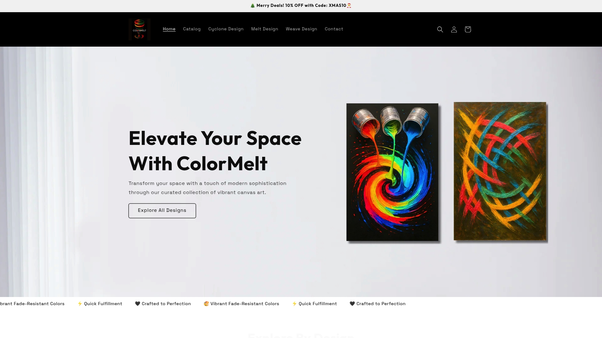
At ColorMelt, you’ll find a curated wall art collection designed around the bold, vibrant aesthetic that modern rooms thrive on. From abstract cyclone designs to geometric weave patterns, every piece is crafted with fade-resistant colors and built to hold their impact for years. If you want something distinctive, the melt design wall art series offers dynamic, color-rich compositions that become natural focal points in any room. For a tactile, contemporary option with serious visual presence, the creative wall hanging art in weave design delivers texture and movement in a single striking piece. Browse, find what speaks to your space, and hang something you’ll genuinely love looking at every day.
Frequently asked questions
How do I choose the right size of modern art for my wall?
Select art that is proportionate to your wall and furniture, aiming for pieces about two-thirds the width of any furniture beneath them and avoiding art that’s too small or hung too high.
Can I mix different styles of modern art in one room?
Yes, mixing abstract, geometric, and bold pieces works beautifully as long as you keep the color palettes cohesive across all the works in the room.
Is unframed art suitable for a modern room?
Absolutely. Unframed art displayed with thumbtacks or leaned against walls adds a relaxed, confident energy that fits the contemporary aesthetic perfectly.
What is the difference between modern and minimalist art decor?
Modern decor actively uses bold accents and color pops for visual interest, while minimalist design favors strict neutrals, bare surfaces, and visual simplicity above everything else.