
What makes vibrant wall art truly alive and energizing
Most people assume that vibrant art is simply about choosing the brightest colors on the shelf. That assumption misses something important. True vibrancy is a layered experience built from color science, strategic contrast, dynamic composition, and emotional resonance working together at once. When all four elements align in a single piece, something remarkable happens: a room stops feeling like just a room and starts feeling like a place with energy and intention. This article breaks down exactly what creates that effect, so you can choose wall art that genuinely transforms your space rather than just decorating it.
Table of Contents
- The science behind vibrant color
- Contrast and value: Creating visual depth
- Dynamic composition and texture
- Emotional impact: Art that inspires and uplifts
- Why vibrant art is more than just color
- Bring vibrant art to your space
- Frequently asked questions
Key Takeaways
| Point | Details |
|---|---|
| Saturation and contrast matter | High saturation and purposeful color contrast make art visually vibrant and energetic. |
| Value creates depth | Strong differences between light and dark boost the dynamic impact in wall art. |
| Composition and texture energize | Bold strokes and textured arrangements give artwork lasting movement and lively presence. |
| Emotional responses are essential | Vibrant art fosters positive moods, pleasure, and well-being in contemporary interiors. |
| Balanced selection is key | Choosing art blends color, contrast, and emotional resonance for true vibrancy in any space. |
The science behind vibrant color
Color is not just something your eyes detect. It is a structured system, and understanding how it works gives you a real advantage when shopping for wall art that delivers on its promise.
Every color has two distinct qualities worth knowing: saturation and chroma. Saturation refers to how free a color is from gray. Chroma measures the intensity or purity of a hue compared to a neutral gray at the same brightness level. High saturation and chroma in colors create purity and intensity, making art appear vivid and energetic. A deep, pure cobalt blue carries far more visual energy than a muted or grayish blue of the same size, even if the two appear similar at first glance.
Beyond individual colors, the relationship between colors matters enormously. Complementary and triadic color schemes provide maximum contrast and lively balance, enhancing vibrancy. Complementary colors sit opposite each other on the color wheel, like orange and blue, or red and green. When placed side by side, they intensify each other visually. Triadic schemes use three colors spaced evenly around the wheel, creating a lively, balanced energy that feels both organized and dynamic.
Here is a quick comparison of common color schemes and how they affect vibrancy:
| Color scheme | Description | Vibrancy level | Best use in home decor |
|---|---|---|---|
| Complementary | Two opposite hues | Very high | Bold statement pieces |
| Triadic | Three evenly spaced hues | High | Large living room walls |
| Analogous | Adjacent hues | Moderate | Calm, unified spaces |
| Monochromatic | One hue, varied tones | Low to moderate | Minimalist settings |
| Split-complementary | One hue + two adjacent to its complement | High | Versatile interiors |
When choosing wall art for your home, look for these qualities:
- Pure, saturated hues with minimal gray or brown mixing
- Color contrast achieved through complementary or triadic pairings
- Balanced distribution of color so no single area feels heavy or flat
- Multiple tones within each hue to add richness and avoid flatness
Pro Tip: If you are unsure whether a piece has true chroma, hold it next to a purely gray surface. Colors with high chroma will seem to almost vibrate against the neutral background.
You can find detailed colorful wall decor tips on how specific palette choices play out in real room settings. Understanding how to match color energy to your existing furniture and lighting will make your final selection far more satisfying. It also helps to think about personalizing art for vibrant style so the piece you choose reflects your own taste rather than just following a trend.
Contrast and value: Creating visual depth
Color gets the attention, but value does the heavy lifting. In art, “value” refers to the lightness or darkness of a color, completely independent of the hue itself. A rich burgundy and a pale lavender can share the same hue family yet have dramatically different values. Understanding this distinction changes how you evaluate art.
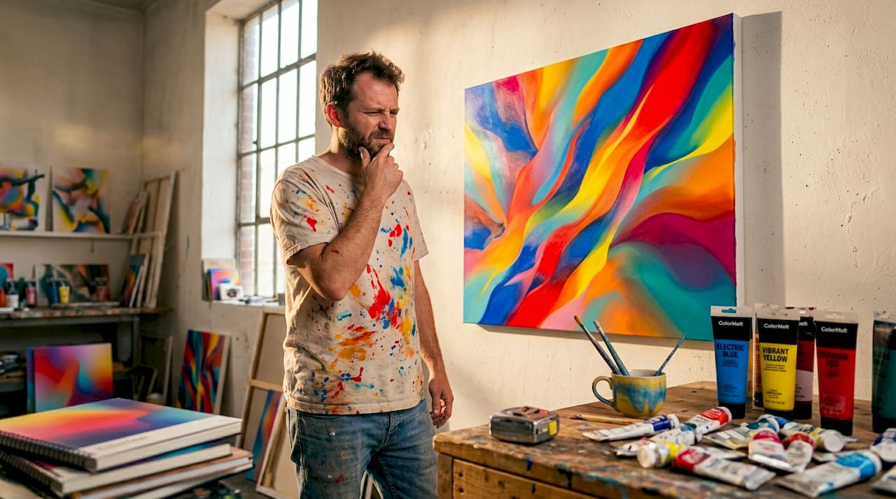
Strong value contrast between light and dark areas guides the eye, adds depth, and creates dynamic compositions. Without value contrast, even the most saturated colors can feel flat or muddy together. Think about a sunrise painting where the deep charcoal sky at the edges frames a brilliant orange center. The contrast between those extremes is what makes the orange feel explosive rather than ordinary.
Here is how different value contrast levels affect the viewer experience:
| Value contrast level | Visual effect | Room energy | Example art style |
|---|---|---|---|
| High | Bold, dramatic, eye-catching | Activating, stimulating | Abstract expressionism |
| Medium | Balanced, readable | Comfortable, inviting | Impressionism |
| Low | Subtle, soft, quiet | Calming, meditative | Watercolor landscapes |
To spot high-value-contrast art when you are browsing:
- Squint at the piece. Details blur, but the light and dark zones remain clearly visible. If the whole image becomes one uniform tone when squinted, value contrast is low.
- Check the extremes. True blacks or near-blacks paired with near-whites create the strongest value range.
- Look at the focal point. In well-designed vibrant art, the eye goes to the area of highest contrast first, then travels outward.
- Compare to a grayscale version. Many phone cameras have a grayscale filter. If the art still looks dramatic in grayscale, it has strong value structure.
- Notice the transitions. Abrupt edges between light and dark areas feel energetic. Gradual transitions feel softer and calmer.
Knowing what to look for when choosing quality art ensures you invest in pieces that hold their visual power over time rather than fading into the background after a few months.
Pro Tip: In a room with mostly neutral furniture, a single piece of high-value-contrast art becomes the entire focal point of the space. You do not need to fill every wall. One strong piece with bold value contrast can do more work than five softer pieces combined.
Dynamic composition and texture
Even color and contrast cannot save a poorly composed piece. Composition is the arrangement of all elements within the artwork, and dynamic composition is what separates art that feels alive from art that just sits there.
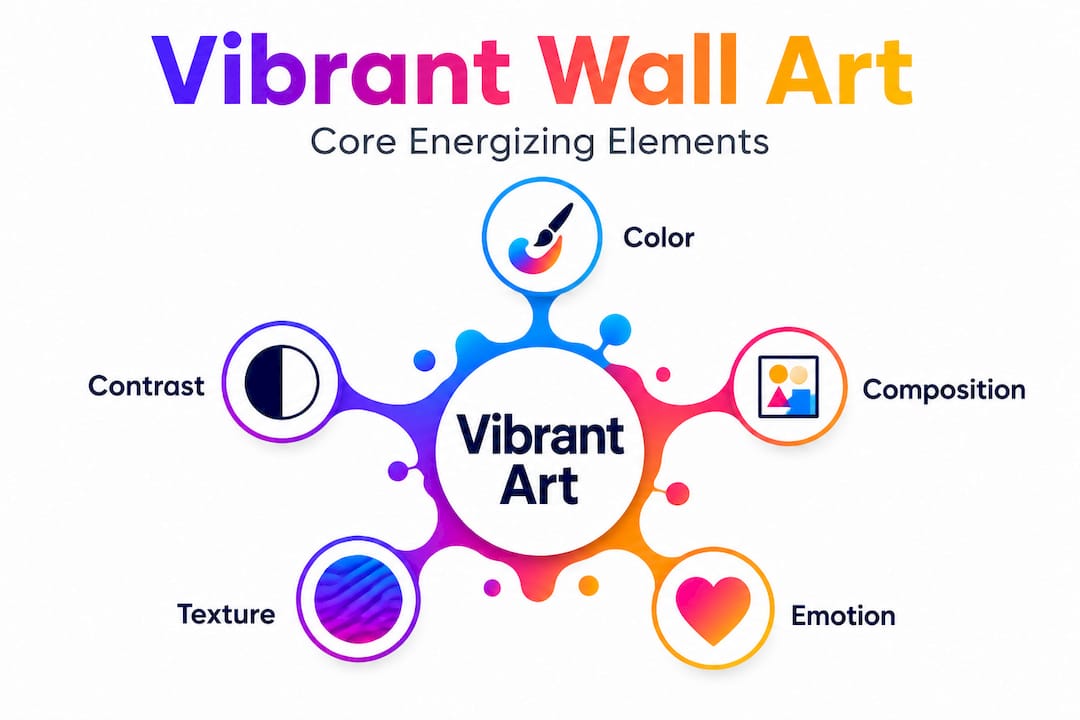
Dynamic composition with bold strokes, asymmetry, geometric forms, and texture adds visual energy and movement. When your eye enters a piece and keeps moving through it, discovering new details and visual paths, the composition is doing its job. When your eye lands once and stops, the composition is static.
Here is what to look for in dynamic, energized wall art:
- Asymmetry over symmetry. Perfectly balanced compositions feel stable but rarely feel alive. Slight asymmetry creates visual tension that keeps you engaged.
- Diagonal lines. Verticals and horizontals feel grounded. Diagonals feel like motion. Art with strong diagonal movement brings energy into a space.
- Overlapping forms. When shapes overlap or interact, they create a sense of depth and layering that adds complexity.
- Visible texture. Raised paint strokes, woven surfaces, and varied surface finishes catch light differently throughout the day, making art feel subtly different depending on the hour.
- Scale variation. Large forms contrasted with fine detail give the eye something to discover. Uniform scale feels monotonous.
“The best vibrant art rewards you for looking longer. The first glance gives you impact; the closer look gives you detail. If a piece reveals nothing new on second or third look, it has a composition problem.”
Common mistakes people make when selecting wall art based on composition:
Choosing perfectly centered, symmetrical pieces for every room. These work in formal dining rooms but drain energy from living spaces and creative areas. A piece with slightly off-center focal points feels more spontaneous and alive.
Ignoring the impact of texture. In product photos online, texture often gets flattened. Look specifically for canvas art, acrylic prints on textured surfaces, or pieces where the artist’s technique shows through. Physical texture adds another layer of visual vibration.
Treating small art as equivalent to large art. A small, dynamic piece gets lost on a large wall. The composition that works at 12 inches by 12 inches may need to be 36 by 48 inches to register as a real presence in the room.
Understanding how modern art and mood interact helps you select pieces that genuinely shift the feeling of a room rather than just filling empty wall space.
Emotional impact: Art that inspires and uplifts
Visual science explains a lot, but it cannot explain everything. Art is ultimately experienced emotionally, and the emotional quality of vibrant art is where the real payoff lives.
Research confirms what many people feel intuitively. An empirical EEG study found that Impressionistic and Post-Impressionistic paintings generate stronger positive emotional responses in modern interiors, including higher levels of pleasure and arousal, compared to other painting styles. This is not a matter of taste. Brain activity measurements showed measurable differences in how viewers responded emotionally to different art styles within the same space.
What does this mean practically? Looser, expressive brushwork with visible movement tends to produce warmer emotional reactions than tight, photographic-style reproduction. Color used expressively rather than literally creates a sense of life and personality that more rigid artwork lacks.
Use this checklist when evaluating the emotional vibrancy of a piece:
- Does it make you feel something within three seconds? True vibrancy registers fast. You do not need to analyze it.
- Does the energy match what you want in the room? Uplift and stimulation suit work spaces and living areas. Calm vibrancy suits bedrooms.
- Does it hold meaning beyond decoration? Art that represents something personal, a color you love, a feeling you want more of, becomes more emotionally charged over time rather than less.
- Would you be excited to share it? Genuinely vibrant art makes people want to talk about it. It is a conversation starter, not just a wall covering.
The science-backed art benefits for home environments are well documented, and emotional vibrancy is a large part of why surrounding yourself with art that moves you has measurable effects on mood, productivity, and overall well-being.
Why vibrant art is more than just color
Here is something worth saying directly: the word “vibrant” has become almost meaningless in home decor marketing. Every product description uses it, yet many so-called vibrant pieces fall flat the moment they go up on your wall. The reason is that most people, and many sellers, treat vibrancy as a color attribute rather than a total experience.
We have seen this play out constantly. Someone buys a piece because the colors look bold in a product photo. They hang it, stand back, and feel underwhelmed. The colors are bright enough. But the composition is static, the value contrast is minimal, and there is nothing pulling the eye through the image. It is loud without being energetic. That is the difference between a piece that shouts and a piece that sings.
Real vibrancy is a balancing act. Color without contrast feels chaotic. Contrast without dynamic composition feels harsh rather than energizing. Composition without emotional resonance feels mechanical. All three need to work together, and they need to work in relationship with the space you are putting the art into.
This is why we believe in art that is designed from the inside out, where every decision about color, value, texture, and arrangement is made with the viewer’s experience as the first priority. Thinking about how modern art transforms living rooms reveals that the best transformations happen not when a room gets a brighter painting, but when it gets a more intentionally designed one.
Choosing vibrant art is an act of curation. You are selecting not just an image but an energy level, a focal point, and an emotional anchor for everything else in the room. That deserves more thought than just picking the piece with the most color.
Bring vibrant art to your space
Knowing what makes art truly vibrant puts you in a much stronger position to find pieces that actually deliver on their promise.
At ColorMelt, every piece in our collection is designed with these principles at its core: bold color relationships, strong value contrast, and dynamic compositions that keep the eye engaged. Whether you explore our wall art collection to find something that matches a specific room energy, or go straight to a standout piece like the vibrant art canvas featuring intricate weave design and layered color depth, or choose something more architecturally bold like our triptych acrylic prints for modern spaces, you will find options built to do exactly what great art should do. They transform a wall into a reason to stay in the room.
Frequently asked questions
How do I choose vibrant art for a small space?
Focus on high-saturation pieces and strong value contrast to make small rooms feel lively without overwhelming the area. One well-placed, dynamic piece typically works better than multiple smaller, quieter ones.
Does vibrant art always mean bright colors?
No. Complementary and triadic schemes show that vibrancy comes from strong color relationships and lively balance, not raw brightness. A piece using deep jewel tones with strong value contrast can feel more vibrant than a pastel piece with high brightness but no contrast.
Are certain art styles more emotionally vibrant?
Yes. An EEG-based study shows that Impressionistic and Post-Impressionistic paintings evoke stronger positive emotional responses in modern interior settings, including measurable increases in pleasure and arousal levels.
How can I tell if a piece has dynamic composition?
Look for bold strokes, asymmetry, geometric forms, and visible texture, all of which signal visual energy and movement. If your eye keeps moving through the piece rather than stopping at one point, the composition is doing its job.