
How to Choose Wall Art for Your Home
Choosing wall art is the process of selecting pieces that balance scale, color, and emotional resonance to transform a room from functional to genuinely personal. Most homeowners treat it as an afterthought, filling blank walls with whatever fits the budget or matches the sofa. That approach produces forgettable rooms. The better method, used by professional interior designers, starts with sizing rules, color theory, and a clear sense of the feeling you want a space to project. This guide covers every step, from measuring your wall to understanding why the right piece of art can define an entire room’s character.
How to choose wall art: sizing and placement rules
Size is the single most common mistake people make when selecting wall decor. A piece that is too small floats awkwardly on the wall, while one that is too large crowds the space and creates visual tension.
The 2/3 rule for furniture-to-art proportion
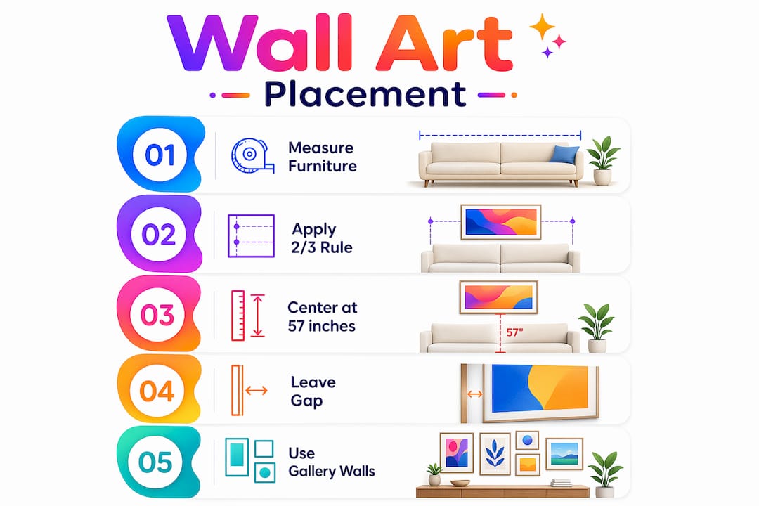
Professional designers recommend that the primary art piece covers 60 to 75% of the furniture width beneath it. For a standard 220 cm wide sofa, that means your artwork should be between 110 and 155 cm wide. This proportion creates visual anchoring. The art feels connected to the furniture rather than floating above it like a postage stamp on a wall.
The 57-inch hanging height standard
Most homeowners hang art too high. The industry standard centers artwork at 57 to 60 inches (145 to 152 cm) from the floor, which corresponds to average adult eye level. This rule applies regardless of ceiling height. A 10-foot ceiling does not mean you move the art up. It means you have more breathing room above the piece, which actually adds to its presence.
The gap between the top of your furniture and the bottom of the frame also matters. Keep that furniture-to-art gap between 15 and 25 cm (6 to 8 inches). Closer than that and the art looks pinned to the furniture. Further than that and the visual connection breaks entirely.
Gallery walls and groupings
Gallery walls follow a different logic, but the underlying principle is the same. Treat the grouping as one piece with consistent 5 to 7 cm gaps between frames and balanced visual weight across the layout. Distribute larger, darker frames across the arrangement rather than clustering them in one corner. The whole grouping should still honor the 2/3 furniture width rule and the 57-inch center height.
Here is a quick sizing reference to use before you buy:
| Furniture width | Recommended art width | Hanging center height |
|---|---|---|
| 150 cm sofa | 90 to 112 cm | 145 to 152 cm from floor |
| 220 cm sofa | 110 to 155 cm | 145 to 152 cm from floor |
| 180 cm console | 108 to 135 cm | 145 to 152 cm from floor |
Pro Tip: Before drilling a single hole, cut paper to your target art dimensions and tape it to the wall. Live with the mock-up for a day. You will catch sizing and placement problems that no amount of mental visualization reveals.
How do you match art colors to your existing room?
Color is where most people either overthink or completely ignore the process. Both extremes produce rooms that feel off.

The most effective approach is to pull colors from your existing furnishings rather than matching them exactly. If your sofa is a warm terracotta, look for art that contains terracotta as one of several colors, not art that is entirely terracotta. The color wheel gives you two reliable strategies: complementary colors (opposites on the wheel, like blue and orange) create energy and contrast, while analogous colors (neighbors on the wheel, like teal and green) create calm and cohesion.
Avoid the “matchy-matchy” trap. Art that perfectly mirrors your wall paint or rug color disappears into the room. It adds nothing. The goal is harmonious contrast, where the art stands out enough to be noticed but shares enough tonal DNA with the room to feel intentional.
Texture and material also play a role in color perception. A canvas print with visible brushstroke texture reads warmer than a flat acrylic print of the same image. Wood prints add organic warmth that works particularly well in rooms with natural materials like linen, rattan, or hardwood floors. Resources like Colormelt’s guide on colorful wall decor styling show how accent hues can be layered without overwhelming a neutral base.
Style consistency matters too, but it does not mean rigidity. A modern abstract piece can work in a rustic room if the color palette connects. An antique botanical print can work in a minimalist space if the framing is clean and simple. The style of the art and the style of the room should be in conversation, not in competition.
Pro Tip: Lean the art against the wall at its intended location for a few days before hanging it. This low-commitment test reveals whether the colors and scale feel right in different lighting conditions, morning versus evening.
Why does emotional connection matter when picking art?
The most underrated factor in selecting wall decor is how the piece makes you feel. Designers at Kit Kemp Design Studio describe art as a room’s emotional anchor, the element that sets the tone before any furniture arrangement or paint color does. A room with dramatic, high-contrast abstract art feels different from the same room with a soft watercolor landscape, even if every other element stays identical.
Consider what you want each room to do for you:
- A living room meant for entertaining benefits from bold, conversation-starting pieces that project energy and confidence.
- A bedroom calls for art that feels calming or intimate, not stimulating. Soft palettes, organic forms, and personal imagery work well here.
- A home office responds to art that focuses or inspires. Geometric abstracts, typography, or nature scenes with strong lines tend to perform well.
- A dining room can handle more dramatic or provocative art because meals are social events where conversation is already flowing.
Personal and meaningful art carries more weight than decorative filler. Travel photographs, original pieces from local artists, or prints connected to a memory all create rooms that feel inhabited rather than staged. Martha Stewart’s design guidance frames art as a long-term relationship, one that should evolve with you rather than lock you into a single aesthetic moment.
One principle worth holding onto: it is better to leave a wall blank than to fill it with small, unanchored pieces that serve no emotional or visual purpose. A single well-chosen large piece almost always outperforms a collection of random small ones. Patience in art selection is not indecision. It is good design practice.
What should you budget for wall art?
Budgeting for art involves more than the sticker price. When buying art, budget an additional 15 to 30% beyond the listed price to cover hidden costs like sales tax, shipping, and custom framing. A $200 print can easily become a $300 purchase once framing is added.
Follow these steps to avoid budget surprises:
- Set a total budget before you shop, not just a price-per-piece limit. Knowing you have $400 total for a living room wall helps you decide between one statement piece and a small gallery grouping.
- Call local frame shops with your art dimensions before purchasing. Framing quotes vary widely, and knowing the cost upfront prevents the common scenario of buying art you cannot afford to properly frame.
- Mix price points intentionally. A high-quality canvas print as the anchor piece, surrounded by lower-cost prints in coordinating frames, creates a collected look without a collected price tag.
- Factor in hardware. Heavy canvas prints and framed pieces require appropriate wall anchors. Drywall anchors for pieces over 5 kg cost very little but are non-negotiable for safety.
- Plan for maintenance. Direct sunlight fades art over time. Position pieces away from south-facing windows or use UV-filtering glass in frames to protect your investment.
For renters, the calculus shifts. Renter-friendly options include picture ledges (which let you swap art without new holes), removable adhesive strips rated for your art’s weight, and leaning large pieces against the wall on a console or shelf. Colormelt’s damage-free wall decor checklist covers the specific hardware and techniques that protect both your walls and your security deposit.
Pro Tip: Start with one room and one statement piece. Getting that right teaches you more about your own taste than any amount of browsing. Once you know what works, building out the rest of your home becomes significantly faster.
Key takeaways
Choosing wall art successfully requires applying the 2/3 sizing rule, the 57-inch hanging height, and emotional resonance before making any purchase.
| Point | Details |
|---|---|
| Apply the 2/3 sizing rule | Art should cover 60 to 75% of the furniture width beneath it for visual balance. |
| Hang at 57 inches center | Center every piece at 145 to 152 cm from the floor, regardless of ceiling height. |
| Pull colors, don’t match them | Use complementary or accent hues from existing furnishings to avoid flat, forgettable results. |
| Choose by feeling first | Art that evokes the right emotion sets a room’s character more effectively than any other design element. |
| Budget 15 to 30% extra | Account for framing, shipping, and tax beyond the listed price to avoid surprises. |
Why I think most people approach art selection backwards
Most people choose art last, after the furniture, the paint, the rugs, and the throw pillows are already in place. I understand the logic. Art feels like the finishing touch. But in practice, that sequence produces rooms where the art is always slightly wrong because it has to fit around every other decision already made.
The rooms I find most memorable, the ones that feel genuinely personal rather than assembled from a catalog, are the ones where a piece of art came first. Someone found a painting they loved, and then built the room around its colors and energy. The sofa color was chosen to complement the art, not the other way around. That approach requires patience and a willingness to sit with a blank wall for longer than feels comfortable.
I also think people underestimate the value of buying original work from living artists. Prints are practical and often beautiful, and there is nothing wrong with them. But owning an original piece, even a small, affordable one from a local artist or an online marketplace, creates a different relationship with your space. You know the story behind it. That story becomes part of your room’s character in a way that a mass-produced print simply cannot replicate.
The best living room art tips I have encountered all share one theme: commit to the piece before you commit to the wall. Lean it, move it, live with it in different light. The right art will keep pulling your attention. The wrong art will start to disappear. Trust that instinct.
— Shlomo
Find your next statement piece at Colormelt
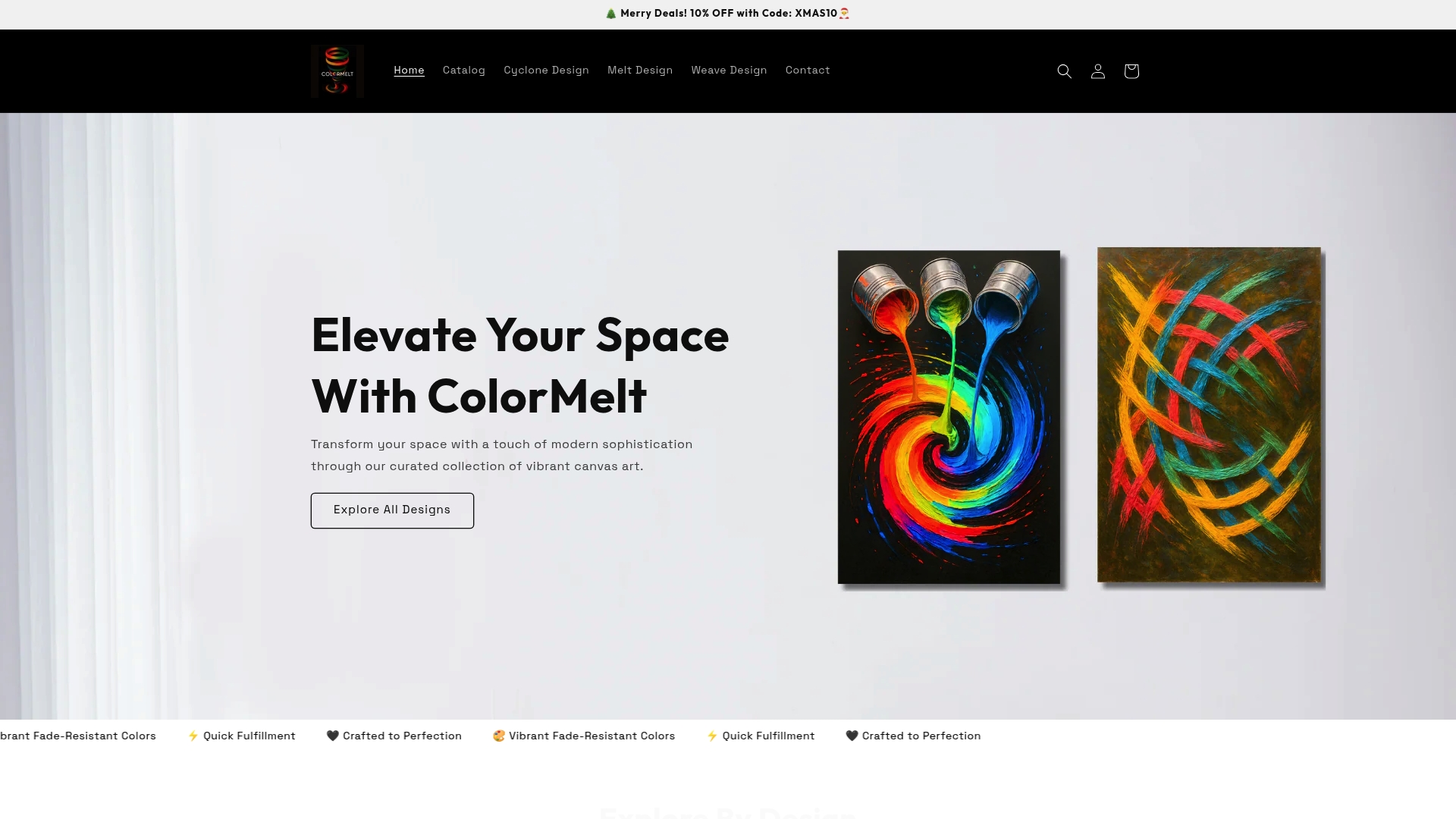
Now that you know how to choose art for your space, the next step is finding pieces that actually apply these principles. Colormelt’s wall art collection is built around the same ideas covered in this guide: balanced scale, vibrant color relationships, and designs that hold your attention over time. The range includes canvas prints, acrylic prints, wood prints, and framed artwork in abstract, weave, cyclone, and floral motifs, all with fade-resistant colors and quick fulfillment. Whether you are furnishing a rental with renter-friendly options or investing in a long-term statement piece for your home, Colormelt offers designs sized and styled to work with the rules you now know how to use.
FAQ
What is the correct height to hang wall art?
The center of artwork should sit at 57 to 60 inches (145 to 152 cm) from the floor, which corresponds to average adult eye level. This rule applies in every room regardless of ceiling height.
How big should wall art be relative to furniture?
Art should cover 60 to 75% of the furniture width beneath it. For a standard sofa around 220 cm wide, that means choosing a piece between 110 and 155 cm wide.
How do I choose art colors that work with my room?
Pull accent colors from your existing furnishings rather than matching them exactly. Using complementary or analogous hues from the color wheel creates harmonious contrast without making the art disappear into the room.
Can renters hang wall art without damaging walls?
Yes. Picture ledges, removable adhesive strips rated for the art’s weight, and leaning large pieces against the wall on a console are all renter-friendly options that avoid permanent wall damage.
How much extra should I budget beyond the art price?
Budget an additional 15 to 30% beyond the listed price to cover framing, shipping, and sales tax. Call local frame shops with your art dimensions before purchasing to get an accurate total cost.