
Vibrant artwork ideas: transform your home with color
Picking artwork for your home sounds simple until you’re standing in front of a blank wall, wondering whether that bold canvas will energize the room or clash with everything you love. The challenge isn’t finding art. It’s finding the right art: pieces with enough color intensity and personal resonance to genuinely lift a space rather than just fill it. This article walks you through clear selection criteria, iconic inspirations, modern examples, and a side-by-side comparison so you can confidently choose vibrant artwork that reflects who you are and transforms your home into something worth showing off.
Table of Contents
- How to choose vibrant artwork for your home
- Iconic vibrant artwork: Classic inspirations for home decor
- Modern vibrant artwork: Contemporary styles and practical displays
- Comparison: Classic vs. modern vibrant artwork for home decor
- Why vibrant artwork matters more than style: A decorator’s insight
- Discover vibrant artwork for your home
- Frequently asked questions
Key Takeaways
| Point | Details |
|---|---|
| Selection criteria matter | Vibrant artwork should use bold colors, strong contrast, and resonate emotionally to enhance any space. |
| Classic and modern styles inspire | Both historical masterpieces and contemporary pieces offer vibrant color and impact for home decor. |
| Comparison aids decision | Side-by-side comparisons help determine which artwork style best matches your personal taste and interiors. |
| Emotional effects count | Choosing artwork that sparks joy and personality goes beyond mere visual appeal in home decoration. |
How to choose vibrant artwork for your home
Vibrant artwork isn’t just colorful. True vibrancy comes from the combination of color intensity, contrast, and emotional charge. A painting dominated by a single flat hue can look dull, while a piece that pairs warm oranges against deep navy blues creates tension and movement that pulls the eye across the canvas. That visual push and pull is what making wall art come alive actually looks like in practice.
When selecting artwork, think in threes. The rule of threes is a simple design principle: group three colors, three pieces, or three elements together for visual balance. A living room wall with three coordinated prints that share a vibrant color thread reads more curated than a single oversized piece or a random cluster. The grouping also lets you introduce contrast within the set, for example pairing a bold abstract with a delicate floral and a geometric pattern so the eye stays engaged.
Bold artwork works especially well as a focal piece. Gallery wall inspiration from House Beautiful shows how using a non-neutral, eye-grabbing piece anchors an entire room’s color story. The key is giving that focal piece room to breathe, which means keeping nearby furniture and accessories quieter in color so the art does the talking.
Scale and placement matter just as much as the artwork itself. A small print on a large wall will disappear. A massive canvas in a narrow hallway can feel suffocating. A reliable guideline: the artwork should cover roughly two-thirds of the wall width it occupies. And always hang art at eye level, which for most rooms means the center of the piece sits around 57 to 60 inches from the floor.
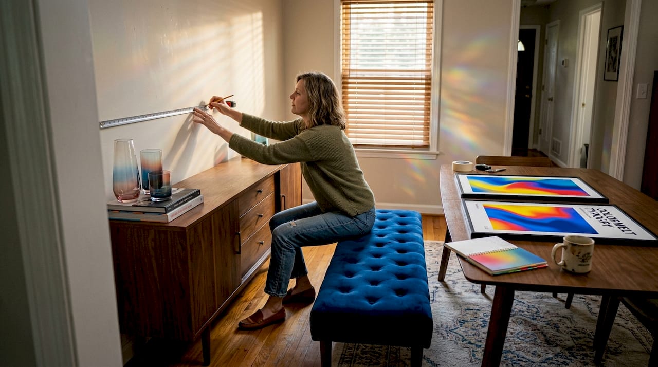
Consider how styling colorful wall decor interacts with lighting. Natural light brings out warm undertones; cool overhead lighting shifts the palette. Before committing, hold a print against the wall at different times of day to see how the colors shift.
Key criteria to evaluate before buying:
- Color intensity: Does the palette feel rich and saturated, or washed out?
- Contrast: Are there light-to-dark shifts that create depth and movement?
- Emotional resonance: Does the piece make you feel something specific, energy, calm, joy, nostalgia?
- Scale: Is the size proportional to your wall and furniture arrangement?
- Material: Canvas, acrylic, and wood each handle light differently and affect perceived vibrancy.
Pro Tip: Layer different types of vibrant art for unique character. Try mixing an acrylic print with a canvas piece nearby. The difference in surface texture catches light at different angles, creating a gallery feel that a single medium can’t match. You can explore ideas for personalizing your space with art to build a collection that truly feels like yours.
Now that you know what makes artwork vibrant, let’s explore standout examples that energize spaces.
Iconic vibrant artwork: Classic inspirations for home decor
Some of the most instructive examples of vibrant art aren’t in galleries you can visit every day. They’re in art history, and their influence on modern home decor is very much alive.
Vincent van Gogh is the gold standard of expressive color. His heightened colors and loaded brushwork in Landscape with Ploughman demonstrate how color doesn’t simply describe a scene but amplifies its emotional intensity. The swirling texture of paint creates a sense of movement that a flat photograph never could. When you see a modern abstract canvas that uses thick impasto-style texture, this is the lineage it draws from.
Claude Monet approached vibrancy differently. His decorative patterning and color contrast in Water-lilies create vibrancy through the relationship between colors rather than through sheer boldness. The yellow lilies pop against the cool, reflective greens and blues of the water, making the eye dance across the surface. This technique, using complementary colors to energize a composition, is exactly what modern floral wall art for vibrancy draws on when it places warm blooms against cool backgrounds.
What do these classics teach us about decorating?
- Expressive brushwork adds tactile energy to a room even when viewed from across the space.
- Complementary color pairing creates vibrancy without overwhelming the senses.
- Pattern and rhythm in a composition keep the eye moving, making a room feel more alive.
- Emotional intention in artwork translates directly to mood in the space it occupies.
“Color is my day-long obsession, joy, and torment.” — Claude Monet
That quote captures something important for decorators. The best vibrant artwork isn’t chosen randomly. It’s chosen because the maker cared deeply about how each color choice would land emotionally. When you bring that kind of piece into your home, the energy it carries doesn’t disappear. It becomes part of the room’s character.
Modern art for living rooms often references these classical techniques while adapting them to contemporary aesthetics, making it easier than ever to access that same emotional power without hunting for museum-quality originals.
Inspired by time-tested masterpieces, it’s equally important to recognize vibrant artwork created specifically for modern interiors.
Modern vibrant artwork: Contemporary styles and practical displays
Today’s vibrant artwork scene is rich with options that range from sweeping abstract compositions to precise geometric patterns and layered floral designs. The current trends break down into three dominant visual directions.
Abstract art uses color fields, organic shapes, and expressive mark-making to create emotional impact without requiring representational imagery. It’s the most flexible category for interior design because it plays well with almost any existing furniture style. Floral art bridges the classic and the contemporary, taking the complementary color logic of Monet and applying it to bold, oversized bloom compositions that energize kitchens, bedrooms, and living rooms equally. Geometric art uses clean lines and precise color blocking to deliver vibrancy with a structured, modern edge, ideal for offices and minimalist living spaces.
Material choices significantly affect how vibrant a piece looks on your wall:
- Canvas prints: Warm, slightly textured surface that softens color slightly. Great for bedrooms and living rooms where you want energy without harshness.
- Acrylic prints: Colors appear intensely saturated, almost luminous, because light passes through the acrylic layer before reflecting back. Ideal for statement walls.
- Wood prints: Natural grain interacts with printed color, creating organic warmth. Best for earthy or bohemian decors.
- Framed artwork: Adds a finishing weight and formality that suits traditional or transitional interiors.
| Style | Best material | Room suitability | Mood effect |
|---|---|---|---|
| Abstract | Acrylic, canvas | Living room, studio | Energizing, expressive |
| Floral | Canvas, framed | Bedroom, dining room | Warm, inviting |
| Geometric | Acrylic, wood | Office, entryway | Focused, modern |
| Cyclone/swirl | Acrylic | Living room, hallway | Dynamic, dramatic |
When selecting artwork for an existing color scheme, pull from the palette already in the room rather than fighting it. If your sofa is a warm terracotta, look for artwork that includes orange, gold, or rust tones alongside a contrast color, like teal or deep plum, to create the complementary tension that makes vibrant work so effective.
Pro Tip: Mix modern prints with classic techniques for depth. A contemporary abstract acrylic print hung beside a traditionally framed floral canvas creates an unexpected dialogue between old and new that makes your collection feel curated rather than coordinated. Check out the vibrant weave acrylic art triptych as an example of how modern craftsmanship delivers this kind of multi-piece visual energy. For more ideas, browse decor tips for modern art to see how layering styles works in real rooms.
To further refine your choices, compare classic and modern vibrant artworks side by side to see which suits your home best.
Comparison: Classic vs. modern vibrant artwork for home decor
Choosing between classic-inspired and contemporary vibrant artwork often comes down to three factors: your existing decor style, the mood you want to create, and how much visual complexity the space can hold.
| Feature | Classic-inspired art | Modern vibrant art |
|---|---|---|
| Visual quality | Expressive, textured, painterly | Crisp, saturated, graphic |
| Color approach | Tonal depth and brushwork | Bold contrast and flat fields |
| Room suitability | Formal dining rooms, traditional living rooms | Open-plan spaces, modern studios |
| Material options | Framed prints, canvas reproductions | Acrylic, canvas, wood, mixed media |
| Mood effect | Warmth, nostalgia, depth | Energy, freshness, boldness |
| Maintenance | Standard dusting, avoid humidity | Easy-clean, fade-resistant |
Both Van Gogh’s expressive color approach and Monet’s decorative color contrast remain genuine inspirations for modern art buyers. The difference is in how much structure you want.
Here’s a simple framework to make your decision:
- Identify your dominant room style. Traditional furnishings pair naturally with classic-inspired art. Modern or Scandinavian interiors tend to favor geometric and abstract vibrant pieces.
- Choose your mood target. Warm and nostalgic? Go classic. Bold and energizing? Go modern.
- Pick your focal wall. The largest unbroken wall in a room is the natural home for your statement piece.
- Select a piece that includes at least one color already present in the room. This connects the artwork to its environment without making it feel random.
- Decide on a single material first. Once you commit to canvas or acrylic, the rest of your selection criteria narrows considerably and shopping becomes much easier.
For a modern living room statement, a vibrant weave acrylic wall art piece delivers sharp color and an intriguing geometric pattern. For a more dynamic, multi-panel look, a triptych acrylic for living rooms in a cyclone design creates a sweeping visual effect that classic art simply can’t replicate.
Having seen the options and comparisons, let’s share a unique perspective on what truly matters when choosing vibrant artwork for your space.
Why vibrant artwork matters more than style: A decorator’s insight
Most people approach artwork shopping as a style decision. They ask: does this match my sofa? Does it go with my rug? That’s the wrong question, and it leads to walls full of safe, forgettable pieces that blend into the background within a week.
The real question is: does this artwork make me feel something when I walk into the room? Vibrant art has a physiological effect. Color has a direct impact on mood and cognitive state. Warm reds and oranges raise energy levels. Blues and greens calm the nervous system. Strong contrast sharpens focus. These are not abstract design ideas; they are real responses that happen whether or not you’re consciously aware of them.
The most satisfying collections we see people build are the ones driven by genuine emotional response first, style matching second. Someone who buys a wildly saturated cyclone print because it makes them feel alive every morning will never regret that choice, even if the colors don’t perfectly match their throw pillows. Someone who buys a safe neutral print because it “goes with everything” will stop seeing it within a month.
Long-term satisfaction with vibrant artwork also comes from craftsmanship. A piece printed on high-quality acrylic with fade-resistant inks will look as striking in five years as it does on day one. A cheaply produced print fades, and when it does, it doesn’t just lose color. It loses the emotional charge that made you choose it. That’s why material quality isn’t a luxury consideration; it’s the baseline for any piece you expect to live with for years.
Our perspective: choose what energizes you, invest in quality, and trust that art that energizes your home will never feel like a decoration. It’ll feel like part of the room’s personality.
Discover vibrant artwork for your home
The criteria, comparisons, and classic inspirations in this article all point toward one practical next step: finding pieces that actually deliver that vibrant energy in your space.
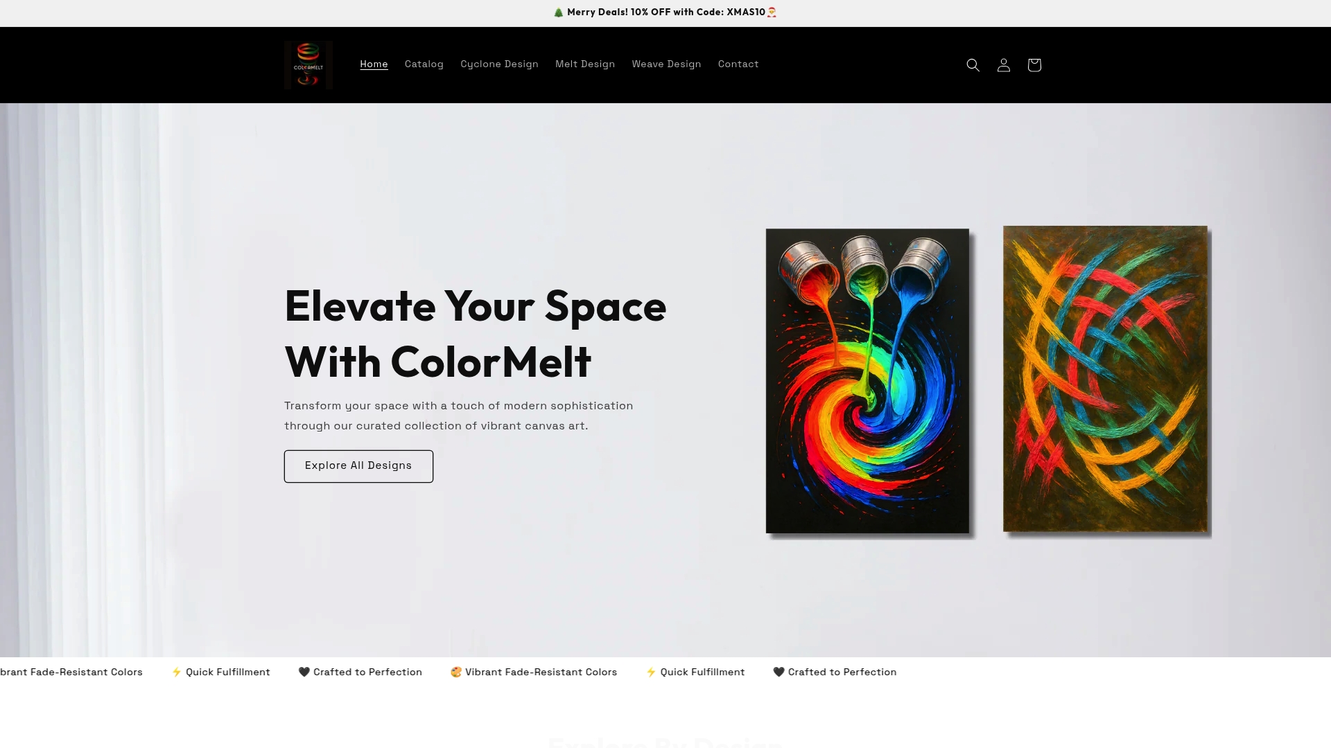
At ColorMelt.shop, every piece in the ColorMelt wall art collection is designed around exactly the principles covered here: bold contrast, expressive color, and craftsmanship built to last. Whether you’re drawn to the organic geometry of the creative weave wall hanging or the sweeping drama of the abstract cyclone canvas print, you’ll find pieces that bring the same emotional charge as the masterworks that inspired them, at a scale and price point built for real homes. Explore the collection and let the colors do the work.
Frequently asked questions
What defines vibrant artwork in home decor?
Vibrant artwork is defined by bold colors, strong contrast, and expressive brushwork or patterning that create visual energy and focal points in a room. Think of the loaded brushwork and heightened color in Van Gogh’s work as the benchmark for how expressive color creates that sense of energy.
How can vibrant artwork change the feel of a room?
Vibrant artwork energizes a room, anchors its mood, and creates an immediate conversational centerpiece that reflects the personalities living there. As House Beautiful’s gallery wall guidance demonstrates, using a bold, non-neutral piece as your focal artwork completely reshapes how a room feels.
Should I match vibrant artwork to my existing decor or use it as a statement piece?
Both approaches work well: matching a piece to your palette creates visual harmony, while a contrasting statement piece makes the artwork the undisputed focal point and sparks genuine visual interest. The choice depends on whether you want the room to feel unified or want the art to lead the space.
Are classic artworks like Monet or Van Gogh suitable for modern decor?
Absolutely. The expressive color and decorative contrast found in both artists’ work aligns naturally with modern design principles, especially in spaces that mix traditional warmth with contemporary clean lines. Their palettes feel timeless precisely because they’re built on color relationships that never go out of style.