
Best Colors for Wall Art to Transform Your Home
The best colors for wall art are those that balance your room’s natural light, existing décor, and the mood you want to create. Color choice is not just aesthetic preference. It directly shapes how a space feels, how large it reads, and how cohesive your interior looks. Earthy tones like terracotta, olive green, and sage rank as top recommended palettes for 2026 interiors, pairing exceptionally well with wood furniture and soft lighting. The right wall art color scheme does not compete with your room. It completes it. Whether you are drawn to calming neutrals or dramatic moody hues, this guide covers the top color choices, how lighting affects your decision, and how to avoid the most common pitfalls.
1. Terracotta and warm brown
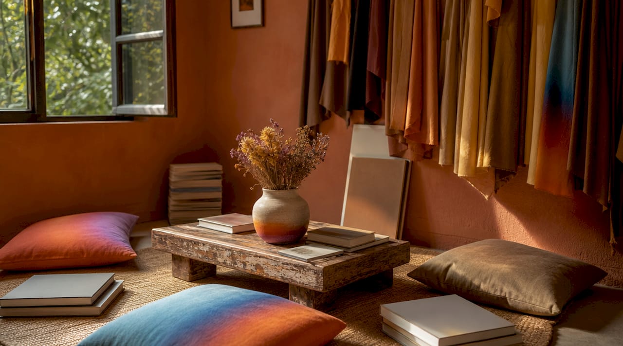
Terracotta is the most versatile earthy tone in residential design right now. It reads warm without being aggressive, and it works across minimalist, bohemian, and Mediterranean-inspired interiors. Paired with warm brown tones in the same piece, it creates depth that feels grounded and inviting. This combination works especially well in living rooms with wood floors or rattan furniture, where the art echoes the natural materials already in the space.
2. Sage green and olive
Sage green has moved well beyond a passing trend. It sits in the middle ground between warm and cool, which makes it one of the most forgiving colors in any art palette. Olive green adds richness and pairs naturally with linen, leather, and raw wood. Together, these tones create a quiet, organic feel that suits bedrooms, reading nooks, and home offices where calm focus matters.
3. Navy and deep charcoal
Navy and charcoal are the go-to choices when you want wall art to anchor a room rather than blend into it. Deeply pigmented tones like navy and forest green are trending for 2026 for exactly this reason. They offer a dramatic, restorative quality that lighter palettes simply cannot match. Use these in spaces with high ceilings or strong architectural features, where the depth of color adds presence rather than weight.
4. Warm cream and soft mushroom
Warm whites and creamy neutrals create a lived-in, cozy feel that works as both a backdrop and a focal point in wall art. Soft mushroom tones, which sit between beige and gray, complement nearly every furniture style from mid-century modern to farmhouse. These colors are particularly effective in open-plan spaces where the art needs to feel cohesive across multiple zones without dominating any single area.
Pro Tip: Creamy neutrals in art look richer when placed against a slightly deeper wall tone. Try a warm greige wall behind cream-toned art to make both elements pop without visual conflict.
5. Mustard yellow and burnt orange
Mustard yellow and burnt orange function as accent colors in wall art, meaning they work best when used as the dominant hue in one or two pieces rather than across an entire gallery wall. These colors stimulate energy and activity, making them well-suited for creative studios, kitchens, and dining rooms. A single large canvas in burnt orange against a neutral wall creates a focal point that reads intentional rather than chaotic.
6. Calming blue and soft teal
Blue is the most studied color in interior design for its effect on mood, and the research is consistent. Calming blues in bedrooms promote rest, while softer teals in living spaces add a refreshing, airy quality. Analogous palettes like blue-green blends create smooth visual transitions and soothing atmospheres, which is why they perform so well in spaces designed for relaxation. Pair these tones with white or light gray walls for maximum effect.
7. Forest green and burgundy
Forest green and burgundy represent the moody contrast palette that interior designers have been reaching for in 2026. These colors add drama without the coldness of black or the harshness of bright red. They work best in dining rooms, libraries, and bedrooms where you want the space to feel rich and enveloping. Keep surrounding décor in neutral tones so the art carries the color story without competition.
8. Greige and muted taupe
Greige (a blend of gray and beige) and muted taupe are the workhorses of popular wall art colors. They do not demand attention, but they make every other element in a room look more considered. These tones are ideal for transitional spaces like hallways and entryways, where art needs to set a tone without overwhelming a viewer who is simply passing through. They also age well, meaning you will not tire of them after a single season.
How lighting affects your wall art color choices
Lighting direction is the single most overlooked factor when choosing colors for wall art. North-facing rooms receive cool, indirect light that can make blue, gray, or white art look stark and cold. In these rooms, warmer tones like terracotta, mustard, and warm cream compensate for the light’s coolness and keep the space feeling inviting. South-facing rooms have the opposite problem. Warm light intensifies already-warm tones, so cooler art colors like sage, teal, or soft blue provide balance.
Artificial lighting adds another layer of complexity. Incandescent bulbs push warm tones further toward orange, while LED daylight bulbs can make cool colors feel clinical. The practical solution is to test art in actual room light at the time of day you use the room most. A piece that looks perfect in afternoon sun may read completely differently under evening lamp light.
Pro Tip: In well-lit rooms with large windows or strong overhead lighting, choose art with a matte finish. Matte finishes soften colors and reduce glare, making them far safer than glossy prints that can appear overly intense or cheap under bright artificial light.
Room function also shapes the right color choice. Bedrooms benefit from blues, greens, and soft neutrals that support rest. Home offices perform better with sage or warm neutrals that reduce visual fatigue. Living rooms can handle the full spectrum, from calming analogous palettes to bold moody contrasts, depending on how you use the space.
Comparing wall art color schemes: earthy neutrals, analogous, and moody contrasts
Not every color scheme suits every home style. Understanding the strengths of each approach helps you make a deliberate choice rather than a reactive one.
| Color scheme | Feel | Best rooms | Furniture match | Lighting compatibility |
|---|---|---|---|---|
| Earthy neutrals | Warm, grounded, cozy | Living room, bedroom | Wood, rattan, linen | Works in all light directions |
| Analogous palettes | Soothing, unified, airy | Bedroom, office, bathroom | Light wood, upholstered pieces | Best in north and east-facing rooms |
| Moody contrasts | Dramatic, rich, enveloping | Dining room, library | Dark wood, velvet, leather | Best in south-facing or well-lit rooms |
| Warm accents | Energizing, bold, focal | Kitchen, studio, dining | Mixed materials, metal accents | Works well under warm artificial light |
Earthy neutrals offer the broadest versatility. They pair with almost any furniture style and hold up across changing décor trends. Analogous color schemes create harmony by keeping hues close together on the color wheel, which suits minimalist and Scandinavian interiors. Moody contrast palettes demand more commitment but deliver the most memorable spaces when executed well. For eclectic or maximalist homes, mixing a moody anchor piece with earthy accent art creates a layered look that feels curated rather than cluttered. You can find more ideas on styling colorful wall decor to see how these schemes translate in real interiors.
Practical tips for coordinating wall art colors with your interior
Getting the color right in isolation is only half the job. The other half is making sure the art works with everything else in the room.
Wall art should never match your wall color exactly. Instead, pull one minor accent shade from the art and echo it in the wall tone or a nearby textile. This creates a visual connection between the art and the room without making the piece disappear into the background.
Frame consistency matters more than most people realize. Identical frame styles across diverse art pieces enforce cohesion and prevent visual noise, even when the color palettes within each piece vary significantly. A gallery wall of five different art styles reads as intentional when every frame is the same black or natural wood finish.
Large format art amplifies color impact, so scale back saturation as size increases. A 60-inch canvas in deep burgundy will dominate a room in a way that a 20-inch print in the same color never would. For oversized pieces, choose muted or mid-tone versions of your preferred color rather than the most saturated option.
Pro Tip: Limit strong accent colors to one or two pieces per room. When every wall competes for attention, none of them win. Anchor the room with one bold piece and let the rest of the art support it in quieter tones.
For more ideas on balancing color and texture without overwhelming your space, the guide on decorating with vibrant artwork covers practical approaches that work across home styles.
Key takeaways
The best colors for wall art work because they respond to your room’s light direction, scale, and existing palette rather than existing independently of them.
| Point | Details |
|---|---|
| Light direction determines color choice | North-facing rooms need warmer art tones; south-facing rooms benefit from cooler hues for balance. |
| Earthy tones lead 2026 trends | Terracotta, sage, olive, and warm brown pair well with wood furniture and soft lighting. |
| Never match wall and art color exactly | Use the wall hue as a minor accent within the art to create cohesion without losing contrast. |
| Frame consistency unifies diverse art | Matching frame styles across a collection prevent visual noise regardless of color variation. |
| Matte finishes outperform glossy in most rooms | Matte absorbs light and softens colors, making art look higher quality under bright or artificial lighting. |
What I have learned from choosing art colors in real rooms
The single biggest mistake I see homeowners make is choosing wall art in a store or on a screen and assuming it will look the same at home. It almost never does. Lighting transforms color in ways that are genuinely hard to predict without testing. I have watched a warm terracotta canvas look muddy under cool LED lighting and the same piece come alive under a warm-toned floor lamp. The fix is simple: order a sample or print a test image before committing to a large piece.
The second mistake is treating color as decoration rather than function. Calming blues in a bedroom are not just pretty. They actively support the room’s purpose. Energizing mustard in a home office is not just bold. It keeps you alert. When you start choosing art colors based on what you want the room to do rather than just how you want it to look, the decisions become much clearer.
I am also skeptical of the idea that you need to start from scratch to get a cohesive look. Most rooms already contain a color story in the furniture, textiles, and flooring. The art’s job is to pick up that story and extend it, not replace it. Pull one tone from your sofa fabric or rug and find art that features it prominently. That single connection is often enough to make a room feel designed rather than assembled.
The investment in a curated, cohesive collection always outperforms buying individual pieces that each fight for dominance. One strong anchor piece in a moody forest green, supported by two quieter prints in sage and cream, will always look more intentional than five unrelated canvases in five unrelated palettes. Restraint is the most underrated skill in home design.
— Shlomo
Explore Colormelt’s curated wall art collections
Colormelt designs wall art specifically for the color schemes that work hardest in real homes, from earthy terracotta and sage to dramatic navy and forest green. Every piece is printed with fade-resistant inks on quality substrates, so the colors you see online are the colors that arrive on your wall.
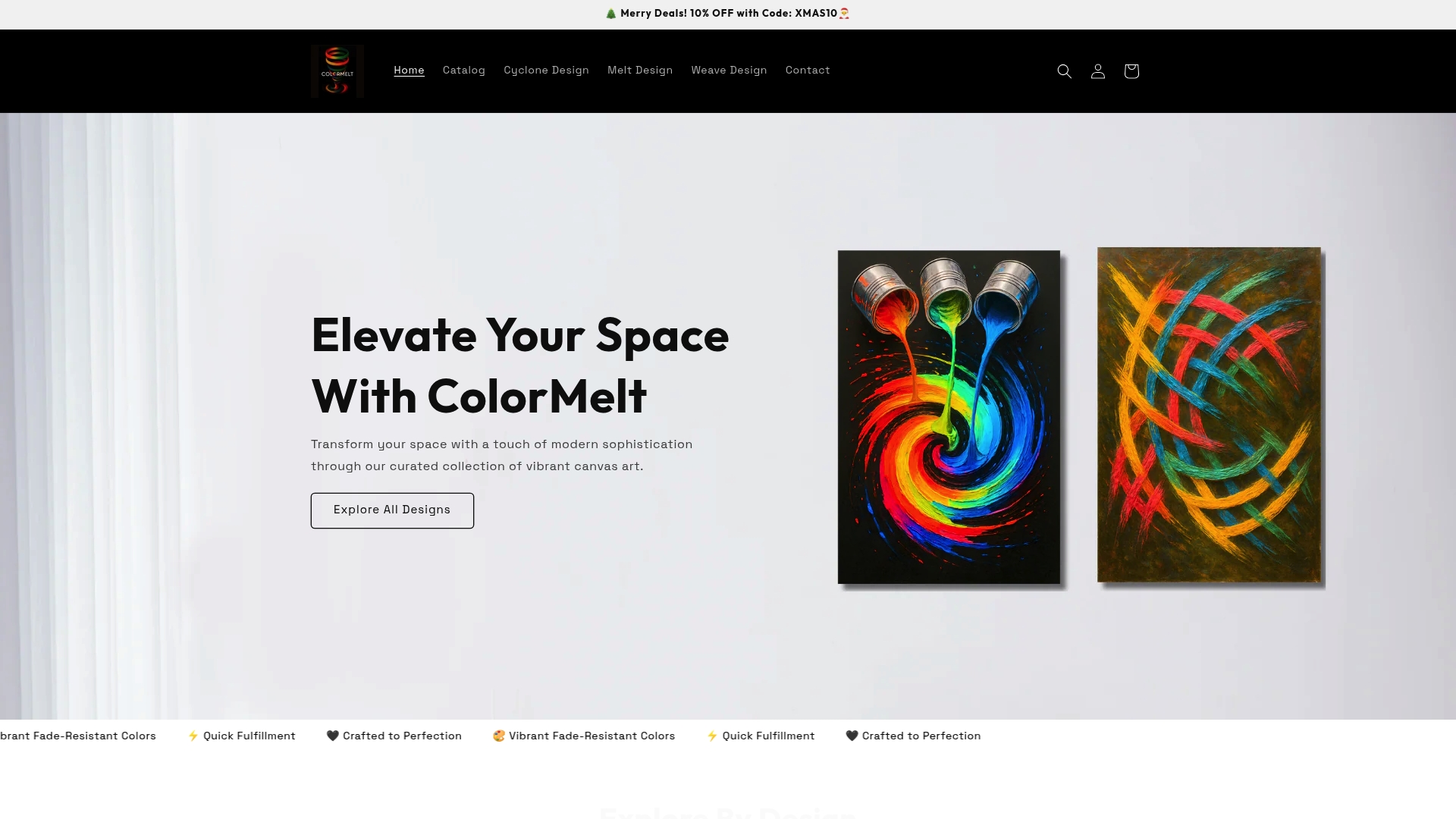
Whether you are building a gallery wall around a moody contrast palette or looking for a single statement piece in a warm accent tone, the Colormelt wall art collection covers the full spectrum. The weave design canvas is a strong choice for anyone who wants texture and color working together in one piece. Browse the full collection and find art that fits your room, your light, and your color story.
FAQ
What are the best colors for wall art in a living room?
Earthy tones like terracotta, sage green, and warm brown are the top choices for living rooms in 2026, pairing well with wood furniture and soft lighting. Moody contrasts like navy or forest green also work well in larger living spaces with strong architectural features.
How do I choose wall art colors that match my walls?
Wall art should never match your wall color exactly. Instead, choose art that contains your wall hue as a minor accent, which creates visual cohesion without making the piece disappear into the background.
Does lighting affect how wall art colors look?
Yes, significantly. North-facing rooms make cool-toned art look stark, so warmer art colors work better there. South-facing rooms intensify warm tones, so cooler art colors provide balance. Always test art in the room’s actual light before committing.
What finish is best for wall art: matte or glossy?
Matte finishes are the safer choice for most interiors because they soften colors and reduce glare, especially in well-lit rooms. Glossy finishes increase saturation and reflectivity, which can look overly intense under bright artificial lighting.
How many strong colors should I use in one room’s wall art?
Limit strong accent colors to one or two pieces per room. Using consistent frame styles across diverse pieces prevents visual noise and keeps the overall look cohesive, even when individual art palettes vary.