
How to decorate with vibrant artwork for a stunning home
Blank walls and generic prints have a way of making even the most beautifully furnished room feel like a waiting room. If your space feels flat, predictable, or just a little lifeless, the fix is often not a new sofa or a fresh coat of paint. It’s art. Specifically, bold, vibrant artwork that stops people in their tracks and communicates who you are before you even say a word. Bold artwork creates a focal point and channels a kind of energy that neutral décor simply cannot replicate. This guide will walk you through everything you need, step by step, to hang vibrant art with confidence and intention.
Table of Contents
- Why vibrant artwork is essential in modern homes
- What you need: Materials and preparation
- Step-by-step: Arranging vibrant artwork for best impact
- Troubleshooting: Common mistakes to avoid
- How to personalize your space with bold art
- Why truly vibrant artwork demands restraint: The expert paradox
- Take your space further with ColorMelt’s vibrant wall art
- Frequently asked questions
Key Takeaways
| Point | Details |
|---|---|
| Artwork shapes mood | Vibrant art brings energy and character, turning any space into a lively focal point. |
| Start with balance | Neutral décor and thoughtful placement let bold artwork shine without overpowering a room. |
| Practical steps matter | Careful planning, measuring, and lighting are essential for displaying vibrant art effectively. |
| Personalize intentionally | Choose pieces that reflect your story or passions to create a home that truly feels like yours. |
Why vibrant artwork is essential in modern homes
Color is not just visual. It’s physiological. Warm reds and oranges raise heart rate and stimulate conversation, which is why they work so well in dining areas. Cool blues and greens lower stress, making them perfect for bedrooms and reading corners. Vibrant artwork brings these effects into your home intentionally, giving each room a distinct emotional signature.
Modern interior design has moved away from the “safe” beige-and-grey formula. Homeowners now want spaces that feel alive, personal, and worth photographing. That shift is exactly why art transforms decor from background noise into the dominant language of a room.
Here’s what vibrant art specifically does for a modern interior:
- Creates a defined focal point that anchors furniture arrangements and draws the eye on entry
- Boosts mood and perceived energy in spaces that might otherwise feel dim or static
- Acts as a conversation starter, communicating your taste, travels, and personality
- Fills vertical space effectively, making rooms feel taller and more dynamic
- Ties color stories together by pulling shades from artwork into pillows, rugs, and accents
The most important thing to remember: bold artwork and high energy go hand in hand with restrained, neutral surroundings. The art wins when it doesn’t have to compete. Think of vibrant pieces as the lead singer. Everything else in the room is the backup band.
Once you’ve seen how impactful color can be, the next step is understanding what you’ll need to bring this vision to life.
What you need: Materials and preparation
Decorating with vibrant artwork isn’t just about buying a print and hammering a nail. Getting it right requires thinking through materials, tools, and wall conditions ahead of time.
Artwork types and surfaces
| Art Type | Best For | Key Benefit |
|---|---|---|
| Canvas print | Living rooms, bedrooms | Lightweight, warm texture |
| Acrylic print | Modern, minimalist spaces | High gloss, vivid color depth |
| Wood print | Rustic or eclectic rooms | Warm, organic feel |
| Framed art | Traditional or classic spaces | Polished, gallery-ready finish |
| Metal print | Industrial or contemporary rooms | Sleek, ultra-durable surface |
When choosing quality wall art, always check for fade-resistant inks, especially if your wall receives direct sunlight. A print that fades in two years is not a design choice. It’s a waste.
Tools and preparation checklist
Before hanging anything, gather the following:
- Measuring tape and pencil
- A level (laser levels are excellent for gallery walls)
- Wall anchors and appropriate nails or screws for your wall type
- Painter’s tape (for mocking up layouts on the wall before committing)
- A hammer or drill, depending on wall material
Wall and lighting analysis
Walk into the room and ask yourself three things. First, where does the natural light enter, and what time of day is the space most used? Second, which wall is the first one visible when you enter? Third, how large is the dominant piece of furniture that the art will sit above?
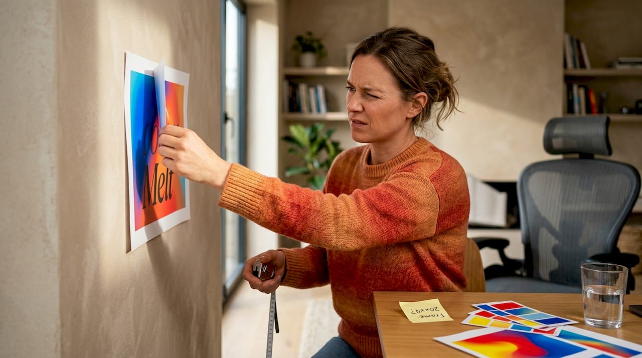
Pro Tip: Cut paper to the exact dimensions of your intended artwork and tape it to the wall before hanging. This mock-up step saves countless unnecessary holes and helps you visualize scale in real space.
Bold art paired with neutrality is the formula that professional designers return to again and again. That means assessing what colors currently exist in your room before selecting a piece. A room full of warm terracotta tones pairs beautifully with abstract art in burnt orange, cobalt, or forest green.
With your essentials gathered, you can begin selecting and arranging art for maximum effect.
Step-by-step: Arranging vibrant artwork for best impact
Good placement turns a beautiful piece into an experience. Poor placement turns it into wallpaper. Follow these steps to get it right.

1. Decide on a single statement piece or a gallery wall A single oversized piece works best in smaller rooms or when you want to create immediate impact. A gallery wall suits larger empty walls, stairwells, or spaces where you want to showcase multiple pieces with a cohesive color story.
2. Identify your primary wall The wall you see first when you enter the room is the best candidate for your focal artwork. This is typically the wall directly opposite the main entrance, or the one behind a sofa or bed.
3. Determine hanging height The center of your artwork should sit at roughly 57 to 60 inches from the floor. This is the standard museum and gallery hanging height because it aligns with the average human eye level. When hanging above furniture, keep 6 to 12 inches of space between the top of the piece and the bottom of the artwork.
4. Map out proportions Art should span at least two-thirds the width of the furniture beneath it. A tiny print above a wide sofa looks like a postage stamp. A large canvas above a narrow console table will feel top-heavy. Balance matters.
5. Hang and adjust Use your level constantly. Even a one-degree tilt is immediately noticeable to the human eye. Step back after each adjustment and view the piece from across the room, not just up close.
Comparing approaches for room size
| Room Type | Recommended Approach | Key Consideration |
|---|---|---|
| Small room (under 120 sq ft) | Single large statement piece | Avoid multiple pieces competing for attention |
| Medium room (120 to 250 sq ft) | One anchor piece plus 1 to 2 smaller accents | Keep accent colors pulled from the main piece |
| Large room (250+ sq ft) | Gallery wall or oversized triptych | Use consistent framing or color palette for cohesion |
These modern art decor tips also apply when layering artwork with shelves or architectural features like fireplaces.
Pro Tip: For gallery walls, lay all pieces on the floor first and photograph the arrangement. This gives you a bird’s-eye view of how the shapes, colors, and sizes relate before you commit to the wall.
Learning canvas print styling tips for specific print types also helps you decide which wall finishes and frame colors will support rather than fight your vibrant focal piece. Bold art and high energy always read more powerfully when placement is deliberate and proportional.
Once you’ve mastered basic placement, it’s time to address common mistakes that hold back even the boldest designs.
Troubleshooting: Common mistakes to avoid
Even great artwork can fall flat when surrounding decisions undermine it. Here are the biggest errors and how to correct them.
Crowding art with other bold items When a vibrant piece of art competes with a bold patterned rug, brightly colored throw pillows, and a statement light fixture, the room reads as chaotic rather than curated. Pull back. Choose one bold element per visual zone and let the others support it quietly.
Ignoring lighting Lighting is where most people leave the most value on the table. A stunning print hung in shadow will look muddy and uninspiring. Adjustable track lighting or picture lights placed 12 to 18 inches above the center of the piece will transform the color intensity and make the art come alive at any hour.
Hanging art too high This is the single most common mistake in home decorating. Art hung near the ceiling feels disconnected from the room and the people in it. Stick to the 57 to 60-inch center rule, even if it feels low at first. After a few days, you’ll wonder why it ever seemed wrong.
Mismatching style and room function Understanding what makes wall art energizing also means respecting the room’s purpose. A hyper-stimulating abstract with sharp reds might not serve a bedroom intended for rest. Save the highest-energy pieces for living rooms, home offices, or entryways where stimulation is welcome.
“Bold artwork creates a focal point and high energy, so surrounding décor often benefits from calmer neutrality to let the art read clearly.” This principle isn’t a restriction. It’s a strategic design decision that separates designed spaces from decorated ones.
Ignoring scale and proportion Art that is too small for a wall makes the wall look bigger and emptier. Art that is too large for a space feels aggressive and overwhelming. If in doubt, go slightly larger than feels comfortable. Bold art rewards confidence.
After avoiding these pitfalls, you’ll notice your space feels more cohesive and energizing.
How to personalize your space with bold art
Choosing art that genuinely reflects your life is what separates a styled room from a personal room. Anyone can buy a trending print. Fewer people take the time to connect their art choices to their actual story.
Here’s how to personalize your home with art in a way that feels authentic:
- Connect to memory and meaning. Choose colors or motifs that tie to places you’ve traveled, seasons that move you, or experiences that shaped you. A vibrant coastal abstract can keep the feeling of a beach vacation alive year-round.
- Mix sizes for a dynamic arrangement. One large piece flanked by two smaller works creates visual rhythm. A row of identical small pieces creates a different kind of order. Either approach works if it’s intentional.
- Rotate pieces seasonally. Displaying different works in spring versus winter prevents visual fatigue. It also gives your secondary pieces regular time in the spotlight rather than storage.
- Use abstract or floral wall art when you want color without a literal subject. Abstract pieces work in virtually any room and don’t date the way some representational art styles can.
- Pull from your existing palette. Look at the colors already in your wardrobe, your favorite ceramics, and your outdoor plants. Those are the colors that genuinely appeal to you, and artwork featuring them will always feel right.
Bold art reinforcing personal taste is most powerful when the rest of the room steps back and lets the art speak. That takes editing. Curation. The willingness to remove things you like in order to let the things you love stand out.
Now that you’ve learned all the functional steps, let’s reframe the big picture and share our deeper perspective on this process.
Why truly vibrant artwork demands restraint: The expert paradox
Here’s the truth most decorating guides won’t tell you: the more vibrant and bold your artwork, the less you should do everywhere else. Most people do the opposite. They choose exciting art and then try to match that energy across every surface in the room. The result looks busy, not bold.
The spaces that genuinely stop you in their tracks, the ones that feel sophisticated rather than loud, all share one quality. The art breathes. There’s open wall space. The furniture is quiet. The textiles are mostly neutral. The art gets to be the entire personality of the room because nothing else is competing for attention.
This is a strategic design decision that most people only arrive at after making the opposite mistake first. And that’s okay. Design learning works that way.
We’d also argue that personal curation matters as much as art selection itself. Editing your space, meaning the willingness to remove a piece that you like but that doesn’t serve the overall vision, is the skill that separates genuinely beautiful rooms from rooms that are just full of beautiful things. There’s a real difference.
When you learn to style colorful wall decor with restraint as your guiding principle, the artwork you choose gains real power. It doesn’t shout. It commands. That’s a much more interesting result.
Take your space further with ColorMelt’s vibrant wall art
If you’re ready to move from planning to purchasing, the right starting point matters. You want art built to hold its color, sized for real walls, and designed with the kind of intentional boldness that transforms rooms rather than just filling them.
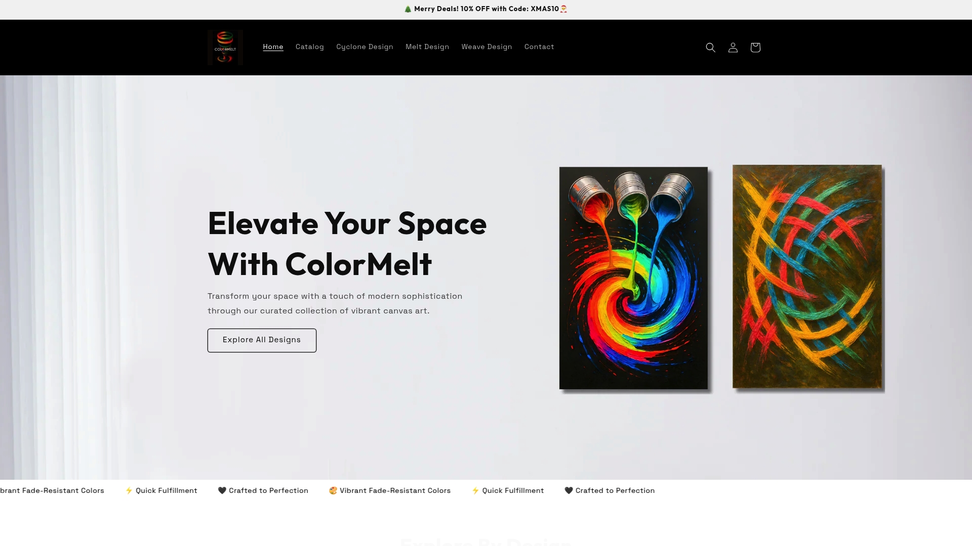
ColorMelt wall art offers a curated selection of canvas prints, acrylic prints, and framed pieces in abstract, weave, cyclone, and floral motifs, all printed with fade-resistant inks. Whether you’re building your first gallery wall or sourcing a single oversized statement piece, the collection is organized to help you shop by style and color. For something truly distinctive, the Melt Design wall art collection features dynamic cyclone and flow patterns that create movement on the wall and serve as powerful focal points in any modern room. Quick fulfillment and crafted quality mean your art arrives ready to hang, not ready to disappoint.
Frequently asked questions
How do I choose the right size artwork for my wall?
Choose artwork that fills at least two-thirds of your available wall space or matches the width of the furniture beneath it for a balanced, proportional result.
Can I mix vibrant artwork with patterned furnishings?
Keep surrounding décor simple and neutral so the bold art remains the focal point. Bold artwork and high energy read clearly only when competing patterns are minimized elsewhere in the room.
What’s the best way to light vibrant artwork?
Use adjustable track or picture lights aimed directly at the art to enhance its color saturation and surface details without creating glare or hot spots.
Is vibrant artwork suitable for small rooms?
Absolutely. One bold piece on a primary wall, surrounded by neutral tones and minimal clutter, can make a small room feel energized and larger. Bold art needs neutrality around it to read clearly, which naturally creates the visual breathing room that opens up smaller spaces.
How often should I rotate or change my displayed artwork?
Rotating pieces seasonally, roughly every three to four months, refreshes the mood of your space without requiring a full redesign. It also gives you a reason to revisit pieces that are in storage and rediscover why you loved them.