
Advantages of Vibrant Wall Art for Your Home in 2026
Vibrant wall art is defined as any artwork using bold, saturated, or high-contrast color to create an immediate emotional and visual response in a space. The advantages of vibrant wall art extend well beyond decoration: research links colorful art environments to measurable mood improvement, spatial transformation, and deeper personal identity expression. Trends like dopamine decor, the Simultanism design movement, and biophilic art integration have pushed vibrant color from accent choice to deliberate psychological tool. Whether you are drawn to abstract canvas prints, floral motifs, or cyclone-patterned wood art, the case for going bold in your home has never been stronger.
1. How vibrant wall art boosts mood and mental well-being
Vivid colors in home decor produce small dopamine hits linked to optimism and heightened well-being, particularly during stressful or uncertain times. This is the core premise behind dopamine decor, a trend that has generated over 70,000 TikTok posts and seen Google search interest rise 110% in the past year. The numbers reflect a real behavioral shift: people are actively choosing color as a mood management strategy, not just an aesthetic preference.
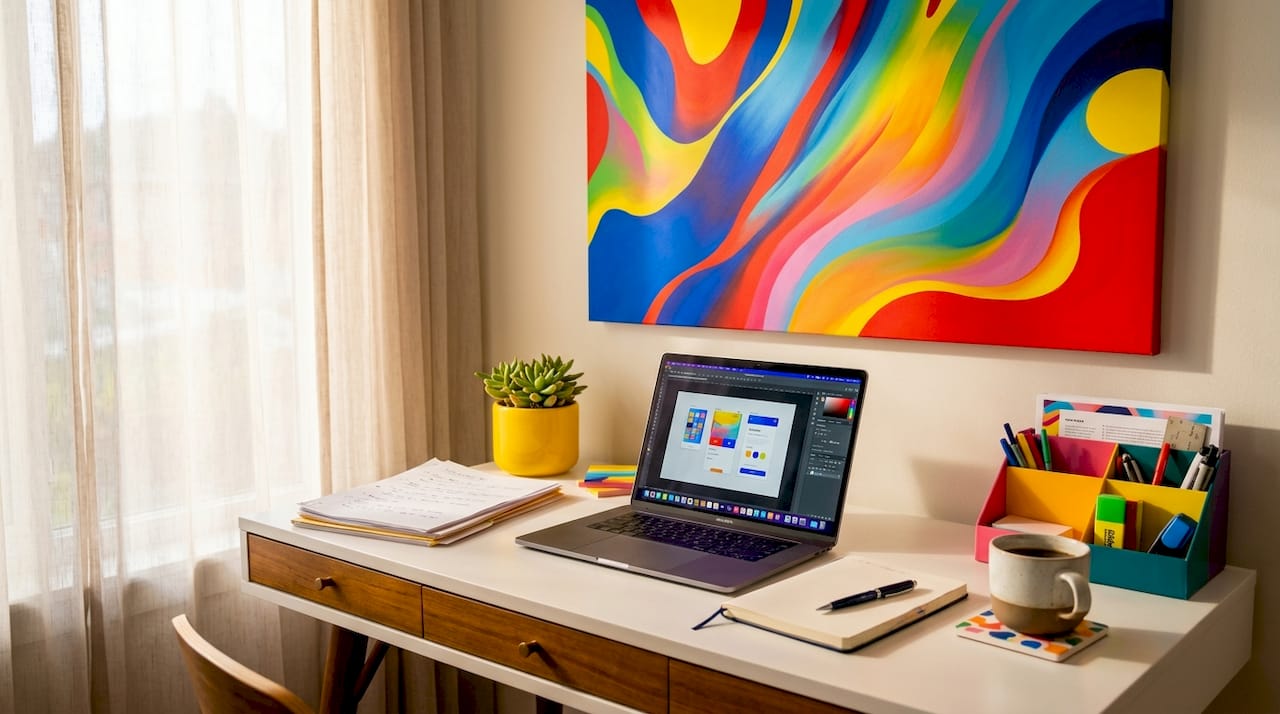
The science behind this goes deeper than a simple color-to-emotion equation. While no direct neurological pathway connects a red canvas to a dopamine spike, improved perceived environment quality indirectly enhances emotional well-being by reducing the brain’s stress load. When your surroundings feel intentional and alive, your nervous system responds accordingly.
Biophilic art environments, which combine natural motifs with vibrant color, take this further. A controlled study found that urban biophilic art environments produced a 67% improvement in depression symptoms and a 72% reduction in anxiety over 12 months. Those are moderate to large effect sizes, comparable to structured therapeutic interventions. The implication is clear: art on your walls is not decorative noise. It is an active participant in your mental health.
“Color is not just what you see. It is what you feel before you have time to think.”
Pro Tip: For maximum mood benefit without sensory overload, choose one wall as your color anchor and keep surrounding surfaces in warm neutrals. This gives your eye a place to rest while the art does its emotional work.
Key colors to consider for mood-specific goals:
- Warm reds and oranges: Stimulate energy and social engagement, ideal for dining rooms and entryways
- Deep blues and teals: Promote calm and focus, well-suited for home offices and reading nooks
- Vibrant greens with botanical motifs: Combine biophilic benefits with visual freshness, effective in living rooms and bedrooms
- Golden yellows at mid-saturation: Lift mood without the agitation risk associated with hyper-bright versions
2. Why vibrant wall art creates dynamic energy and transforms interiors
The Simultanism interior design trend, currently one of the most discussed movements in 2026 design circles, is built on a direct principle: contrasting and complementary color schemes create movement, energy, and individuality without causing visual aggression when anchored properly. Interior designers using this approach recommend placing bold color on one surface and letting the rest of the room react harmoniously around it. The result is a room that feels immersive rather than chaotic.
Large-scale vibrant art amplifies this effect significantly. A single oversized canvas print with contrasting hues can visually expand a small room, draw the eye upward in low-ceiling spaces, and create the illusion of architectural depth where none exists. Textured formats, such as weave-design wall hangings or wood art with cyclone patterns, add a physical dimension that flat paint cannot replicate.
The table below illustrates how subtle versus vibrant art choices affect the overall ambience of a room:
| Factor | Subtle/neutral art | Vibrant wall art |
|---|---|---|
| Visual energy | Low, receding | High, commanding |
| Perceived room size | Unchanged or smaller | Often appears larger |
| Emotional tone | Calm, understated | Stimulating, expressive |
| Focal point strength | Weak | Strong, immediate |
| Personalization signal | Minimal | Clear and distinctive |
Pro Tip: If you are working with a room that already has strong architectural features, choose vibrant art that echoes one color already present in the space. This creates visual harmony rather than competition between the art and the room’s existing character.
3. The role of vibrant wall art in personal expression and emotional anchoring
Statement wall art functions as a visual anchor that invites interpretation, creating spaces that feel curated rather than assembled from a catalog. Research linked to the National Endowment for the Arts associates visual arts engagement with measurable personal well-being. The mechanism is straightforward: when art reflects something true about you, the space around it stops feeling generic and starts feeling like yours.
Designers in 2026 are increasingly recommending a story-first placement strategy. Rather than choosing art to match a sofa or fill a wall, you start with a memory, a feeling, or an identity marker, and then find the piece that carries it. A vivid abstract print in the colors of a place you love, or a bold floral canvas that echoes a childhood garden, transforms decoration into autobiography.
The multimedia emotional wall art trend extends this further. Canadian artists are currently pairing visual art with complementary music or storytelling to create fully immersive environments. Even without the audio layer, the principle applies: vibrant art that carries narrative weight deepens the viewer’s connection every time they walk past it.
Here are four concrete ways to personalize your vibrant art selection for genuine emotional resonance:
- Anchor to a specific memory. Choose colors that match a place or moment that carries meaning for you, not just colors that are currently trending.
- Scale to the emotion. Large-scale art signals importance. If a piece matters deeply, give it the wall space it deserves.
- Pair contrasting pieces intentionally. Two vibrant works that seem to argue with each other visually can reflect the complexity of real life better than a matched set.
- Rotate seasonally. Swapping one statement piece with the seasons keeps your emotional connection to the space fresh and prevents visual habituation.
You can explore personalized art strategies that turn impersonal rooms into spaces with genuine identity.
4. Balancing vibrancy and comfort: best practices for colorful wall decor
Psychological evidence confirms that low- to mid-saturation shades support long-term comfort better than hyper-bright colors, which can become less tolerable over extended exposure. Blue and muted green surfaces are linked to enhanced creativity and reduced mental fatigue, while high-saturation yellows carry a documented risk of increasing agitation over time. This does not mean avoiding vibrancy. It means using it with precision.
Think of saturation the way a chef thinks about seasoning. A dish built entirely on salt is unpleasant; a dish with salt in the right places is memorable. The same logic applies to vibrant colors as accents, limited to one or two walls or focal pieces, which maintains visual comfort across extended periods without sacrificing impact.
The table below summarizes how specific colors commonly used in vibrant wall art perform across key comfort and mood dimensions:
| Color | Mood effect | Best room placement | Saturation guidance |
|---|---|---|---|
| Deep blue | Calm, focused | Home office, bedroom | Mid-saturation works well long-term |
| Vibrant green | Refreshing, restorative | Living room, kitchen | Botanical motifs enhance biophilic effect |
| Warm red | Energizing, social | Dining room, entryway | Use as accent; avoid full-wall saturation |
| Golden yellow | Uplifting, warm | Hallways, creative spaces | Mid-tone preferred; hyper-bright increases agitation |
| Rich purple | Creative, introspective | Studio, reading room | Works well in large-format art with neutral surrounds |
Room-by-room guidance matters here. Social spaces like living rooms and dining areas benefit from energizing, warm-toned vibrant art that encourages conversation. Home offices and reading spaces respond better to cooler, mid-saturation pieces that support concentration without distraction. Bedrooms sit in the middle: vibrant enough to feel personal, calm enough to support rest.
Pro Tip: Apply the 60-30-10 rule to any room with vibrant art. Let 60% of the visual space be a dominant neutral, 30% a secondary tone pulled from the artwork, and 10% the most vibrant color in the piece. This keeps the art as the star without overwhelming the room. Find more guidance on choosing quality wall art that holds up visually over time.
The psychology of color in home environments confirms that even adjacent surfaces, like kitchen doors or trim, influence how wall art reads in a space. Coordinating these elements intentionally amplifies the art’s emotional effect rather than diluting it.
Key takeaways
Vibrant wall art works because it combines psychological mood benefits, spatial transformation, and personal identity expression into a single design decision.
| Point | Details |
|---|---|
| Mood and well-being | Biophilic vibrant art environments reduced depression by 67% and anxiety by 72% in controlled studies. |
| Dynamic spatial energy | Simultanism-inspired bold color anchored to one surface transforms room ambience without visual chaos. |
| Personal expression | Story-first art placement turns generic decor into a curated reflection of identity and memory. |
| Saturation balance | Limit hyper-bright colors to 1-2 focal points; mid-saturation shades support long-term visual comfort. |
| Room-specific strategy | Match color temperature to room function: warm tones for social spaces, cool tones for focus and rest. |
What I have learned from living with vibrant art
When I first started paying serious attention to color in my own home, I made the classic mistake: I chose pieces I admired in isolation, without thinking about how they would live together or what they would ask of me every day. A hyper-saturated orange canvas that looked electric in a gallery felt exhausting by week three. That experience taught me something no design guide had spelled out clearly: vibrancy is not a volume dial you turn up. It is a conversation between the art, the room, and the person living in it.
What actually worked was choosing one piece I had a genuine emotional response to, something that stopped me mid-scroll or mid-gallery walk, and building the room around it rather than the other way around. The color in that piece became the room’s emotional signature. Everything else served it.
The research on dopamine decor and biophilic art confirms what I experienced intuitively. Color does not just decorate a space. It sets the emotional register of everything that happens in it. The rooms where I feel most like myself are the ones where the art on the walls reflects something true, not just something pretty.
My honest advice: trust your gut reaction before you trust the trend report. If a piece makes you feel something specific and real, that is the data point that matters most. Vibrant art that connects emotionally will outlast any color cycle.
— Shlomo
Bring your walls to life with Colormelt
Colormelt’s collection of vibrant wall art is built around exactly the principles covered in this article: bold color with intention, quality that holds its saturation over time, and designs that carry enough visual weight to anchor a room.
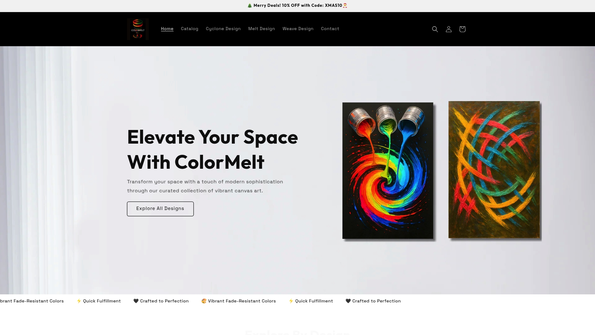
From abstract cyclone prints to weave-design wall hangings and fade-resistant floral canvases, Colormelt offers formats and motifs that fit a range of room styles and emotional tones. Every piece is crafted for lasting impact, not just immediate visual appeal. If you are ready to move past neutral walls and give your space a genuine emotional identity, the Colormelt wall art collection is the right place to start exploring.
FAQ
What are the main advantages of vibrant wall art?
Vibrant wall art improves mood, transforms spatial perception, and provides a strong focal point for personal expression. Research links colorful art environments to reduced anxiety and depression symptoms, particularly when natural motifs are incorporated.
How does vibrant wall art influence mood?
Bold, saturated colors trigger a motivational reward response in the brain, producing what researchers describe as small dopamine hits linked to optimism. The effect is strongest when color is used intentionally rather than applied uniformly across a space.
Can bright wall art be too stimulating for everyday living?
Hyper-saturated colors can become less tolerable over extended exposure, particularly high-brightness yellows. Limiting vibrant pieces to one or two focal walls and choosing mid-saturation shades for larger surfaces maintains comfort without sacrificing visual impact.
What is the best room for vibrant colorful wall decor?
Social spaces like living rooms and dining areas benefit most from warm, energizing vibrant art. Home offices and bedrooms respond better to cooler, mid-saturation pieces that support focus and rest without overstimulation.
How do I choose vibrant wall art that reflects my personality?
Start with a specific memory, feeling, or identity marker rather than a color trend. Story-first placement, where the art reflects something personally meaningful, produces spaces that feel curated and emotionally resonant rather than generically decorated.