
How to Match Art with Decor: A Room-by-Room Guide
Matching art with decor means balancing scale, color, style, and placement so every piece feels like it belongs in the room rather than landed there by accident. Interior design professionals treat art as a structural element, not a finishing touch. The right artwork anchors furniture, directs the eye, and adds personality that paint and textiles alone cannot deliver. Get the pairing wrong and even expensive art looks out of place. Get it right and a single canvas can pull an entire room together.
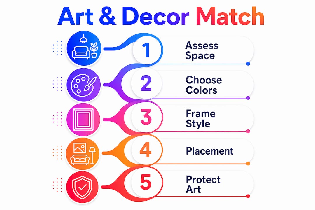
How to match art with decor: assess your space first
The first step in matching artwork with your space is reading the room before you shop. Wall size, ceiling height, natural light, and how you use the space all determine which art will work and which will fail.
Start with measurements. A piece that looks bold in a gallery can disappear on a large living room wall. Use these checkpoints before selecting any artwork:
- Wall dimensions: Measure the full wall width and the width of any furniture below the intended hanging spot.
- Ceiling height: Rooms with ceilings above 9 feet can support taller, more vertical compositions. Standard 8-foot ceilings favor horizontal or square formats.
- Natural light direction: North-facing rooms receive cooler, indirect light. South-facing rooms get warm, direct sun throughout the day.
- Room function: Bedrooms call for calmer, quieter imagery. Living rooms and dining rooms support bolder, more energetic work.
Light deepens texture and shifts color in ways that change how a piece reads at different times of day. A painting that looks warm and inviting in afternoon sun may feel flat and cold on a gray morning. Observe your walls at multiple times of day before committing to a placement.
Pro Tip: Tape a paper template of your intended artwork to the wall and live with it for 24 hours. You will immediately see whether the scale and position feel right before you hang anything.
How to choose art colors that work with your existing palette
Color is the most common reason an art and decor pairing fails. The fix is not to match colors exactly. Exact duplication creates a flat, catalog-like look that designers call “matched but stale.”
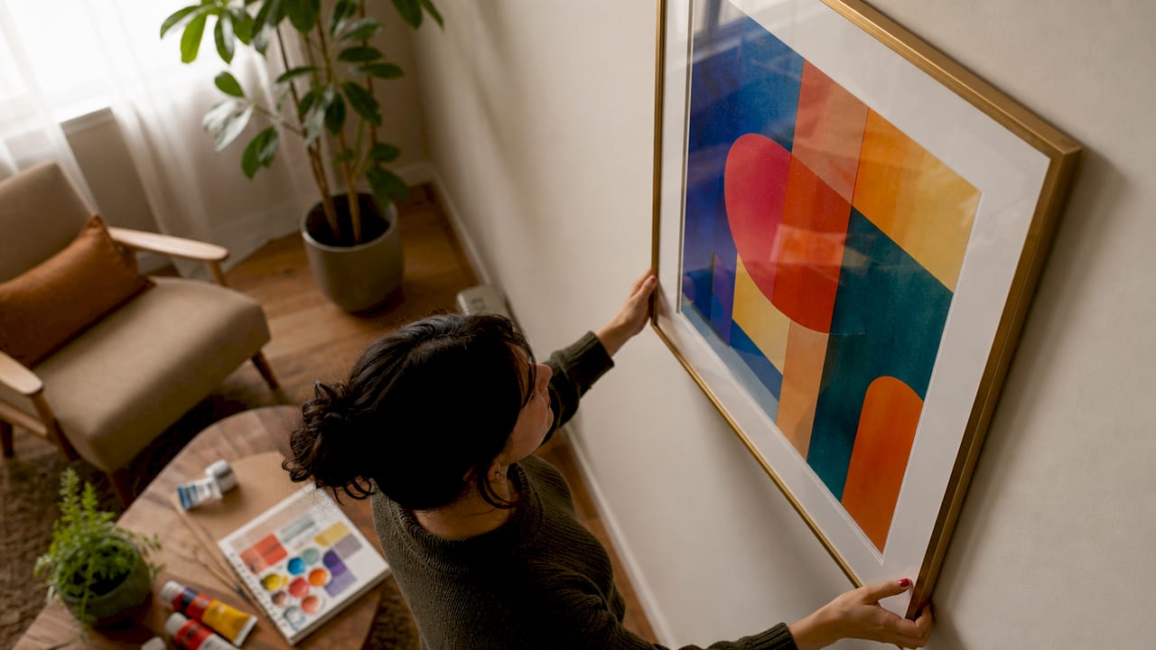
The correct approach is to echo 1–2 accent colors from your room’s existing palette without reproducing the full scheme. If your sofa is a warm terracotta and your rug pulls in mustard, look for artwork that contains one of those tones, not both. That single shared color creates connection. The rest of the artwork can introduce new hues that add depth.
Three reliable color strategies for art decor pairing:
- Tonal harmony: Choose art in the same color family as your walls but in a different value. A sage green room pairs well with a painting that includes deep forest green or pale mint.
- Complementary contrast: Place a piece with strong orange tones against a blue-gray wall. The contrast creates a focal point without clashing.
- Neutral anchor: In rooms with bold, patterned textiles, choose artwork in black, white, or warm gray. The art provides visual rest while still holding its own.
Lighting affects how art colors are perceived in the real world. Warm incandescent or LED lighting shifts yellows and reds toward orange. Cool daylight bulbs push blues and greens toward gray. When you pick art colors, test your swatches under the actual lighting conditions of the room, not in a store or on a screen.
How to coordinate art style and framing with your decor aesthetic
Art style and frame choice work together. Getting one right and ignoring the other produces a mismatch that undermines the whole effect.
Thin metal frames suit modern and minimalist interiors, while wider gilded or dark wood frames complement traditional and transitional decor. The frame is not decoration. It is a visual bridge between the artwork and the wall.
| Decor style | Recommended art style | Frame type |
|---|---|---|
| Modern/minimalist | Abstract, geometric, photography | Thin metal, black or white |
| Traditional | Landscapes, portraits, botanical | Wide gilded, dark walnut |
| Industrial | Urban photography, raw abstract | Raw steel, reclaimed wood |
| Eclectic | Mixed media, bold color, pattern | Varied, unified by finish color |
| Scandinavian | Line art, nature prints, muted tones | Thin natural wood, white |
Mixing art styles across a room is not a problem as long as one element stays consistent. That element can be frame finish, mat color, or a repeated tone in the artwork itself. A gallery wall with five different subjects reads as intentional when every frame shares the same black finish. The same five pieces in five different frame styles read as chaotic.
Pro Tip: When building a gallery wall, lay all pieces on the floor first and arrange them before you touch a nail. Photograph the layout from above. That photo becomes your hanging guide.
What are the best placement and scaling rules for hanging art?
Placement is where most homeowners make their biggest mistakes. The two most common errors are hanging art too high and choosing pieces that are too small for the wall.
The two-thirds width rule is the most reliable sizing guide in interior design. Art hung above a sofa, bed, or sideboard should span roughly two-thirds the width of that furniture piece. For an 84-inch sofa, that means artwork in the range of 56–63 inches wide. This proportion anchors art to its furniture footprint and prevents it from visually floating on the wall.
Follow these steps for correct hanging height and spacing:
- Set the center point at eye level. The standard hanging height places the center of the artwork at approximately 145–155 cm from the floor. This applies to most residential spaces with standard ceiling heights.
- Leave 6–8 inches between art and furniture. This gap connects the piece to the furniture below without making it feel crowded.
- Adjust for high ceilings. In rooms with ceilings above 10 feet, raise the center point slightly to avoid art that looks pinned to the floor.
- Group multiple pieces as one unit. When hanging a gallery wall, treat the entire arrangement as a single artwork. The outer edges of the group should follow the same two-thirds rule as a single piece would.
For a detailed breakdown of canvas sizing and placement, Colormelt’s hanging guide covers room-by-room recommendations with specific measurements.
How do you protect art while keeping it visually integrated?
Preservation and aesthetics are not separate decisions. Where you place art and how you frame it affects both how it looks and how long it lasts.
Light-sensitive artworks require UV-filtering glazing and placement away from direct sunlight. This applies to prints, photographs, watercolors, and any work on paper. Canvas and acrylic prints are more durable, but prolonged direct sun still causes fading over time. Fade-resistant inks, like those used in Colormelt’s canvas prints, extend display life significantly.
Key preservation practices that also inform your placement decisions:
- Avoid south-facing walls with unfiltered windows for paper-based art. The cumulative light exposure causes irreversible color shift.
- Use archival mats and backing when framing prints. Acidic materials yellow and transfer damage to the artwork over years.
- Seal frames properly to protect against dust and humidity, particularly in kitchens and bathrooms.
Museum guidelines recommend display below 50 lux for light-sensitive works, with limited exposure periods. For home settings, that translates to placing delicate pieces on interior walls away from windows, using UV-filtering glass, and supplementing with directed artificial light rather than ambient daylight.
Framing creates a microenvironment for your artwork. The right materials protect against light, dust, and humidity, preserving both condition and color for years.
Planning for preservation at the framing stage is far easier than trying to reverse damage later. Choose framing materials with longevity in mind, not just aesthetics.
Key takeaways
Matching art with decor works best when you treat artwork as a design element from the start, not a last-minute addition.
| Point | Details |
|---|---|
| Assess the space first | Measure walls, observe light, and identify room function before selecting any artwork. |
| Echo, don’t copy, colors | Match 1–2 accent colors from your existing palette to create harmony without a flat, catalog look. |
| Frame style bridges art and room | Choose frame type based on decor aesthetic: thin metal for modern, wide wood for traditional. |
| Follow the two-thirds rule | Art above furniture should span roughly two-thirds the furniture’s width to stay visually anchored. |
| Protect art through placement | Use UV-filtering glazing and avoid direct sunlight for prints, photographs, and works on paper. |
Art and decor: what I’ve learned from getting it wrong first
Most people approach art selection the way they approach throw pillows: they find something they like and hope it fits. That approach works occasionally. More often it produces a room full of pieces that each look fine in isolation but create no coherent feeling together.
The shift that changed how I think about this came from watching a designer integrate art early in the room design process rather than after the furniture was placed. She chose the artwork first, then built the color palette and furniture selection around it. The result was a room where everything felt inevitable rather than assembled.
Scale is the variable most homeowners underestimate. A piece that feels bold in a shop looks timid on a 12-foot wall. I have seen homeowners buy three small prints when one large canvas would have done the job better and cost less. The two-thirds rule exists because it works, not because designers invented an arbitrary formula.
The other lesson is about authenticity. Rooms that feel genuinely personal contain art the owner actually responds to, not art selected to match the sofa. The matching principles in this guide are tools, not rules. Use them to make confident choices, then trust your own eye. A piece you love will always read better than a technically correct piece you feel nothing for.
— Shlomo
Colormelt’s wall art collection for every decor style
Putting these principles into practice starts with having the right art to work with.
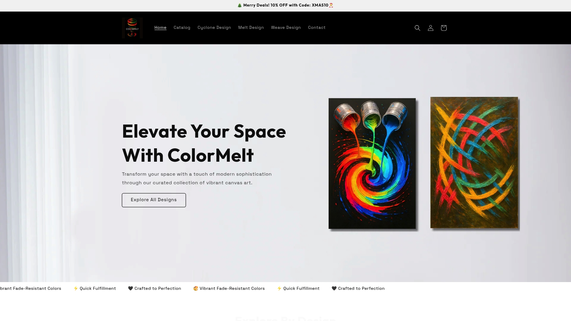
Colormelt offers a curated selection of canvas art, acrylic prints, and framed artwork in sizes designed to follow the two-thirds rule across common furniture widths. The collection spans abstract, weave, cyclone, and floral motifs, giving you options for modern, eclectic, and transitional interiors. All prints use fade-resistant inks, which makes placement near ambient light sources less of a preservation risk. If you want texture and dimension on a wall, the weave design wall hanging adds tactile depth that flat canvas prints cannot replicate. Browse by color family or style to find pieces that echo your existing palette without copying it.
FAQ
What is the two-thirds rule for hanging art?
The two-thirds rule states that artwork hung above furniture should span roughly two-thirds the width of that furniture piece. For an 84-inch sofa, the ideal art width is 56–63 inches.
How do I pick art colors that work with my decor?
Echo 1–2 accent colors from your existing palette rather than matching every tone exactly. This creates visual connection without the flat, overly coordinated look that makes rooms feel like a showroom.
What height should I hang artwork?
The center of the artwork should sit at approximately 145–155 cm from the floor. Leave 6–8 inches of space between the bottom of the frame and the top of any furniture below it.
How do I protect art from fading in my home?
Use UV-filtering glazing for prints and works on paper, and avoid placing light-sensitive pieces on walls with direct sunlight exposure. Fade-resistant canvas prints handle ambient light better than paper-based works.
Can I mix different art styles in the same room?
Yes. Mixing styles works when one element stays consistent across all pieces, such as frame finish, mat color, or a repeated tone in the artwork. Consistency in one variable creates cohesion across variety.