
What Is Art for Small Spaces: a Practical Guide
Most people decorating a small apartment make the same mistake. They assume small spaces call for small art, so they scatter tiny frames across the wall and wonder why the room feels chaotic instead of curated. Understanding what is art for small spaces means rethinking that assumption entirely. The right art for a compact room isn’t about fitting in. It’s about choosing and placing pieces that shape how the space feels, not just how it looks. This guide covers the principles, styles, and display methods that actually work.
Table of Contents
- Key takeaways
- What is art for small spaces, really
- Choosing art styles and sizes for compact rooms
- Creative display techniques for small walls
- Integrating art with the room’s overall design
- My honest take on art for small spaces
- Art for your space, made easy with Colormelt
- FAQ
Key takeaways
| Point | Details |
|---|---|
| Large art beats small clusters | One bold focal piece makes a small room feel intentional and less cramped than many tiny frames scattered around. |
| Scale is relative to furniture | Art should span roughly two-thirds the width of the furniture it sits above to maintain visual balance. |
| Hang at the right height | Position art 57 to 60 inches from the floor to keep it grounded and cohesive with the rest of the room. |
| Consistent framing reduces noise | Using one frame style and a limited color palette across a gallery wall creates calm instead of clutter. |
| Color continuity expands space | Monochromatic and light palettes minimize visual breaks and make a room read as a larger, unified envelope. |
What is art for small spaces, really
Here’s the core idea most decorating advice misses: art for small spaces is less about the object itself and more about the composition it creates on the wall and in the room. When you treat art selection as a design decision instead of a shopping exercise, everything changes.
Your eye uses reference points to estimate room size. Walls, furniture edges, door frames, and art pieces all serve as anchors. When you hang multiple small pieces across a compact wall, you multiply those anchors. The brain reads each frame as a boundary, making the space feel choppy and smaller than it actually is. One large artwork disrupts that process. The eye travels to the piece and reads it as a destination, not a boundary. The result? The room feels purposeful and, surprisingly, bigger.
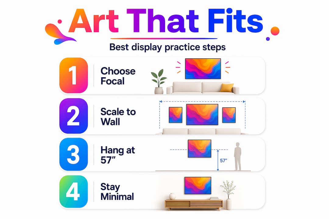
Scale also needs to match the furniture and wall around it. A piece that looks massive in the store can look lost above a full sofa if it’s the wrong width. The standard guideline is to choose art that covers roughly two-thirds of the furniture width below it. So a 72-inch sofa calls for art in the 48-inch range. That ratio keeps the wall and furniture in conversation rather than competing.
Pro Tip: Before buying, cut brown paper or painter’s tape to the exact dimensions of the artwork you’re considering and stick it on the wall. Live with it for a day. What feels bold in theory often looks perfect in practice.
Positioning matters just as much as size. Hanging art at 57 to 60 inches from the floor (measured to the center of the piece) keeps it at natural eye level. When art floats too high, it disconnects from the furniture below and makes the ceiling feel low. When it hangs too low, it anchors the eye to the floor and shrinks the perceived height of the room.
Choosing art styles and sizes for compact rooms
Not every art style works equally well in a tight room. The good news is that some of the most visually compelling styles are exactly the ones that perform best in small spaces.
Large-format and abstract art
Large-format art expands small spaces by giving the eye one strong focal point rather than several competing ones. Abstract and geometric prints are particularly effective because they don’t require a specific viewing distance to appreciate. You can hang a 36x48 inch abstract canvas in a studio apartment and it reads beautifully from three feet away or across the room. Geometric designs with bold contrast add energy. Softer abstract pieces with muted, flowing color fields create calm. Both work well in compact spaces because neither demands narrative attention the way a detailed figurative painting might.
Minimalist art and warm palettes
Minimalist art for tiny spaces operates on a simple principle: less information on the canvas means less visual weight in the room. A single line drawing, a clean typographic print, or a soft watercolor wash on white paper adds personality without demanding attention. Warm palettes (terracotta, ochre, blush) make small rooms feel inviting rather than clinical. Cool palettes (slate blue, sage, off-white) push walls back visually and increase perceived depth.
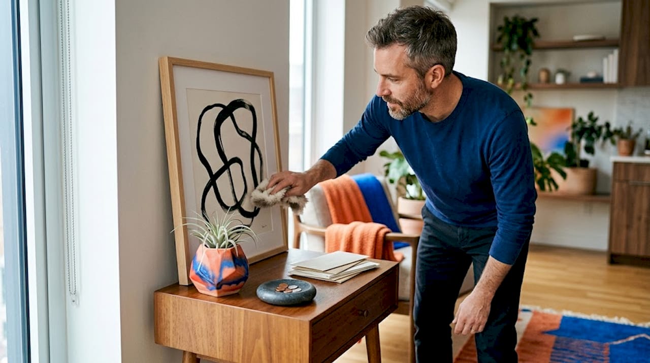
Here’s a quick comparison to guide your style decisions:
| Art style | Best for | Avoid when |
|---|---|---|
| Large abstract canvas | Living rooms, accent walls | Narrow hallways under 3 feet wide |
| Minimalist line art | Bedrooms, bathrooms | Spaces that already feel too bare |
| Geometric prints | Open-plan studios, offices | Rooms with complex patterns in rugs or textiles |
| Warm tonal landscapes | Cozy sitting areas | Rooms with dark walls (colors muddy together) |
| Monochrome photography | Entryways, reading nooks | Spaces needing more warmth and color |
When grouping smaller pieces, keep the collection tight. Three pieces in matching frames work. Six mismatched pieces in different sizes do not. The visual continuity created by a consistent palette and frame style signals coherence, which the brain reads as spaciousness.
Pro Tip: Stick to a maximum of three art pieces per wall in a small room. If you’re tempted to add a fourth, remove one instead. Editing is the skill that separates a curated space from a cluttered one.
Creative display techniques for small walls
Getting the display right is where most people have the most room to improve. Small walls can carry more visual impact than you’d expect if you work with the architecture instead of against it.
Gallery wall formats that work in tight spaces
Not all gallery walls are created equal. These formats consistently deliver in compact rooms:
- Vertical stacks: Two or three pieces stacked in a single column work brilliantly on narrow walls beside doors or windows. They draw the eye upward, which makes ceilings feel taller.
- Triptychs: A set of three related panels hung side by side reads as one unified image. You get the impact of large-format art with the flexibility of multiple smaller pieces.
- Micro grids: A tight 2x2 or 2x3 grid of identically framed pieces in matching or closely related colors creates a structured, gallery-quality display even on a small accent wall.
Consistent spacing, frame style, and palette are the rules that keep gallery walls from looking chaotic. Use a level and measure gaps precisely. Even a quarter-inch inconsistency in spacing reads as sloppiness up close.
Mirrors and reflective art
Mirrors alongside art reflect light and extend perceived depth in ways a flat print cannot. A decorative round mirror hung adjacent to or above a canvas piece acts as both art and spatial tool. Position it near a window and it doubles the natural light in the room. Use a mirror with an interesting frame and it functions as a statement piece in its own right.
Renter-friendly and flexible hanging methods
If you’re renting, you can still achieve a polished display. Follow these steps for zero-damage installation:
- Use adhesive picture-hanging strips rated for the weight of your piece. Most standard canvas prints under 8 pounds attach securely with two strips.
- Lean larger pieces against the wall on a picture ledge or floating shelf rather than hanging them at all. This also lets you swap art easily without repositioning nails.
- Use removable adhesive hooks for lightweight prints and works on paper.
- Install a picture rail system with hooks if your building allows small ceiling-level fasteners. These are nearly invisible and allow full flexibility.
DIY small-scale art projects like mini canvas paintings, washi tape wall designs, or string art add texture on a budget and are completely removable, making them ideal for renters or anyone who likes to rotate pieces seasonally.
Integrating art with the room’s overall design
Art doesn’t operate in isolation. The best small-space art decisions account for everything else in the room.
Lighter and monochromatic color palettes create continuity that expands perceived space. When your wall color, ceiling color, and trim are all in the same family, the room reads as a single cohesive volume. Art that pulls one of those tones into its palette reinforces that effect rather than breaking it. A teal abstract piece on a warm gray wall creates a visual break. The same piece on a white or very light gray wall feels like it belongs.
Furniture scale sets the ceiling for art scale. If your sofa is compact, your coffee table is small, and your rug is modest, a massive canvas can feel out of place. The room’s art should grow proportionally from the furniture. Pairing art with room furniture creates a sense of intentionality that makes compact rooms feel designed rather than furnished by necessity.
In studio apartments or open-plan spaces, art can do double duty as a zone-defining tool. A large canvas hung above a console table signals “this is the entry area.” A triptych above a low platform bed anchors the sleeping zone visually. Art essentially draws invisible lines that organize open space without requiring physical dividers.
Pro Tip: Hang one piece slightly higher than eye level in a room with low ceilings. Not above a door, but 5 to 10 inches above standard hanging height on an accent wall. The eye follows it upward and the ceiling reads as taller than it is.
My honest take on art for small spaces
I’ve watched people agonize over tiny prints for small rooms, convinced that going big would overwhelm the space. In my experience, the opposite is almost always true. The rooms that feel cramped and chaotic are usually the ones with too many pieces fighting for attention, not too few or too large.
What I’ve found works consistently is committing to a focal point first. Pick the wall you want to own and put something genuinely bold on it. One piece you love, sized to fill at least a third of that wall. Then step back and see if the room needs anything else. It usually needs less than you think.
The mistake I see most often is treating art like wallpaper. People fill every empty surface because silence on a wall feels uncomfortable. But white space is not wasted space. It gives the pieces you do hang room to breathe and be seen. Editing your collection down to the art you genuinely love creates a room that feels personal, not cluttered.
I also think personalizing your home with art is about more than aesthetics. The right piece in the right spot changes how you feel in a room. That’s worth investing real thought and some budget into, regardless of square footage.
— Shlomo
Art for your space, made easy with Colormelt
If you know what you’re looking for but haven’t found the right piece yet, Colormelt makes it easier to get there. The collection is built around vibrant, modern designs that work specifically well in compact rooms because they lead with bold focal energy rather than busy detail.
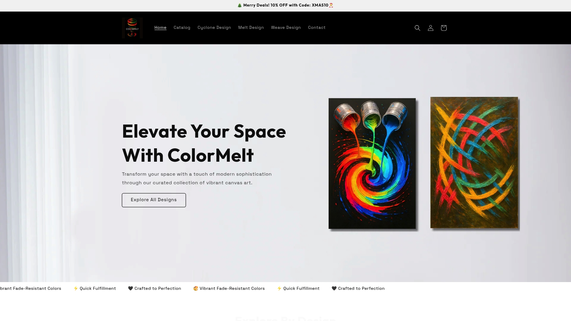
Colormelt’s wall art collection includes canvas prints, acrylic prints, and framed artwork in abstract, weave, cyclone, and floral motifs. Pieces are crafted with fade-resistant color and scaled for real apartments, not gallery warehouses. If you want something that adds personality without overwhelming your space, the weave design wall art is a strong starting point. It’s textured, layered, and holds its own as a solo focal piece. Browse the full vibrant art ideas on the Colormelt blog for room-specific styling inspiration.
FAQ
What size art works best in a small room?
Art that spans roughly two-thirds the width of the furniture below it works best. In small rooms, one larger piece generally outperforms several small ones because it creates a focal point without visual fragmentation.
Should small spaces use small or large art?
Designers recommend one large focal artwork over many small pieces. Oversized art prevents the eye from measuring limited wall space and makes rooms feel more intentional and spacious.
How do I arrange art on a small wall without it feeling cluttered?
Use consistent frame styles, limit your palette to two or three colors, and keep spacing even. Minimalist gallery wall formats like vertical stacks or triptychs work well without overwhelming tight walls.
What art styles suit a small apartment?
Abstract, geometric, and minimalist styles work best in small apartments. They read well at close range, add visual interest without requiring narrative attention, and pair naturally with the clean lines typical of compact interiors.
Can renters hang art without damaging walls?
Yes. Adhesive picture-hanging strips, removable hooks, and picture ledges all allow secure display without nails. DIY art options like washi tape designs are also removable and easy to replace with new work anytime.