
The Role of Botanical Art in Decor: A Style Guide
Botanical art is defined as the visual representation of plant life, from scientific illustrations to abstract floral compositions, used to bring organic beauty into interior spaces. The role of botanical art in decor goes far beyond decoration. It introduces natural forms that calm the mind, soften architectural edges, and give any room a grounded, intentional feel. Backed by biophilic design principles, which connect human wellbeing to nature, plant art has become one of the most consistent choices across interior styles, from Japandi minimalism to American farmhouse. This guide covers the aesthetic science, styling techniques, and material quality behind botanical wall art.
How does botanical art enhance the mood and aesthetic of a home?
Botanical art works because organic shapes contrast sharply with the straight lines of furniture, walls, and architecture. That contrast gives a room visual balance. A room full of right angles feels rigid. Add a print of trailing ferns or a loose watercolor magnolia, and the space immediately softens.
The psychological effect is real. Plants and floral designs reduce anxiety and contribute to a sense of happiness by fostering a connection to nature indoors. That connection is the core idea behind biophilic design, a principle now widely applied in residential and commercial interiors. Decorating with plant art is one of the simplest ways to apply biophilic thinking without structural renovation.
Color also plays a direct role. Natural, muted palettes featuring greige, sage, warm whites, and charcoal help botanical prints feel intentional rather than decorative afterthoughts. These tones align with the neutral bases common in Scandinavian, Japandi, and modern farmhouse interiors. That alignment is why botanical art integrates so cleanly across such different design styles.
“Botanical art gives interiors a composed yet soft feel by providing organic shapes that balance harsh architectural lines.” — Living Pristine
The style range is wide. Vintage scientific plates from the 18th and 19th centuries carry a scholarly, collected quality. Abstract botanical prints feel contemporary and bold. Monochrome line art reads as minimal and graphic. Photographic plant studies bring a raw, documentary texture. Each style creates a distinct atmosphere, which means botanical art in interior design is never a one-size-fits-all category. The right choice depends on the room’s existing palette, furniture weight, and the mood you want to set.
Practical tips for selecting and styling botanical art
Styling botanical art well requires decisions about scale, arrangement, framing, and color discipline. Most people underestimate how much scale matters.
Choosing the right scale
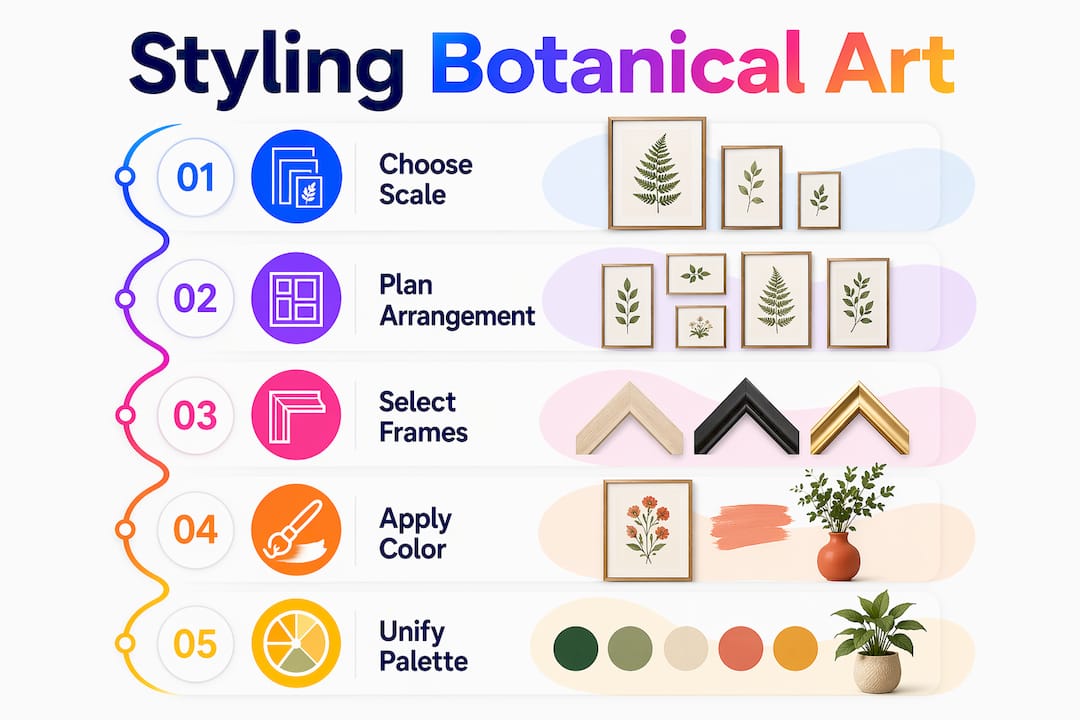
Large statement walls work best with a single oversized print measuring 80–100cm wide, or a balanced 3x3 grid of smaller coordinated prints. A single large print creates focus and drama. A grid creates rhythm and works well when the prints share a consistent palette or subject. Avoid mixing large and small prints randomly on the same wall. The result reads as cluttered rather than curated.
Building a gallery wall
Follow these steps to build a botanical gallery wall that looks intentional:
- Choose a focal point. Select one wall, ideally behind a sofa, bed, or console table, and commit to it.
- Set your palette first. Pick two or three colors that appear across all prints. This is the single most effective way to unify diverse botanical images.
- Lay it out on the floor. Arrange frames on the floor before hanging anything. Adjust spacing until the arrangement feels balanced.
- Maintain consistent spacing. Designers recommend 5–7cm between frames for a gallery wall that looks professional. This detail is the most commonly overlooked step by beginners.
- Hang at eye level. The center of each print should sit at approximately 145–150cm from the floor, which is the standard eye-level height for most adults.
- Step back and assess. View the arrangement from the room’s natural entry point before committing to final placement.
Pro Tip: Consistent frame color and a shared palette unify diverse botanical prints and make the arrangement appear curated. Black frames work with almost every botanical style. Natural wood frames suit warmer, earthier palettes.
Frame and finish comparison
| Format | Best for | Mood |
|---|---|---|
| Black frame, white mat | Vintage scientific plates, monochrome line art | Crisp, editorial |
| Natural wood frame | Watercolor botanicals, photography | Warm, organic |
| Frameless canvas | Abstract and bold botanical prints | Modern, gallery-style |
| Acrylic mount | Photographic plant studies | Clean, contemporary |
Color echoing is another technique worth applying. If your botanical print contains sage green, repeat that color in a throw pillow or a vase nearby. This creates a visual thread between the art and the room’s furnishings. The result feels designed rather than assembled. You can read more about this approach in Colormelt’s guide on canvas print styling tips for modern homes.
What types of botanical art suit different decor styles?
Botanical prints span vintage scientific plates, abstract compositions, monochrome line art, and photographic studies. Each type carries a different visual weight and suits a different interior context.
- Vintage scientific illustrations (think the style of 18th-century botanical plates) suit traditional, eclectic, and maximalist interiors. They carry historical authority and pair well with antique furniture, dark wood, and rich textiles.
- Abstract botanical prints work in contemporary and mid-century modern spaces. They prioritize shape and color over literal plant representation. A loose, gestural leaf form in terracotta and cream reads as art-forward without feeling cold.
- Monochrome line art suits minimalist and Japandi interiors. The restraint of a single ink line on white paper adds visual interest without competing with other design elements.
- Photographic plant studies bring a documentary quality. A close-up of a monstera leaf or a backlit fern frond works in both modern and biophilic-focused spaces.
The uses of botanical illustrations extend well beyond wall art. Botanical motifs appear in textiles, lighting fixtures, furniture carvings, and rugs, broadening how nature shapes a room’s overall feel. A linen cushion with a pressed-leaf print, a pendant light shaped like a leaf cluster, or a carved wooden side table with floral detailing all carry the same visual language as a framed botanical print. Using these elements together creates a layered, nature-themed home decor scheme that feels cohesive rather than themed.
The importance of plant art in different rooms also varies. In a bedroom, soft watercolor botanicals promote rest. In a home office, structured line art adds focus without distraction. In a kitchen or dining room, fruit and herb illustrations feel contextually appropriate and add warmth. Matching the art style to the room’s function is a simple rule that most guides skip.
Does print quality affect how long botanical art lasts?
Print quality determines whether botanical art looks as good in ten years as it does on day one. The material and ink technology behind a print are the two factors that matter most.
Premium canvas prints use a 70% cotton/30% polyester blend at 410 gsm, combined with archival giclée inks. That combination can preserve color for up to 200 years under normal indoor conditions. That figure puts the investment in perspective. A quality canvas print is not a seasonal purchase. It is a long-term decor decision.
Archival giclée prints on fine art paper resist fading, smudging, and UV damage. They produce soft, gallery-quality finishes that suit framed presentation. Fine art paper prints tend to feel more delicate and scholarly, which aligns well with vintage botanical illustrations and monochrome line art. Canvas prints carry more visual weight and suit larger, bolder compositions.
Satin finishes sit between matte and gloss. They reduce glare while retaining color depth, making them a practical choice for rooms with natural light. Acrylic mounts amplify color saturation and add a contemporary edge. For a detailed breakdown of how these materials compare, Colormelt’s guide on durable art prints covers the key differences clearly.
Pro Tip: Always check whether a print uses archival inks before purchasing. Non-archival inks can fade noticeably within five years, especially in rooms with direct sunlight. UV-resistant glass or acrylic glazing adds another layer of protection for framed pieces.
Sustainable production is also worth considering. Prints produced on demand reduce waste compared to mass-produced runs. Water-based inks lower the environmental impact of the printing process. These factors do not affect the visual quality of the art, but they do affect the overall value of the purchase for buyers who prioritize responsible consumption.
Key takeaways
Botanical art is one of the most versatile and psychologically grounded choices in home decor, delivering visual balance, emotional calm, and lasting aesthetic value when selected and styled with intention.
| Point | Details |
|---|---|
| Biophilic design benefit | Plant art reduces anxiety and fosters calm by connecting occupants to nature indoors. |
| Scale and arrangement | Use an 80–100cm statement print or a 3x3 grid; maintain 5–7cm spacing between frames. |
| Color discipline | A shared palette and consistent frame color unify diverse botanical prints into a curated display. |
| Style matching | Match botanical art style (vintage, abstract, photographic) to the room’s function and existing palette. |
| Material quality | Archival giclée inks on 410 gsm canvas preserve color for up to 200 years. |
Botanical art in modern homes: what I’ve actually learned
I’ve styled botanical art in spaces ranging from compact urban apartments to open-plan family homes, and the pattern is consistent. The rooms that look best are not the ones with the most art. They are the ones where the art was chosen with a clear intention.
The biggest mistake I see is treating botanical prints as filler. Someone buys a set of three small prints because the wall looks bare, hangs them without a plan, and wonders why the room still feels unfinished. The art is not the problem. The absence of a visual strategy is. Committing to one palette, one frame style, and one focal wall changes everything.
I also think the trend conversation around botanical art is overblown. Yes, it appears in 2026 floral art trends, and yes, it fits current Japandi and biophilic design movements. But botanical art has been a fixture in interior design for centuries. It was in Victorian parlors, mid-century modern living rooms, and now in minimalist Scandinavian spaces. That longevity is not a coincidence. It reflects something genuine about how humans respond to plant imagery.
My advice: buy the piece you find genuinely beautiful, not the one that matches a trend. Trends shift. A well-chosen botanical print, properly framed and placed, will outlast every design cycle you encounter.
— Shlomo
Colormelt’s botanical wall art collection
Colormelt curates a collection of botanical and nature-inspired wall art built for lasting impact. Every piece uses fade-resistant inks and premium substrates, including canvas, acrylic, and wood prints, so the color you see on day one stays vivid for years.

The range spans abstract floral compositions, bold cyclone designs, and nature-driven motifs that suit everything from minimalist bedrooms to statement living room walls. Whether you want a single oversized canvas or a coordinated set for a gallery wall, Colormelt’s collection gives you the quality and variety to build a space that feels genuinely personal. Browse the full range and find the piece that fits your room, your palette, and your style.
FAQ
What is the role of botanical art in home decor?
Botanical art introduces organic shapes and natural color palettes that soften architectural lines, reduce visual tension, and create a calming atmosphere. It applies biophilic design principles to residential spaces without structural changes.
How do I choose the right size botanical print for my wall?
Large statement walls suit a single print measuring 80–100cm wide or a balanced 3x3 grid of smaller coordinated prints. Smaller walls work better with one or two medium-sized pieces hung at eye level.
What spacing should I use between botanical art frames?
Designers recommend 5–7cm between frames for a gallery wall that looks balanced and professional. Consistent spacing is the detail most often overlooked by beginners.
Which botanical art style suits a minimalist interior?
Monochrome line art and simple watercolor botanicals suit minimalist and Japandi interiors best. Their restraint adds visual interest without competing with clean architectural lines or neutral palettes.
How long do quality botanical canvas prints last?
Premium canvas prints using archival giclée inks on a 70% cotton/30% polyester blend can preserve color for up to 200 years under normal indoor conditions. UV-resistant glazing extends that lifespan further for framed pieces.