
What Is Styling with Art? Your Practical Interior Guide
Styling with art is the deliberate act of selecting and placing artwork to define a space’s personality, mood, and emotional depth. It goes well beyond hanging something on a blank wall. Where structural design handles the bones of a room, art styling adds depth and narrative through curated color palettes, textures, and visual storytelling that makes a space feel genuinely lived in. Think of it as the difference between a room that looks finished and one that actually feels like you.
A few things art styling focuses on:
- Personality and emotion: Art carries feeling. The right piece can make a room feel calm, energized, playful, or contemplative.
- Color and texture: Artwork introduces tones and surfaces that tie together furniture, textiles, and architectural details.
- Narrative: A curated grouping of pieces tells a story about who lives there, not just what they own.
- Mood setting: Scale, subject matter, and placement all shape how a room feels the moment you walk in.
- Bridging design and life: Interior styling transforms a designed space into a home by layering the personal on top of the structural.
How to style your home with art: practical tips that actually work
Getting art onto your walls is easy. Getting it right takes a little more thought. These tips cover the decisions that separate a space that looks styled from one that just looks busy.
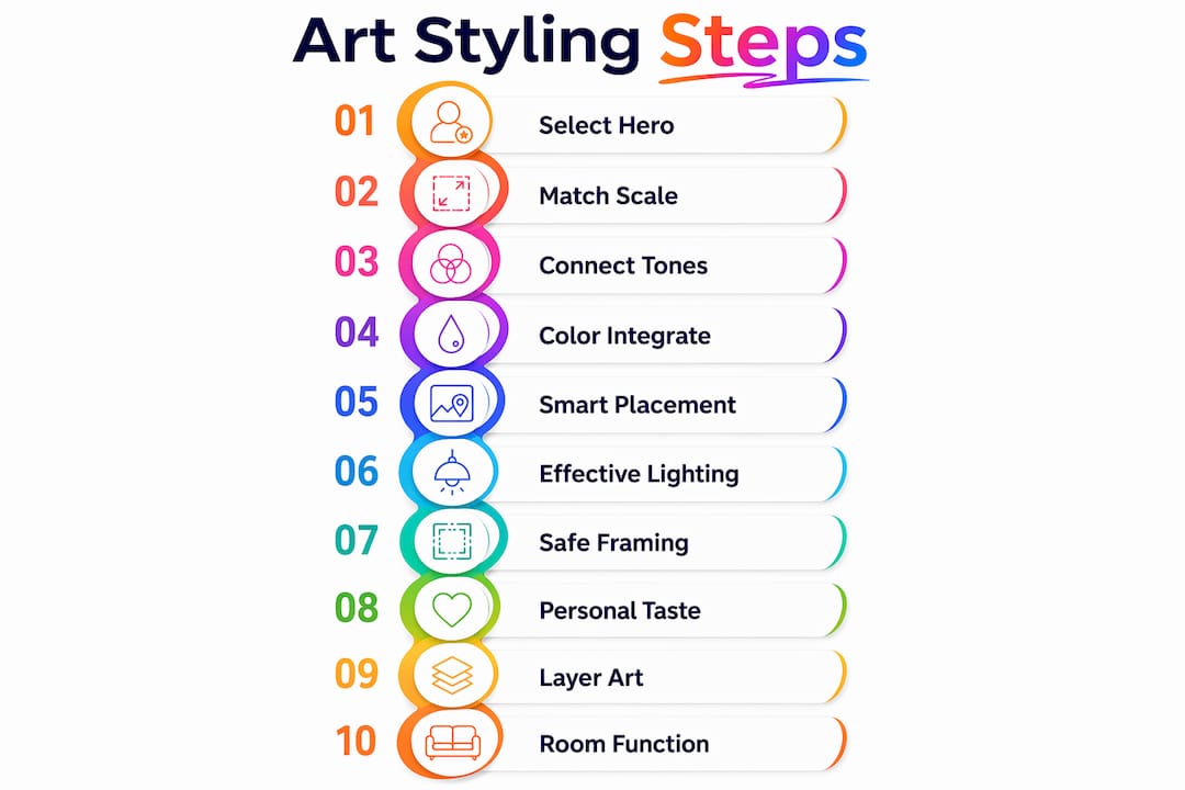
1. Choose a hero piece first
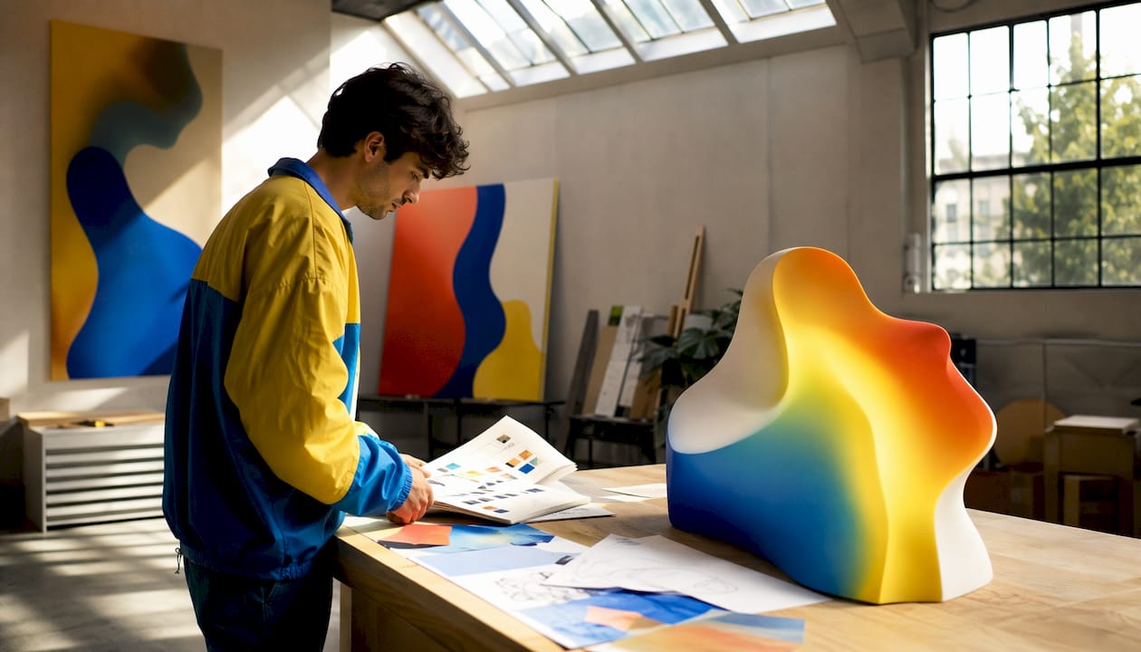
Hero pieces anchor a room’s color story and visual attention. Pick your statement work before you finalize paint colors, cushion fabrics, or rug choices. When you build outward from a single strong piece, the rest of the room gains a natural coherence that is almost impossible to achieve in reverse. A large abstract canvas with deep teal and warm ochre, for instance, gives you a ready-made palette to pull from across every surface in the room.
2. Match scale to the wall, not just the furniture
Scale and orientation matter more than most people realize. A small print on a vast wall looks lost; an oversized canvas on a narrow wall feels oppressive. The general rule: artwork should fill roughly two-thirds of the wall width it occupies. For furniture groupings like a sofa, aim for art that spans about two-thirds of the sofa’s length. Orientation matters too. A tall, narrow wall calls for portrait-oriented work; a wide horizontal space suits landscape format.
3. Connect pieces through tonal families, not exact matches
Avoid trying to match art directly to your decor. When everything coordinates too perfectly, the result reads as flat and corporate rather than personal. Instead, look for shared tonal families: warm earthy pieces alongside warm-toned wood furniture, or cool blues and grays grouped with slate and linen. This approach creates an organic, evolving feel rather than a showroom snapshot.
4. Integrate art with your existing color scheme
Pull one or two colors from your art into smaller decor elements like throw pillows, vases, or books. You do not need to repaint a room to make new art feel at home. A single vibrant abstract with coral and navy reads beautifully against a neutral wall when the coral reappears in a nearby cushion or ceramic. Choosing wall art with this color-echo approach in mind makes the whole room feel considered.
5. Think about placement beyond eye level
The standard advice is to hang art so its center sits at roughly 57–60 inches from the floor, which approximates average eye level. That works well for standalone pieces. For art above furniture, leave 6–8 inches of space between the bottom of the frame and the top of the piece below. In stairwells, follow the angle of the stairs with your arrangement rather than fighting it.
6. Use lighting to make art come alive
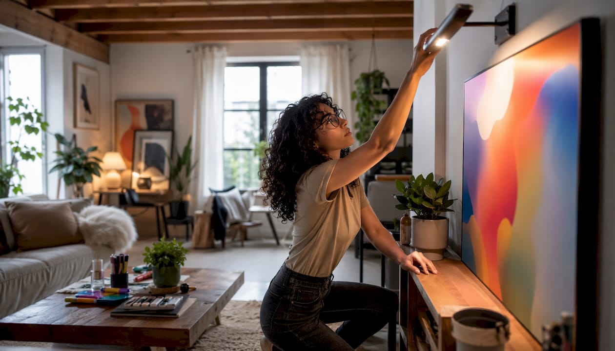
Overhead ambient lighting rarely does art any favors. Picture lights, adjustable track lighting, or directional spotlights aimed at a 30-degree angle from the wall bring out texture, depth, and color in ways that flat ceiling light simply cannot. Warm-toned bulbs (around 2700K–3000K) suit most art, especially works with earthy or warm palettes. Cooler light works better for photography and high-contrast black-and-white pieces.
Pro Tip: Avoid placing art in direct sunlight. UV exposure fades pigments over time, even in prints marketed as fade-resistant. If a sunny wall is your only option, use UV-filtering glass or acrylic in the frame.
7. Choose Perspex over glass for safety and practicality
Perspex framing is lighter and safer than standard glass, particularly for artwork hung above beds, sofas, or anywhere people spend time directly beneath a piece. It offers comparable optical clarity without the shatter risk. For large-format works, the weight difference alone makes installation significantly easier.
8. Express your own taste over current trends
Trends in interior art cycle quickly. What reads as current in 2026 may feel dated by 2028. The pieces that age best in a home are the ones chosen for personal resonance rather than trend alignment. Buy what genuinely moves you, and the styling will feel authentic rather than assembled.
9. Layer and group artworks for a richer story
Single pieces make statements. Groups tell stories. When arranging a gallery wall or a shelf display, vary the sizes, frame finishes, and orientations rather than lining up identical frames in a grid. Mix a large anchor piece with smaller works, and let some overlap slightly in subject matter or palette to create visual conversation.
Pro Tip: Before committing to nail holes, lay your arrangement on the floor and live with it for a day. What looks balanced in your head often needs adjustment once you see it at scale.
10. Consider the room’s function when selecting subject matter
A bedroom calls for art that feels restful: soft abstracts, muted landscapes, or gentle organic forms. A home office benefits from pieces that feel focused or energizing without being distracting. A dining room can handle bolder, more complex works because people spend time sitting and looking rather than moving through. The subject matter and energy of a piece should match how you actually use the space.
What defines an artist’s style? The six core qualities
Understanding what makes an artist’s style distinct gives you a real advantage when selecting and mixing art. Style is an artist’s unique visual voice, the consistent set of choices that makes their work instantly recognizable across different subjects and periods. Six qualities define that voice.
Elements and principles of art
Every artist works with the same raw materials: line, shape, form, value, color, texture, and space. What differs is how they weight and combine them. A painter who favors strong diagonal lines and high contrast creates a very different visual experience from one who works with soft curves and low-contrast gradients. When you recognize which elements dominate an artist’s work, you can predict how their pieces will interact with your space.
Medium
Oil paint, watercolor, acrylic, charcoal, photography, digital print, and mixed media each carry their own visual and tactile qualities. Oil paintings tend to feel rich and layered; watercolors feel light and atmospheric; acrylics can go either way depending on application. Medium affects not just how a piece looks but how it reads in different lighting conditions and at different scales.
Technique
Technique is how an artist handles their medium. Impasto painting, where paint is applied thickly enough to create physical texture, reads very differently from smooth, blended glazing. Pointillism builds images from discrete dots of color. Gestural brushwork carries energy and movement. Recognizing technique helps you anticipate how a piece will feel in a room, not just how it will look in a photograph.
Composition
Composition is the arrangement of visual elements within the frame. Symmetrical compositions feel formal and stable; asymmetrical ones feel dynamic and modern. Artists who consistently use a lot of negative space create work that breathes; those who fill the frame create density and intensity. A room’s existing energy should inform which compositional approach you bring into it.
Motifs
Motifs are the recurring subjects, symbols, or forms that appear across an artist’s body of work. Botanical forms, geometric patterns, human figures, architectural fragments, and abstract organic shapes are all examples. When you know an artist’s motifs, you can build a cohesive collection without every piece being identical. Two works by the same artist, one featuring a floral motif and one featuring a geometric grid, can still feel unified because the underlying visual language is the same.
Color palette
An artist’s characteristic palette is often the most immediately recognizable element of their style. Some artists work within a narrow, tightly controlled range of tones; others use broad, high-contrast palettes. When mixing art from different artists in one space, shared palette relationships matter more than shared subject matter. Two pieces from entirely different artists can coexist beautifully if both favor warm, muted earth tones.
Pro Tip: When building a collection, prioritize palette coherence over stylistic uniformity. A room with three pieces from three different artists, all working in cool blues and warm neutrals, will feel more cohesive than three pieces by the same artist in clashing color families.
A brief history of style in visual arts
Style in visual art) refers to the set of identifiable characteristics that link a work to a particular artist, period, school, or cultural movement. It is both a descriptive and analytical tool: art historians use it to date and attribute works, while collectors and decorators use it to understand what they are looking at and how different pieces might relate to each other.
Style evolves. What reads as radical in one era becomes the established norm in the next, and movements often define themselves in opposition to what came before. Here is a condensed timeline of the major shifts:
| Period | Style or Movement | Key Characteristics |
|---|---|---|
| Renaissance | Renaissance | Realism, perspective, classical subjects, balanced composition |
| 17th century | Baroque | Drama, movement, strong light-dark contrast (chiaroscuro) |
| Late 18th century | Neoclassicism | Restraint, classical antiquity, clean lines |
| Early 19th century | Romanticism | Emotion, nature, the sublime, individual expression |
| — | Impressionism | Light, color, loose brushwork, everyday subjects |
| — | Post-Impressionism | Personal expression, structure, symbolic color (Cézanne, Van Gogh) |
| Early 20th century | Cubism | Multiple perspectives, fragmented forms, geometric abstraction |
| — | Abstract Expressionism (precursors) | Pure form and color, non-representational imagery |
| — | Abstract Expressionism | Gestural painting, emotional directness, large scale |
| — | Pop Art | Mass culture imagery, bold color, flat graphic style |
| — | Contemporary / Neo-Expressionism | Diverse media, personal narrative, global cultural references |
Knowing where a piece fits historically changes how you use it in a room. A Baroque-influenced work with deep shadows and dramatic contrast creates a very different atmosphere from a Impressionist-inspired piece built on soft, diffused light. Both can work beautifully in a home, but they call for different supporting decor.
A few style categories and their natural interior affinities:
- Abstract and geometric: Works well in modern, minimal interiors; pairs naturally with clean-lined furniture and neutral palettes.
- Impressionist and painterly: Suits traditional and transitional spaces; softens rooms with hard architectural details.
- Pop Art and graphic: Energizes contemporary spaces; works particularly well in kitchens, home offices, and creative studios.
- Botanical and organic: Versatile across styles; brings warmth and life to almost any room.
- Photography and documentary: Grounds a space in reality; adds intellectual weight and personal narrative.
Understanding color psychology alongside art history gives you a fuller picture of why certain pieces feel right in certain rooms. Color carries emotional associations that operate independently of subject matter, and a piece’s palette can shift a room’s mood as powerfully as its imagery.
What separates professional art styling from amateur decorating
The gap between a room that looks styled and one that just looks decorated usually comes down to a few specific decisions, not the price of the art.
Professional stylists build a visual narrative
A professional stylist treats art as part of an argument about a room’s mood and purpose. Each piece contributes to a visual narrative that guides how a visitor experiences the space. The art does not just fill walls; it sets a sequence of emotional responses. An amateur approach tends to place art reactively, filling gaps rather than building a story.
Layering changes everything
Styling decisions like combination, casting, framing, and layering create multiple visual narratives from the same art piece. Layering, specifically, alters the perceived formality and visual weight of a composition. A single large canvas reads as a statement; that same canvas flanked by two smaller works at different heights reads as a curated collection. Add a shelf with objects in front of it, and the whole arrangement gains depth and dimension that a flat wall arrangement cannot achieve.
- Combination: Which pieces appear together and how they relate in subject, palette, or scale.
- Casting: The cultural or emotional register a piece is placed in, shaped by surrounding decor and context.
- Framing: How the physical frame, or lack of one, affects the perceived formality and finish of a piece.
- Layering: The depth created by placing objects, furniture, or other art in front of or around a primary piece.
Avoiding the over-matched room
One of the most common amateur mistakes is coordinating art too closely to the room’s existing palette and theme. When every element matches, the room reads as flat. Professional stylists introduce deliberate contrast: a rough-textured piece in a polished room, a bold color in an otherwise neutral space, or an unexpected subject in a room full of pattern. The contrast creates visual interest and makes the art feel chosen rather than purchased to fill a space.
Framing choices signal intent
The frame around a piece communicates as much as the piece itself. A raw wood float frame signals a relaxed, contemporary sensibility. A gilded ornate frame signals formality and historical reference. A frameless canvas or a piece mounted directly on aluminum signals a modern, gallery-like approach. Mixing frame styles intentionally, rather than defaulting to whatever the art came with, is one of the clearest markers of a considered approach to styling.
Pro Tip: When layering a gallery wall, start with the largest piece slightly off-center rather than dead center. Off-center anchors create more dynamic arrangements and give you more flexibility to add pieces asymmetrically as your collection grows.
Put your styling knowledge to work
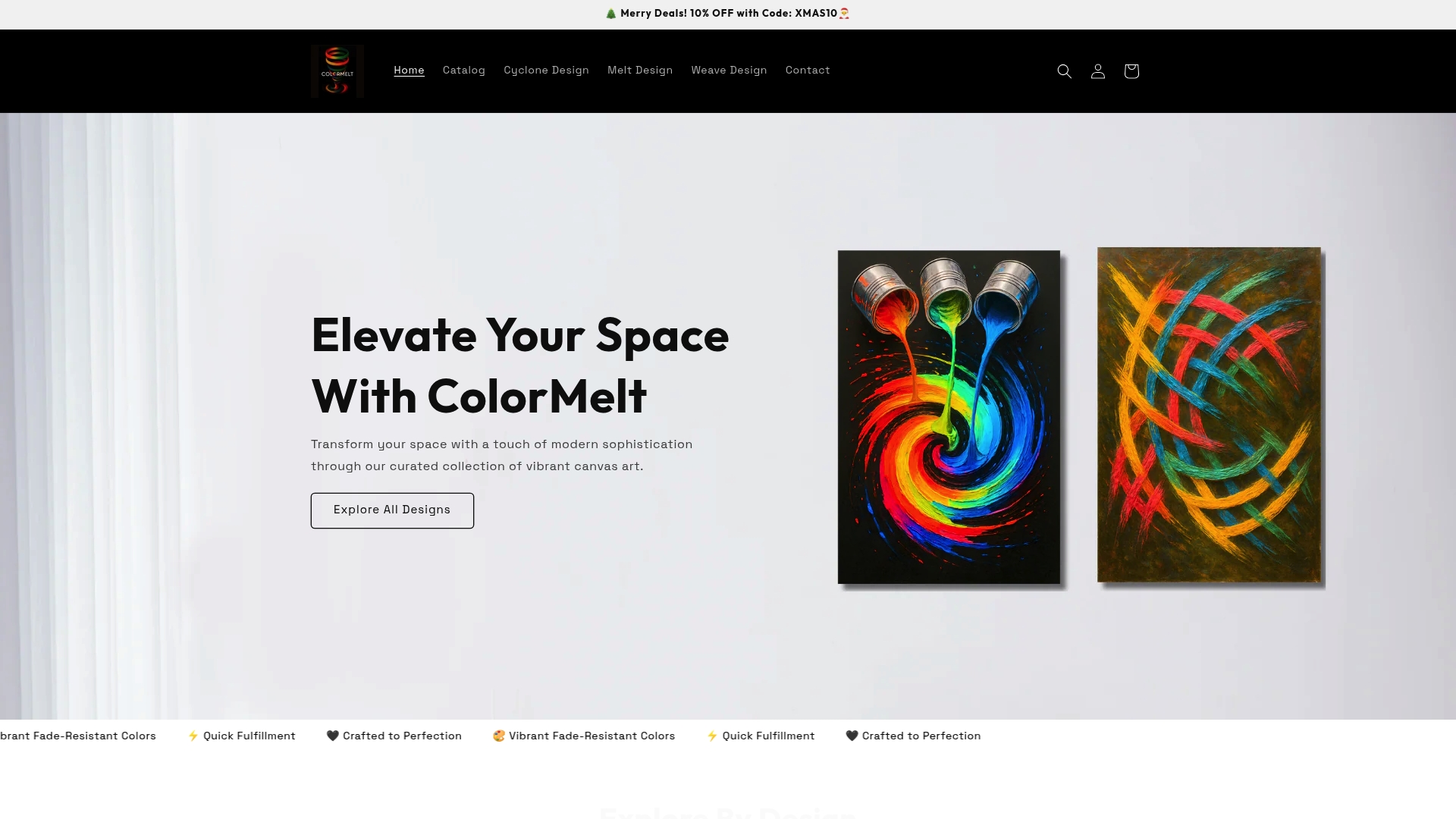
Understanding the principles behind art styling is one thing. Applying them with pieces you genuinely love is where it gets satisfying. Colormelt’s wall art collection is built specifically for people who want to style their spaces with intention, featuring vibrant abstracts, weave patterns, cyclone designs, and framed canvas prints that bring the color-forward energy this kind of styling calls for. Every piece uses fade-resistant inks and is crafted to hold its visual impact over time, not just in the first week on the wall.
If you are ready to build around a hero piece, the Melt Design framed canvas is a strong starting point. Its layered color gradients give you a rich palette to pull from across an entire room. For something with more graphic energy, the Weave Design framed print brings structured movement and bold contrast that works particularly well in modern and contemporary spaces.
Key Takeaways
Styling with art works best when you treat each piece as part of a deliberate visual argument, not just decoration placed to fill empty wall space.
| Point | Details |
|---|---|
| Art styling goes beyond decoration | Deliberate curation of art adds emotional depth, color narrative, and personality that structural design alone cannot provide. |
| Scale and placement drive impact | Artwork should fill an appropriate portion of the wall width it occupies, with placement height centered around average eye level. |
| Six qualities define an artist’s style | Elements and principles, medium, technique, composition, motifs, and color palette together form an artist’s recognizable visual voice. |
| Tonal coherence beats exact matching | Connecting pieces through shared tonal families creates a more personal, lively space than coordinating art directly to existing decor. |
| Layering builds visual narrative | Combining, framing, and layering art pieces creates depth and a richer story than any single standalone piece can achieve. |