
Why Decorate with Prints: Transform Your Home and Mood
Most people hang art because a wall looks bare. That thinking sells prints short. The real reason to decorate with prints goes much deeper than filling empty space. Research now shows that the right wall art can reduce anxiety and depression measurably over time, influence how calm or energized you feel in a room, and give your home a sense of identity that paint color alone never could. If you’ve been treating prints as an afterthought, this article will change that.
Table of Contents
- Key takeaways
- Why decorate with prints: the science behind the choice
- Design principles for using prints effectively
- Print types and styles that enhance your space
- Practical tips for decorating with prints
- Common mistakes to avoid
- My take: prints changed how my home feels, not just looks
- Find prints that do more than fill your walls
- FAQ
Key takeaways
| Point | Details |
|---|---|
| Prints support mental health | Biophilic and nature-based art can reduce anxiety and depression symptoms with consistent exposure. |
| Restraint beats coverage | Leaving negative space around a statement print creates more visual impact than covering every wall. |
| Style and content both matter | The subject, shape, and color of a print all influence your emotional response to the room. |
| Personality drives selection | Choosing prints with personal meaning creates a home that feels genuinely yours, not staged. |
| Avoid common pitfalls | Poor sizing, placement, and lack of design coherence are the fastest ways to undermine your decor. |
Why decorate with prints: the science behind the choice
There is a growing body of research that reframes wall art not as decoration but as a tool for wellbeing. A longitudinal study following 300 urban residents found that biophilic art environments accounted for 67% of depression symptom improvement and 72% of anxiety symptom reduction over 12 months. Those numbers are striking. They suggest that what you hang on your wall is doing something to your nervous system every single day.
The mechanism behind this is called attention restoration theory. When your brain encounters imagery with what researchers call “soft fascination,” which includes open skies, flowing water, and natural landscapes, it shifts into a restorative state rather than staying in the high-alert mode that most modern environments trigger. You are not consciously aware this is happening. You just feel less tired, less tense, and more at ease in that room.
Color plays a direct role here too. Cooling tones like blues and greens are consistently linked to calmer emotional states, while warmer and bolder tones bring energy and stimulation. A bedroom print dominated by deep teal and gray will read very differently to your body than a vibrant orange abstract in the same spot. Neither choice is wrong. Both choices have consequences you should make deliberately.
Shape matters more than most people realize. Research on green wall environments found that curvilinear forms improved relaxation and reduced fatigue more effectively than angular, linear compositions. Soft curves in a print feel less demanding on your visual system. That’s worth factoring in when you’re choosing between a geometric abstract and a flowing floral design.
“Well-chosen naturalistic prints with depth and perspective engage soft fascination, which gently restores cognitive function and reduces mental fatigue.” — Art of Healthy Living
Pro Tip: When decorating a bedroom or reading nook, prioritize prints with curved compositions, open natural scenes, or soft color gradients. These create a background that your brain finds genuinely restful rather than stimulating.
Design principles for using prints effectively
Knowing that prints are good for you is only half the equation. Knowing how to use prints in decor without creating visual chaos is where most people struggle. The single most common mistake is treating every empty wall as a problem to solve.
Interior design guidance is consistent on this point: overfilling walls with artwork diminishes the impact of each piece and creates something designers call “gallery fatigue.” When everything competes for attention, nothing wins. Your eye gets tired, the room feels crowded, and the prints you actually love stop registering.
The case for restraint
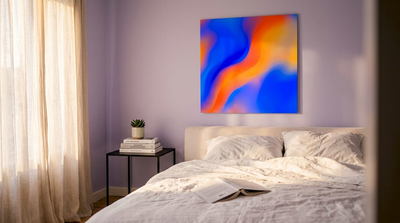
One large, well-chosen piece on a wall will almost always create a stronger impression than three smaller pieces arranged around the same space. Scale matters because it signals confidence. A single canvas that commands a wall tells visitors this print was chosen with intention. A collection of small frames crammed together tends to read as indecision, even when the individual pieces are beautiful.
Leaving negative space around your art is not wasted wall. It is the breathing room that lets a statement piece actually speak. Architectural features like doorframes, molding, and windows are part of your wall’s visual composition too. Working with them rather than papering over them produces rooms that feel designed rather than decorated.
Here are the core principles to guide your placement decisions:
- Hang at eye level. The center of most prints should sit around 57 to 60 inches from the floor. Going higher is one of the most common and easiest mistakes to fix.
- Match scale to furniture. Art above a sofa should span roughly two thirds of the sofa’s width. Too small and it floats; too large and it overwhelms.
- Create a clear focal point. Each room needs one visual anchor. Pick your strongest print for that role and build the rest of the space around it.
- Respect the room’s purpose. Energetic, bold prints suit a home office or kitchen. Soft, calm imagery suits a bedroom or meditation corner.
Pro Tip: Before you put a nail in the wall, tape the print’s dimensions with painter’s tape directly onto the wall and live with it for a day. You’ll immediately see if the scale and position work for the room.
Print types and styles that enhance your space
Not all prints are created equal when it comes to the advantages of prints in home design. The content, style, and medium all interact with your room in different ways, and getting this right is what separates a home that feels cohesive from one that feels assembled.
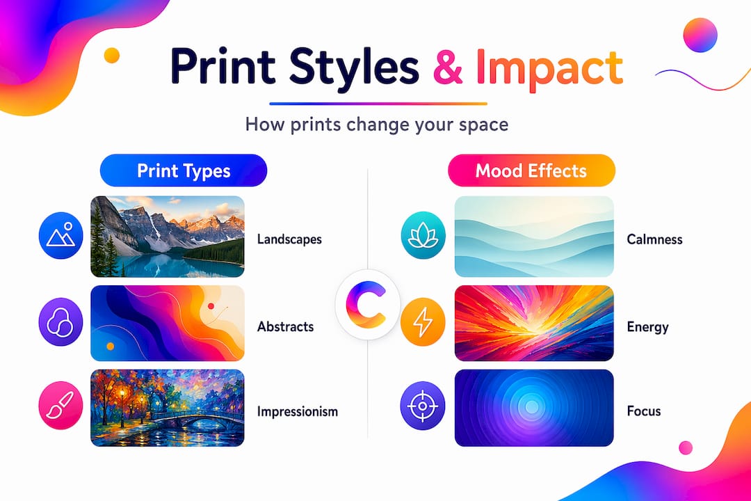
Here’s a quick comparison of the most popular print styles and where they tend to work best:
| Print style | Best for | Emotional effect | Works with |
|---|---|---|---|
| Photographic landscapes | Bedrooms, living rooms | Calming, restorative | Neutral, minimalist interiors |
| Abstract color fields | Living rooms, offices | Energizing, expressive | Modern and contemporary spaces |
| Fine art reproductions | Study, dining room | Refined, stimulating | Traditional and eclectic styles |
| Botanical and floral | Any room | Soft, cheerful | Scandinavian, boho, and farmhouse |
| Geometric patterns | Kitchen, hallway | Ordered, focused | Industrial and modern spaces |
Research using EEG and emotional state modeling found that Impressionistic and Romanticism paintings are consistently preferred in modern and Nordic interiors, particularly by younger audiences. This does not mean you need to hang classical oil paintings. It means that expressive, emotionally resonant imagery outperforms cold or purely decorative patterns in spaces designed for living and relaxing.
Art with naturalistic depth including open horizons, water, and layered natural scenes consistently supports attention restoration. If your goal is a home that genuinely helps you decompress, lean toward prints where your eye can travel into the image rather than bounce off a flat, busy surface.
You can explore different print types and formats to understand how canvas, acrylic, wood, and framed options each interact with light and room atmosphere differently.
Practical tips for decorating with prints
The benefits of wall prints only fully show up when your selection reflects your actual life, not a showroom version of it. Here is a practical sequence for putting it all together:
-
Start with one room. Pick the space where you spend the most time and make that your focus. A single well-decorated room teaches you more about your taste than spreading effort across the whole house.
-
Identify your dominant color story. Pull two or three colors already present in the room through furniture, rugs, or curtains. The prints you choose should echo at least one of those tones to feel intentional rather than random.
-
Choose one statement piece first. Before you think about groupings or galleries, find the one print that genuinely stops you. Build from that. Everything else should support it, not compete with it.
-
Mix formats for a gallery wall. If you want to group prints, vary the sizes and orientations but keep a consistent color palette or framing style to hold the arrangement together visually.
-
Use prints to shape perception. Vertical prints draw the eye upward and make ceilings feel higher. Horizontal prints stretch the eye sideways and make narrow rooms feel wider. Positioning is not just aesthetic. It’s spatial.
-
Refresh without renovating. One of the greatest advantages of prints in home design is that swapping a print costs a fraction of repainting or redecorating. Seasonal changes, new moods, or evolving taste can all be addressed with a new piece rather than a renovation project.
Common mistakes to avoid
Decorating with art prints is forgiving, but a few habits consistently produce disappointing results. Watch out for these:
- Hanging art too high. This is the most universal mistake in home decorating. When art floats near the ceiling, it disconnects from the furniture and the people in the room.
- Choosing prints only for color. Color matters, but a print that has no meaning or resonance to you will start to feel like wallpaper within weeks.
- Ignoring the room’s light. A dark, moody print in a poorly lit hallway disappears. A bright, vibrant piece in a sun-drenched room can feel overwhelming. Consider how natural and artificial light hit the wall at different times of day.
- Buying without a plan. Impulse purchases lead to a collection of unrelated prints with no visual coherence. Before buying, ask yourself where exactly this piece will live and what it will sit next to.
- Overcrowding out of fear of emptiness. An empty wall is not a failure. Negative space in decor is a design choice that amplifies the pieces you do display.
My take: prints changed how my home feels, not just looks
I spent years treating wall art as the last item on the decorating checklist. Something you add after the furniture is placed and the paint is dry. That approach meant I ended up with prints that looked fine but meant nothing, and rooms that were comfortable without ever feeling like mine.
What changed my thinking was reading about how art functions physiologically, not just visually. Understanding that the imagery, color, and composition of what I hang on my walls is actively influencing my mood and cognitive recovery made me stop treating print selection as trivial.
I replaced a busy gallery wall in my living room with one large landscape print. The room immediately felt quieter. Not because anything structural changed, but because my eyes had one place to land instead of thirty. The mental load of that room dropped noticeably.
The lesson I keep coming back to is this: restraint is a form of generosity. When you give one print the room to breathe, you give yourself the room to actually see it. Choosing prints with intention rather than convenience is one of the smallest changes you can make to your home that produces an outsized return on how the space actually feels to live in. I encourage you to explore art at home with that mindset before your next purchase.
— Shlomo
Find prints that do more than fill your walls
If this has you thinking differently about your walls, Colormelt’s curated collection is a strong place to start. Every piece is designed with color contrast and emotional impact in mind, from bold abstract cyclone prints to intricate weave patterns that give the eye something genuinely satisfying to rest on.
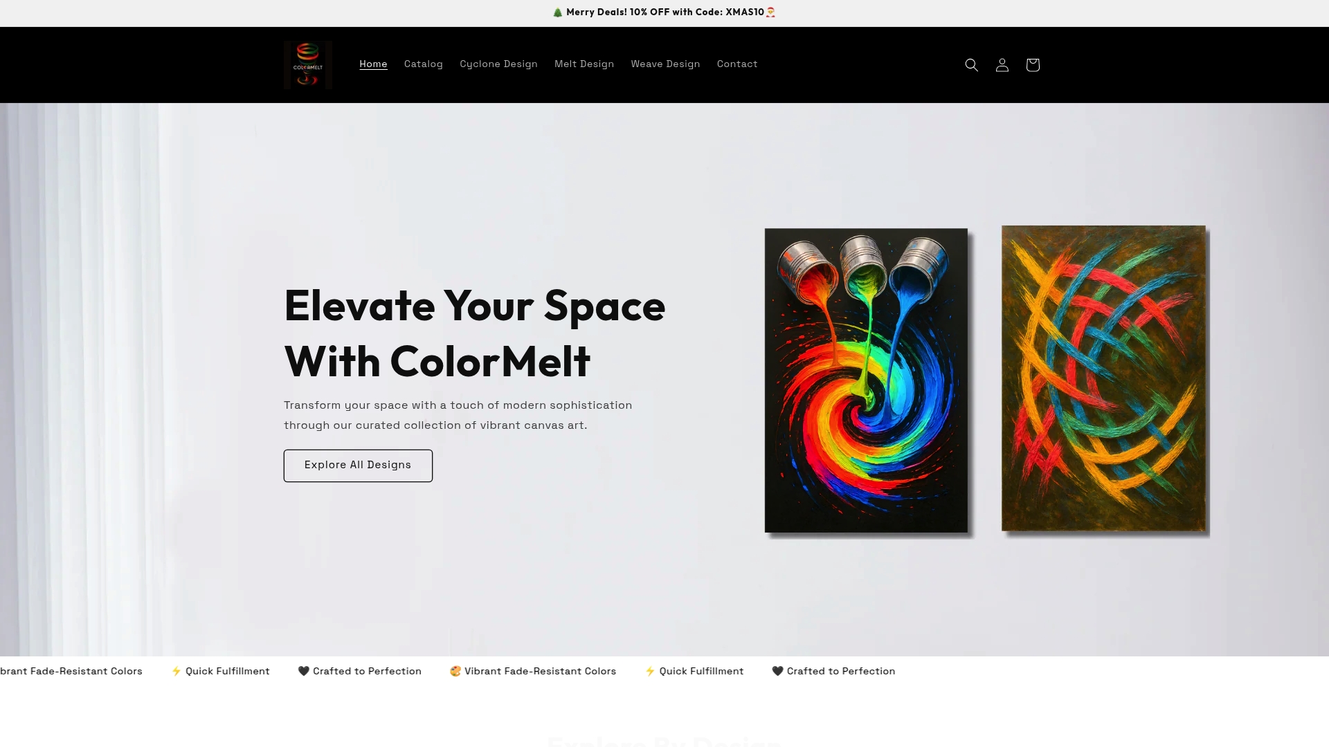
Colormelt ships wall art prints in canvas, acrylic, wood, and framed formats, all with fade-resistant colors and fast fulfillment. Whether you’re building a statement focal point or finding the one piece that finally makes a room feel complete, the collection covers a wide range of moods and interior styles. Browse the full range and see what speaks to you, because the right print for your space is one you respond to immediately.
FAQ
Why decorate with prints instead of painted walls?
Prints let you change the mood, color story, and personality of a room without permanent commitment. They are also far more affordable to update as your taste evolves.
What prints are best for reducing stress?
Natural landscapes and soft imagery with open skies, water, and curved forms are consistently shown to support relaxation and attention restoration. Cool color palettes in blues and greens reinforce that calming effect.
How many prints should I hang in one room?
Quality over quantity. One or two well-chosen, correctly scaled prints will create more impact than a wall covered with smaller pieces. Negative space is part of the design, not a gap to fill.
Does the style of a print affect my mood?
Yes. EEG studies on art preferences show that expressive and Impressionistic styles generate stronger positive emotional responses in modern interiors compared to purely decorative or highly geometric work.
Where should I hang prints for the best visual impact?
Hang prints so the center of the piece sits at roughly 57 to 60 inches from the floor, and match the width of the art to the furniture below it. Use intentional scale and placement to create a focal point rather than scattering smaller pieces across the wall.