
What Is a Vibrant Color Palette? Your 2026 Guide
A vibrant color palette is defined as a curated set of colors with high saturation, chroma, and intensity that produce bold, energetic visual effects. These palettes stand apart from muted or pastel schemes by maximizing brightness rather than softening it. Whether you are decorating a living room, designing a brand identity, or creating digital content, understanding how vibrant palettes work gives you a real advantage. The industry term for this quality is chroma, and it is the measurable backbone behind every electric, eye-catching color combination you have ever admired.
What technical factors define a vibrant color palette?
A vibrant color palette uses high chroma and saturation to create colors that feel pure, electric, and alive. Chroma measures how far a color sits from gray on the color wheel. Saturation describes the intensity of that color within a given brightness level. The two are related but not identical, and confusing them leads to design mistakes.
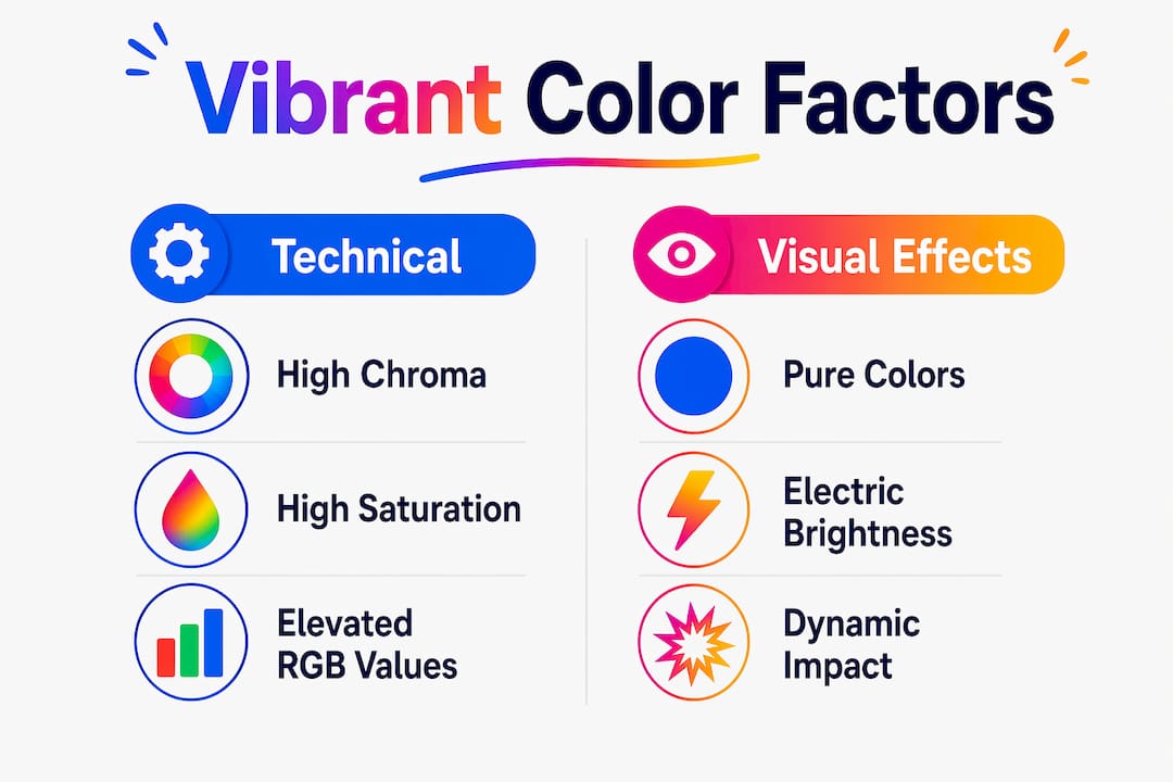
RGB values are a practical way to identify vibrant colors in digital work. Vibrant palettes typically feature RGB values above 200 in at least one channel, producing colors that feel luminous on screen. A fire-engine red, for example, might read as RGB (255, 30, 30), while a muted brick red sits closer to RGB (160, 80, 70). That gap in numbers translates directly to a gap in visual punch.

Vibrancy differs from mathematical saturation in a critical way. Saturation is a fixed measurement; vibrancy is a perceptual quality, the sense of “life” a color carries in context. Increasing saturation globally across an image can cause clipping, where colors blow out and lose detail. Adjusting vibrancy selectively protects highlights while still boosting the colors that need energy. This distinction matters most in photography editing, print production, and digital UI design.
| Palette type | Saturation level | Typical RGB profile | Visual effect |
|---|---|---|---|
| Vibrant | Very high | One channel often above 200 | Bold, energetic, attention-grabbing |
| Pastel | Low to medium | All channels above 180, near white | Soft, airy, gentle |
| Muted | Low | Channels compressed toward gray | Calm, sophisticated, subdued |
Pro Tip: When building a vibrant palette for print, always proof on the actual substrate. Ink on uncoated paper absorbs light and drops perceived chroma by a noticeable margin compared to a screen preview.
How do design experts recommend using vibrant colors effectively?
The 60-30-10 rule is the most reliable framework for applying vibrant colors without chaos. It distributes color as 60% neutral base, 30% secondary color, and 10% vibrant accent. This proportion keeps the eye moving without overwhelming it. A white room with gray furniture and a single cobalt blue armchair is a textbook example of the rule working perfectly.
Designers recommend limiting a palette to 2–3 bright colors to maintain professional cohesion. Each additional vibrant hue competes for attention and dilutes the impact of the others. Think of vibrant colors as focal points, not wallpaper. One dominant accent, one supporting accent, and a neutral field is the structure behind most successful bold color schemes.
Vibrant colors also carry psychological weight. They attract attention, signal energy, and convey confidence. Youth-focused and tech brands use vibrant palettes specifically to communicate vitality and forward momentum. That same psychological pull works in interior design, where a single vivid painting or a bright rug can shift the entire emotional tone of a room.
Common mistakes to avoid when working with vibrant color combinations:
- Applying vibrant colors to large background areas, which causes visual fatigue
- Pairing two equally saturated complementary colors at full intensity without a neutral buffer
- Ignoring how artificial lighting shifts color perception after dark
- Skipping color blindness testing, which affects roughly 8% of men and 0.5% of women
- Choosing vibrant colors in isolation on a screen without testing them in the actual physical space
Pro Tip: Place a vibrant color directly adjacent to a neutral like warm white or soft gray. That push-pull visual dynamic makes the vibrant hue appear even more intense without adding a single extra color to the palette.
What are the main applications of vibrant palettes in design and art?
Interior design is where vibrant palettes have the most immediate real-world impact. Vibrant colors work best as focal colors in furniture, artwork, or rugs, balanced against neutral walls and floors. A deep emerald green sofa against an off-white wall reads as sophisticated. The same sofa against a terracotta wall reads as adventurous. The neutral field changes the story the vibrant color tells. Knowing this gives you real control over how a space feels.
Textured art adds a dimension that flat color cannot. Textured vibrant art creates physical depth and emotional resonance, anchoring a room in a way that a plain painted wall cannot replicate. Abstract canvas prints with raised brushwork, for example, catch light differently throughout the day. That shifting quality keeps the piece visually active. Colormelt’s vibrant wall art collection uses this principle across its abstract, weave, and cyclone designs.
Digital content creation follows similar rules but with medium-specific considerations. UI designers use vibrant accents on call-to-action buttons, progress bars, and notification badges because high chroma draws the eye to the most important element on screen. Brand identities built on vibrant color schemes are easier to recognize at small sizes and in low-attention environments like social media feeds.
Surface finish is a factor most people overlook. Glossy finishes amplify light reflection, making colors appear more vivid. Matte finishes absorb light and soften intensity. This means you can adjust the perceived vibrancy of a piece without changing the palette at all. A vibrant floral print on glossy acrylic will read more intensely than the same print on a matte canvas. Choosing the right finish is as much a design decision as choosing the colors themselves.
Key application areas for bold color palettes:
- Interior design: Accent walls, statement furniture, and art pieces paired with neutral surroundings
- Fine art and canvas prints: Focal point paintings that anchor a room’s color story
- Digital UI: High-chroma buttons, icons, and brand marks that guide user attention
- Brand identity: Consistent vibrant color schemes that build recognition across print and digital media
- Textile and product design: Vibrant patterns on rugs, cushions, and ceramics that introduce energy without structural change
What practical steps help you create a vibrant palette that works?
Creating a vibrant palette that holds together requires a structured process. Improvising with bright colors rarely produces a result that feels intentional. Most effective vibrant palettes contain 3–5 colors built on triadic or tetradic color theory principles. Triadic palettes use three colors evenly spaced on the color wheel. Tetradic palettes use four, forming a rectangle. Both structures provide built-in variety while keeping the palette coherent.
Follow these steps to build and refine a vibrant palette:
- Start with one anchor color. Choose the vibrant hue that best represents the mood or brand you want to communicate. This becomes your dominant accent.
- Apply a color theory structure. Use a triadic or tetradic arrangement to select 2–4 supporting colors. This prevents random combinations that clash.
- Add at least two neutrals. Warm white, soft gray, or natural beige give the eye a place to rest. Neutrals covering 60% or more of the space let vibrant accents breathe.
- Test across mediums. View the palette on screen, in print, and in the physical space where it will be used. Colors shift between mediums, and what works on a monitor may disappoint on paper.
- Check for accessibility. Run the palette through a color blindness simulator. Red-green combinations are the most common problem area.
- Adjust finish, not just color. If a color reads too intense in a physical space, switch from glossy to matte before changing the hue itself.
- Live with it briefly before committing. Paint a large swatch on the wall or print a full-size proof. Lighting changes throughout the day, and a color that looks perfect at noon may feel wrong at dusk.
Pairing vibrant hues with neutrals is not a compromise. It is the technique that makes the vibrant colors work. Vibrants function best as focal points complemented by muted or neutral backgrounds. The neutral field is what gives the vibrant color its power.
Key Takeaways
A vibrant color palette delivers maximum visual impact only when high-chroma colors are paired with neutrals, limited to 2–5 hues, and applied with the 60-30-10 rule.
| Point | Details |
|---|---|
| Define vibrancy by chroma | Vibrant palettes use high chroma and RGB values above 200 to create electric, pure colors. |
| Limit the palette size | Use 2–5 vibrant colors maximum; more than that creates visual imbalance and dilutes impact. |
| Apply the 60-30-10 rule | Distribute color as 60% neutral, 30% secondary, and 10% vibrant accent for visual comfort. |
| Finish affects perceived vibrancy | Glossy surfaces amplify color intensity; matte finishes soften it without changing the palette. |
| Test before committing | Check the palette across mediums, lighting conditions, and for color blindness compatibility. |
Why restraint is the real secret to vibrant color
Most people approach vibrant palettes with the wrong instinct. They assume more color equals more impact. The opposite is true. The most striking rooms I have seen use a single vibrant piece, one painting or one piece of furniture, against a carefully controlled neutral field. The vibrant element earns its power from the quiet around it.
The 2026 cultural shift toward expressive, joyful interiors is real. People want color after years of gray-on-gray minimalism. But the designers executing this shift well are not throwing every bright hue at the wall. They are choosing one or two colors with intention and letting those colors do the work. That discipline is what separates a space that feels alive from one that feels exhausting.
The difference between saturation and vibrancy is also worth internalizing. Saturation is a dial you can turn up. Vibrancy is a relationship between colors and their context. A cobalt blue next to warm white reads as vibrant. The same cobalt next to bright yellow reads as competitive. Context creates vibrancy as much as the color itself does. Once you understand that, you stop chasing brighter colors and start building smarter combinations. Explore how to style colorful wall decor if you want to see this principle applied to real interiors.
— Shlomo
Colormelt’s wall art collection for vibrant color inspiration
Colormelt curates wall art built around the same principles this article covers: high-chroma color, intentional palette structure, and finishes chosen to maximize visual impact.
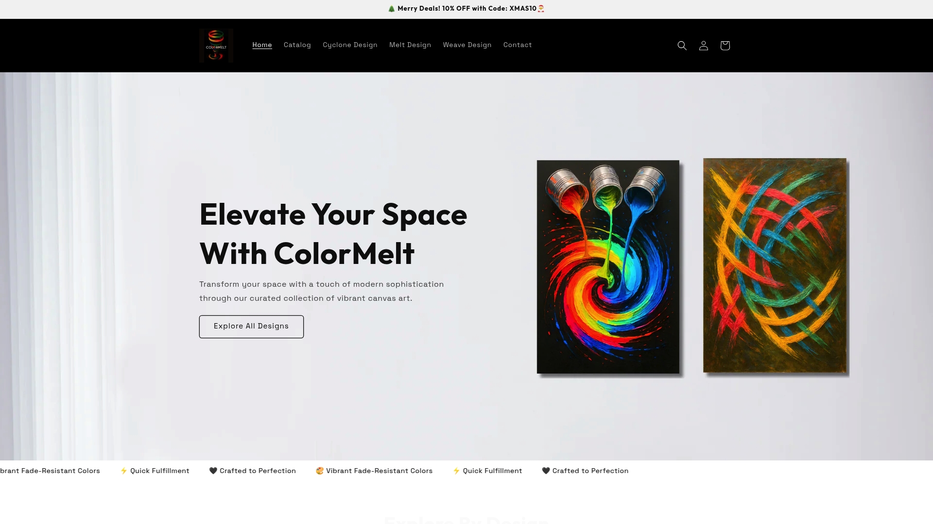
Every piece in the wall art collection uses fade-resistant colors, so the vibrancy you see on day one holds over time. The abstract, weave, cyclone, and floral designs each demonstrate how a single bold piece anchors a neutral room without overwhelming it. If you want to see what a professionally curated vibrant palette looks like in a physical format, the collection is a practical starting point. Colormelt also offers canvas, acrylic, and wood print formats, so you can match the finish to the intensity level your space needs.
FAQ
What is a vibrant color palette in simple terms?
A vibrant color palette is a set of colors with high saturation and brightness that create bold, energetic visual effects. These palettes use high chroma values to produce colors that feel electric and alive rather than soft or muted.
How many colors should a vibrant palette contain?
Most effective vibrant palettes contain 3–5 colors, with no more than 2–3 of those being bright accent colors. Limiting the number of vibrant hues prevents visual overload and keeps the palette cohesive.
What is the 60-30-10 rule for vibrant color schemes?
The 60-30-10 rule distributes color as 60% neutral base, 30% secondary color, and 10% vibrant accent. This proportion keeps vibrant colors from overwhelming a space while still delivering strong visual impact.
How does surface finish affect vibrant color palettes?
Glossy finishes amplify light reflection and make colors appear more vivid, while matte finishes soften and ground vibrant hues. Choosing the right finish lets you control perceived intensity without changing the palette itself.
What is the difference between a vibrant and a bold color palette?
Vibrant palettes emphasize high chroma and saturation, producing colors that feel luminous and energetic. Bold palettes prioritize strong contrast and visual weight, which can include deep, dark colors that are not necessarily high in saturation.