

How to Decorate Living Room Walls: 2026 Guide
Decorating living room walls is the single most impactful change you can make to a room without buying new furniture. The difference between a wall that looks finished and one that looks bare comes down to three things: scale, placement, and cohesion. The 57-inch hanging rule, the two-thirds furniture width rule, and consistent frame spacing are the design standards professionals use on every project. Whether you own your home or rent, this guide gives you the exact measurements, layout methods, and damage-free strategies to get it right.
How to decorate living room walls: spacing and sizing rules
The most common wall decorating mistake is hanging art too high. The 57–60 inch rule positions the optical center of any artwork at eye level from the floor. That measurement applies whether you hang a single canvas or an entire gallery wall.
Sizing matters just as much as height. Wall decor above a sofa should span 60–75% of the furniture’s width. A 90-inch sofa calls for art or a gallery arrangement that stretches roughly 54–68 inches wide. Going narrower makes the wall feel disconnected from the furniture below it.
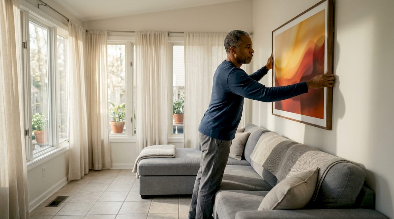
The gap between your art and the top of the sofa also matters. Leave 6–8 inches of space between the top of the sofa back and the bottom of the frame. Less than that and the art looks cramped. More than that and it floats without a visual anchor.
Pro Tip: Measure your sofa width before buying any art. Write the number down and take it with you when shopping. Buying art that is too small is the most expensive mistake in wall decorating.
Spacing and sizing reference
| Measurement | Standard |
|---|---|
| Art center height from floor | 57–60 inches |
| Art width relative to sofa | 60–75% of sofa width |
| Gap between sofa top and frame bottom | 6–8 inches |
| Spacing between gallery frames | 2–3 inches |
| Minimum wall breathing room on each side | 6 inches |
These numbers give you a repeatable framework. Apply them before you pick up a hammer and you will avoid the most common sizing errors.
How do you create a gallery wall that looks intentional?
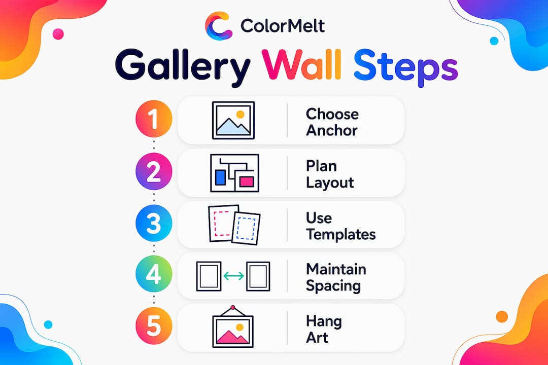
A gallery wall succeeds or fails based on one decision: choosing the right anchor piece. The most common mistake is filling a wall with many small, disconnected pieces. The result looks chaotic rather than curated. Start with one oversized or visually dominant piece and build the arrangement around it.
Three layout styles work consistently well in living rooms. A grid layout uses frames of identical size in even rows. A salon layout mixes sizes and orientations in an organic cluster. A horizontal line layout aligns the tops or centers of frames along a single axis. The grid reads as modern and structured. The salon reads as collected and personal. The horizontal line works well in narrow spaces above a console table or hallway bench.
Paper templates are the single best tool for planning a gallery wall. Trace each frame onto kraft paper, cut it out, and tape the templates to the wall with painter’s tape. You can shift the arrangement freely without making a single nail hole. This step alone saves most homeowners from two or three rounds of patching and repainting.
Pro Tip: Take a photo of your paper template arrangement before you start hanging. If you bump a template out of place mid-install, the photo gives you an exact reference to reset it.
Step-by-step gallery wall assembly
- Choose your anchor piece. Pick the largest or most visually dominant frame in your collection.
- Cut paper templates for every frame and tape them to the wall.
- Adjust the arrangement until the total width aligns with 60–75% of the furniture below.
- Hang the anchor piece first at 57–60 inches from the floor to the optical center.
- Work outward from the anchor, maintaining 2–3 inch spacing between every frame.
- Match frame finishes or repeat one finish at least three times to create visual rhythm.
- Step back and check the arrangement from across the room before driving the final nails.
Consistent spacing is what separates a gallery wall that looks designed from one that looks accidental. Two to three inches between frames is the professional standard. Tighter spacing creates a denser, more graphic look. Wider spacing suits large formal prints.
For more layout ideas, Colormelt’s gallery wall inspiration covers arrangements for rooms of every size.
What alternative wall decor adds texture, function, and light?
Art prints and canvas panels are not your only options. Wall decor that bounces light or adds storage turns a static surface into a functional design element. Mirrors, floating shelves, and textural pieces each serve a distinct purpose beyond decoration.
Textural and sculptural pieces
Woven wall hangings, carved wood panels, and metal sculptures add physical depth to a flat wall. They catch light differently throughout the day, which makes the room feel more alive. Textured art also handles direct sunlight better than glossy prints or framed photographs, reducing fading and the need for UV-protective glazing. If you have a wall that gets strong afternoon sun, a woven or wood piece is a smarter choice than a paper print.
Mirrors and floating shelves
A mirror placed opposite a window reflects natural light and makes the room read as larger. The rule is simple: the mirror should face a light source, not a dark corner or a blank wall. Oversized mirrors work as statement pieces on their own. Smaller mirrors grouped in a cluster function like a gallery wall with the added benefit of light reflection.
Floating shelves styled with groups of three and a 60/40 ratio of decorative to functional objects create a balanced look. That means two decorative objects, like a small sculpture or a trailing plant, for every one functional item, like a book or a candle. More than that and the shelf starts to look like storage rather than decor.
Living room wall decor options by function:
- Light enhancement: Mirrors, metallic-finish art, acrylic prints
- Texture and depth: Woven hangings, carved wood, macramé, canvas with heavy impasto
- Storage and display: Floating shelves, ledge shelves, picture ledges
- Color and pattern: Painted accent walls, removable murals, framed textile art
- Focal point creation: Oversized single canvas, framed triptych, large-format photography
Artwork should relate to the room’s existing palette rather than match it exactly. A piece that picks up one accent color from your throw pillows or rug reads as intentional. A piece that matches your sofa color exactly reads as flat.
What are renter-friendly wall decorating strategies?
Renters have more options than most people realize. Command strips hold frames up to 16 lbs without nails, making them a practical solution for lightweight art and small gallery arrangements. The key to reliable adhesion is surface preparation. Clean the wall with isopropyl alcohol and let it dry completely before applying the strip. Oily or dusty surfaces cause strips to fail regardless of the weight rating.
Leaning large frames against the wall is an underused strategy that looks intentional when done correctly. A large canvas or framed print leaned against the wall on a console table or mantel reads as styled, not lazy. Layer a smaller frame in front of the large one for depth. This approach also makes it easy to swap art seasonally without any hardware.
Removable wall murals and washi tape grids are two more options worth knowing. Removable murals come in large-format panels that peel off cleanly. Washi tape grids let you create geometric patterns directly on the wall using colored tape. Both options work on painted drywall and leave no residue when removed correctly.
Pro Tip: Always check the weight of your frame before choosing a hanging method. Weigh it on a kitchen scale if you are unsure. Command strips are rated by weight, and exceeding that limit is the main reason they fail.
For a complete checklist of damage-free methods, Colormelt’s wall decor checklist covers every surface type and weight category.
Key Takeaways
Effective living room wall decoration requires the 57-inch hanging rule, the two-thirds furniture width rule, and consistent 2–3 inch frame spacing to create a balanced, intentional result.
| Point | Details |
|---|---|
| Use the 57-inch rule | Hang art so its optical center sits 57–60 inches from the floor. |
| Match art width to furniture | Art or gallery arrangements should span 60–75% of the sofa width below. |
| Plan before you hang | Use paper templates to test gallery layouts before driving any nails. |
| Add function with decor | Mirrors, shelves, and textured pieces serve design and practical purposes. |
| Renters have real options | Command strips, leaning art, and removable murals work without wall damage. |
What I’ve learned from decorating walls the wrong way first
The first gallery wall I ever put together had nine frames, three different frame colors, and no anchor piece. It looked like a yard sale. I took it all down and started over with one rule: pick one finish and repeat it at least three times. That single change made the whole arrangement read as designed rather than assembled.
The paper template method sounds tedious until you skip it once and spend a weekend patching holes. I now treat it as non-negotiable. Tape goes up, I live with the arrangement for a day, and I almost always move at least two pieces before I commit. That one day of patience has saved me more time than I can count.
The other lesson I keep relearning is that walls need breathing room. A wall that is 80% covered looks busy. A wall that is 40% covered looks considered. The instinct to fill every inch is strong, especially when you have a collection of art you love. Resist it. White space is not empty. It is what makes the pieces you do hang feel worth looking at.
If you are choosing art for a sun-facing wall, go textured. Canvas, wood prints, and woven pieces hold up to direct light far better than paper prints or photographs. I have seen beautiful framed prints fade noticeably in under two years on a west-facing wall. Colormelt’s fade-resistant canvas prints are worth the consideration if your living room gets strong afternoon sun.
— Shlomo
Wall art for your living room, ready to hang
Knowing the rules is the first step. Finding art that fits them is the second.

Colormelt’s wall art collection includes canvas prints, wood prints, acrylic panels, and framed pieces in abstract, floral, cyclone, and weave designs. Every piece ships with fade-resistant inks and is sized to work with standard spacing and furniture width guidelines. Whether you are building a gallery wall or looking for one oversized statement piece, the collection covers both. Renters will find lightweight options that work with Command strips, and homeowners will find large-format prints sized to anchor a full sofa wall. Browse by format, size, or color palette to find what fits your space.
FAQ
What is the 57-inch rule for hanging wall art?
The 57-inch rule positions the optical center of a piece of art 57–60 inches from the floor, aligning it with average eye level. Apply it to every piece you hang, whether it is a single canvas or the anchor of a gallery wall.
How wide should wall art be above a sofa?
Art or a gallery arrangement above a sofa should span 60–75% of the sofa’s width. For a 90-inch sofa, that means an arrangement roughly 54–68 inches wide.
How do I hang a gallery wall without damaging the wall?
Use paper templates taped with painter’s tape to plan the layout before making any holes. For renters, Command strips rated for the frame’s weight work on clean, dry drywall without leaving damage.
What is the best spacing between frames in a gallery wall?
Maintain 2–3 inches between frames for a standard gallery wall. Tighter spacing creates a denser, graphic look, while slightly wider spacing suits larger or more formal prints.
How do I choose wall art that fits my living room?
Choose art that picks up one color from your existing palette, such as a rug or throw pillow, without matching it exactly. For sun-facing walls, prioritize textured pieces like canvas or wood prints, which handle direct light better than paper prints or photographs.