
Wall Art Trends 2026: Top 10 Styles for Your Home
Wall art trends for 2026 are defined by three forces: biophilic design, tactile mixed-media surfaces, and warm earthy palettes that support wellness-focused interiors. These are not passing fads. They reflect a broader shift in how homeowners think about their walls, treating them as active contributors to mood and comfort rather than blank backdrops. Interior designers are responding by selecting art earlier in the design process, using it to anchor color, texture, and light across an entire room. If you want your home to feel current and cohesive in 2026, these are the trends worth knowing.
1. What are the top wall art trends 2026 homeowners should follow?
The ten trends below cover the full range of 2026 interior design ideas, from nature-inspired prints to AI-influenced digital art. Each one offers a distinct way to update your walls with purpose.
2. Biophilic and botanical prints
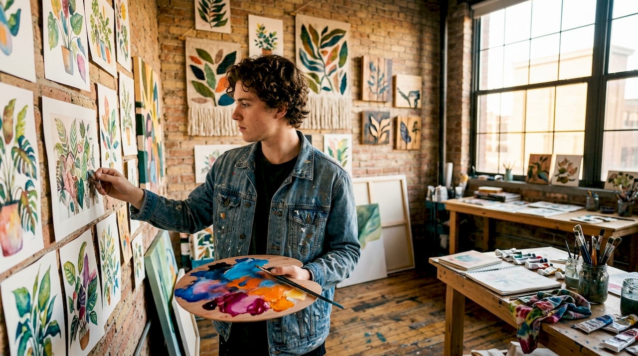
Biophilic design remains a top priority in 2026, with homeowners incorporating preserved moss art and abstract botanical prints to strengthen their connection to nature indoors. The appeal is direct: natural imagery lowers visual stress and makes a room feel alive without requiring actual plants. Abstract leaf forms, pressed botanicals, and moss panels all qualify. For a deeper look at how botanical art works in real interiors, the botanical art style guide from Colormelt covers placement and pairing in practical detail.
3. Tactile and mixed-media surfaces
Three-dimensional textures and materials such as gold leaf, copper leaf, fabric, plexiglass, and layered paper are gaining ground in 2026. Tactile art adds a sensory layer that flat prints cannot replicate. Running your eye across a canvas with raised texture creates depth and visual interest that changes with the light throughout the day. This trend pairs naturally with the earthy palette movement, since warm metallics and rough natural surfaces complement each other without competing.
4. Neutral and earthy color palettes
Warm beiges, soft grays, and greens dominate 2026 wall art color choices, contributing to calming and cohesive interior environments. These tones work because they do not fight with furniture or flooring. They recede slightly, letting the art’s form and texture carry the visual weight. Terracotta, warm sand, and forest green are the specific shades showing up most in curated collections this year.
Pro Tip: When selecting art in earthy tones, bring a fabric swatch or paint chip from your room to compare. Colors shift significantly under store lighting versus natural light at home.
5. Surreal minimalism
Surreal minimalism blends abstract organic forms with subtle texture and a restrained color palette. Think soft, biomorphic shapes rendered in two or three tones on a muted background. The style reads as calm at first glance but rewards closer attention with unexpected curves and layered detail. It suits living rooms and bedrooms equally, since it creates visual interest without demanding attention.
6. Sustainable and eco-friendly materials
Sustainable materials in wall art are increasingly preferred in 2026, reflecting broader environmental awareness in home design. Recycled paper, natural dyes, preserved plant matter, and FSC-certified wood panels are all appearing in mainstream art collections. Beyond the environmental benefit, these materials contribute to healthier indoor air quality. Homeowners who prioritize wellness in their design choices are driving this shift faster than any other demographic.
7. Personalized and customizable wall art
Personalization is moving from novelty to expectation in 2026. Homeowners want art that reflects their specific aesthetic rather than a generic catalog selection. Custom canvas prints, made-to-order color palettes, and commissioned abstract pieces are all accessible at price points that were not available five years ago. The result is walls that feel genuinely personal rather than assembled from a showroom floor.
8. Large-scale statement pieces
Large-scale wall art creates impactful focal points and aligns with both minimalism and gallery wall curation trends. A single oversized canvas in a living room does more visual work than three smaller pieces arranged without intention. The key is proportion: the art should occupy roughly two-thirds of the wall width it anchors. Going too small is the most common mistake homeowners make when buying statement pieces.
9. Metallic accents
Gold and copper leaf details are appearing in abstract and botanical art alike in 2026. Metallics catch light differently at different times of day, which means a piece with copper leaf looks warm and amber in morning light and cooler and more reflective by evening. This dynamic quality makes metallic-accented art feel alive in a way that solid-color prints do not. The trend works best when metallics are used as accents rather than the dominant surface.
10. Digital and AI-influenced art styles
Digital and AI-influenced art forms are emerging as hybrid styles that blend traditional techniques with new technology. These pieces often look painterly or hand-crafted on the surface, with the technology visible only in the precision of the pattern or the complexity of the color gradients. They appeal to homeowners who want a contemporary edge without the cold, clinical feel of purely digital prints.
11. Curated gallery walls
Curated gallery walls that unify furniture, lighting, and color palettes define polished living spaces in 2026. The difference between a gallery wall that works and one that feels cluttered is intention. Every piece should share at least one element with its neighbors, whether that is color family, frame finish, or subject matter. Mixing sizes is encouraged; mixing styles without a unifying thread is not.
How do homeowners choose wall art for 2026 interiors?
Selecting art that actually works in your space requires a process, not just a preference. Interior designer Kit Kemp makes the case clearly: art should not be the finishing touch but rather selected early in the design process to unify furniture, color, and lighting. That single shift in approach changes everything. When art comes first, the rest of the room builds around it with coherence.
- Choose art before finalizing furniture. Art selected after the room is complete tends to feel like an addition rather than an anchor. Pick a piece you love, then build your palette and furnishings around it.
- Live with it before you hang it. Propping artwork against the wall for several days lets you observe how changing natural light affects its colors and mood. A piece that looks perfect in the morning may feel heavy by afternoon.
- Match scale to the wall, not the room. A large room with a small piece of art feels unfinished. Measure the wall space and aim for art that fills it with intention.
- Coordinate color, not match it. Art that exactly matches your sofa color disappears. Choose a piece that shares one or two tones with the room but introduces at least one new element.
- Use texture as a design tool. In rooms with smooth, flat surfaces, a textured canvas or mixed-media piece adds the sensory contrast that makes a space feel complete.
Pro Tip: Photograph your room in natural daylight and use the image to compare potential art pieces before purchasing. Color accuracy on a phone screen in a bright room is far more reliable than in a dimly lit store.
For more guidance on choosing wall art that fits your specific interior, Colormelt’s design resource covers the full decision process in plain terms.
What colors and materials define modern wall decor in 2026?
The palette and material choices of 2026 are not accidental. They reflect a deliberate move toward interiors that feel grounding and sensory rather than slick and minimal.
| Color or Material | Effect on a Room | Best Pairing |
|---|---|---|
| Terracotta | Warm, grounding, earthy | Linen furniture, wood floors |
| Forest green | Calm, nature-connected | White walls, brass fixtures |
| Warm sand | Neutral, airy, versatile | Almost any palette |
| Soft gray | Receding, sophisticated | Bold art, dark wood |
| Gold leaf | Dynamic, light-catching | Muted backgrounds |
| Copper leaf | Warm metallic, shifts with light | Earthy tones, botanical prints |
| Preserved moss | Organic, textural, living quality | Minimalist frames, white walls |
| Plexiglass | Modern, reflective, layered depth | Abstract and digital art styles |
Warm earthy colors support wellness because they mimic the natural environment. Rooms decorated in terracotta and forest green consistently feel more restful than those built around cool grays and stark whites. The best colors for wall art depend on the existing light in your room, but the 2026 palette gives you a wide range of options that work across most interior styles.
Which arrangement styles create polished 2026 interiors?
How you arrange art matters as much as what you choose. Combining wall art with coordinated furniture and lighting improves the harmony of interior spaces and lifts overall design impact.
- Anchor with one large piece. Place your largest, most impactful work first. Everything else in the arrangement should support it, not compete with it.
- Use negative space deliberately. Empty wall space is not wasted space. It gives the eye a place to rest and makes each piece feel more considered.
- Mix dimensions, not chaos. Combine flat prints with textured or three-dimensional pieces for visual variety. Keep frame finishes consistent to hold the arrangement together.
- Align to furniture, not just the wall. Hanging art in relation to a sofa or console table creates a visual unit. Art floating in the middle of a tall wall with no furniture beneath it looks disconnected.
- Test arrangements on the floor first. Lay out your pieces on the floor in the configuration you plan to hang them. Adjust until the balance feels right before putting a single nail in the wall.
Pro Tip: Cut paper templates of each piece and tape them to the wall before hanging. This lets you adjust spacing and height without leaving unnecessary holes.
Key takeaways
The defining characteristic of 2026 wall art is intentionality: every piece, palette, and arrangement choice should serve the room’s mood and function.
| Point | Details |
|---|---|
| Biophilic design leads 2026 | Botanical prints and preserved moss art are the top nature-inspired choices for wellness-focused interiors. |
| Choose art early in the process | Selecting art before furniture unifies color, texture, and lighting across the whole room. |
| Tactile materials add depth | Gold leaf, copper leaf, fabric, and plexiglass create sensory interest that flat prints cannot match. |
| Earthy palettes set the mood | Terracotta, forest green, and warm sand create calming, cohesive environments across most interior styles. |
| Arrangement is half the work | Anchoring with one large piece, using negative space, and aligning art to furniture produces polished results. |
My take on making these trends actually work at home
I have watched homeowners spend real money on art that ends up feeling wrong in their space, and the reason is almost always the same. They bought the piece last, after every other decision was already made. The wall got whatever was left over.
The biophilic and tactile trends of 2026 are genuinely worth following, but not because they are fashionable. They work because they add something physical and sensory to a room that paint and furniture alone cannot deliver. A canvas with copper leaf or a preserved moss panel changes how a room feels at different times of day. That is not a styling trick. That is good design.
My honest advice: pick one trend from this list and commit to it fully in one room before spreading it across your whole home. Surreal minimalism in a bedroom, or a curated gallery wall in a living room, lands better when it has space to breathe. Trying to incorporate five trends at once produces rooms that feel busy rather than considered.
Living with art before hanging it is the single most underused practice in home decorating. Two or three days propped against the wall will tell you more about whether a piece belongs in your home than any amount of time spent browsing online.
— Shlomo
Colormelt’s wall art collection for 2026 interiors
Colormelt’s curated collection covers the full range of 2026 trends, from abstract canvas prints with bold color contrasts to framed works that bring tactile depth to any wall.
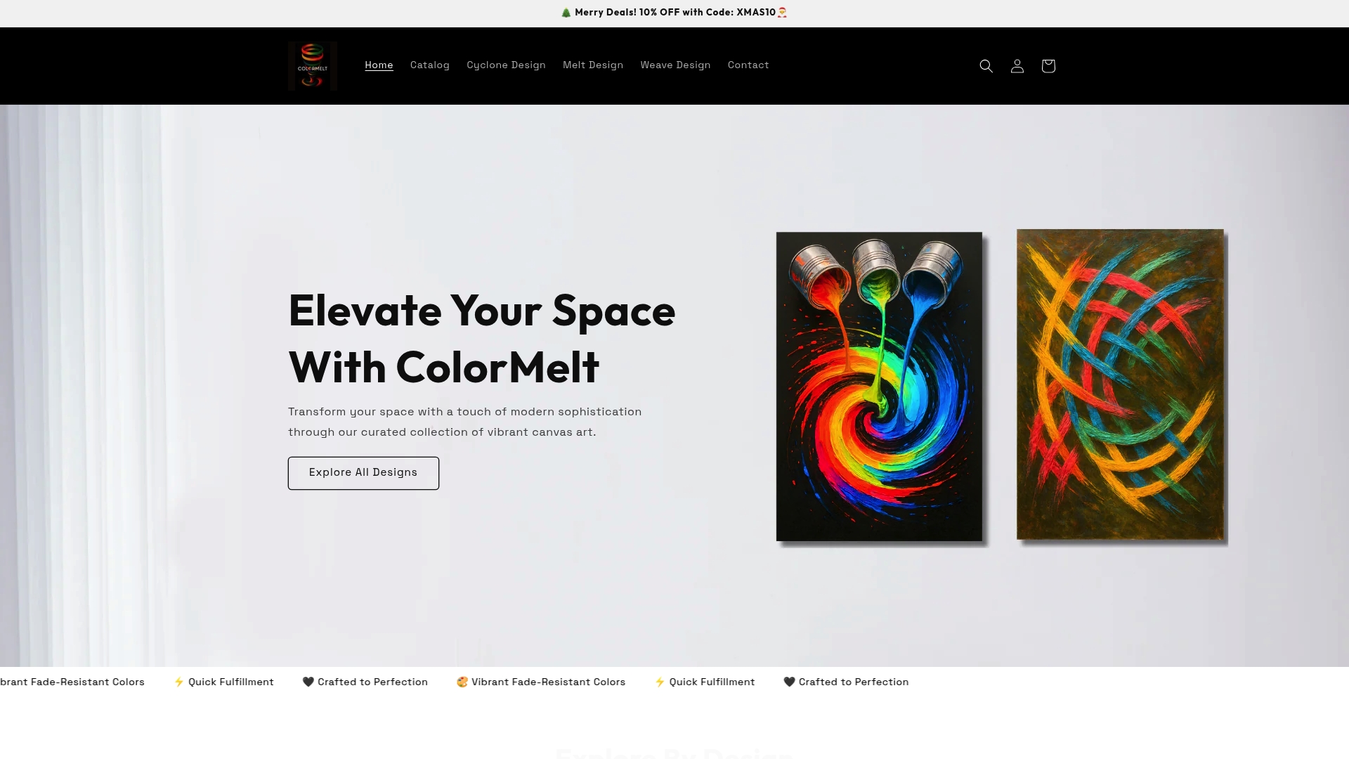
The wall art collection includes abstract, cyclone, weave, and floral designs printed with fade-resistant inks on canvas, acrylic, and wood. Every piece ships quickly and arrives ready to hang. If you want a statement piece that fits the earthy and tactile direction of 2026, the Melt Design framed canvas print is a strong starting point. Colormelt also offers styling ideas and customer showcases to help you see how each piece looks in a real home before you commit.
FAQ
What is the biggest wall art trend for 2026?
Biophilic design is the leading trend, with preserved moss art and abstract botanical prints cited as primary drivers for 2026 interior decor. These elements connect indoor spaces to nature and support a wellness-focused home environment.
How do I choose wall art that fits 2026 interior design ideas?
Select art early in the design process, before finalizing furniture and paint, so it can anchor the room’s color and texture. Designer Kit Kemp recommends treating art as a foundational element rather than a finishing touch.
What colors work best for modern wall decor in 2026?
Warm earthy tones including terracotta, forest green, warm sand, and soft gray define the 2026 palette. These colors create calming, cohesive interiors and pair well with both natural and metallic art materials.
Are large-scale art pieces still popular in 2026?
Large-scale statement pieces remain a top recommendation for creating impactful focal points in 2026 interiors. A single oversized canvas anchors a room more effectively than several smaller pieces arranged without a clear focal point.
What materials are trending in wall art for 2026?
Gold leaf, copper leaf, fabric, plexiglass, preserved moss, and layered papers are the leading tactile materials in 2026. Sustainable options like recycled paper and FSC-certified wood are also gaining ground among environmentally conscious homeowners.