
Wall Art Arrangement Guide for a Polished Home
Wall art arrangement is the process of positioning artwork on walls to achieve aesthetic balance, scale, and harmony with the surrounding space and furniture. Done right, it transforms a blank wall into a focal point that feels intentional and personal. Done wrong, it makes even expensive art look awkward. This guide draws on principles from Studio McGee, Emily Henderson, and Maison Perrin to give you a clear, step-by-step path to gallery-quality results at home. Whether you’re hanging a single statement piece or building a full gallery wall, the rules are the same: scale, spacing, and furniture connection decide everything.
What are the ideal height and spacing rules for hanging wall art?
The single most common mistake in hanging art is placing it too high. Museums and professional designers center artwork at 57–60 inches from the floor, which aligns with average eye level. That measurement refers to the center of the piece, not the top or bottom edge. When you hang art higher than this, it disconnects from the room and feels like it belongs in a different space.
Spacing between frames matters just as much as height. Professional designers recommend 2–4 inches between frames for tight, clustered arrangements and 6–10 inches for larger, looser groupings. Both measurements are edge to edge, not center to center. Tight spacing creates a unified, collected look. Wider spacing gives each piece room to breathe and works better with bold or large-format art.
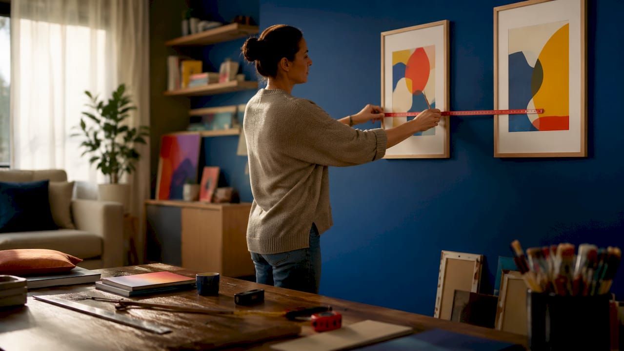
Art above furniture follows its own spacing rule. The bottom edge of the artwork should sit 6–10 inches above the furniture surface to create a visual connection between the two. Less than 6 inches and the art feels crowded. More than 10 inches and it starts to float, losing its relationship to the room below.
Adjusting for room type and wall size
Tall ceilings in dining rooms or entryways can push the center height slightly higher, up to 62 inches, without breaking the visual logic. In low-ceiling rooms or children’s spaces, drop to 54–56 inches. The goal is always to keep art within comfortable sightlines for the people using the room most.
- Measure 57–60 inches from the floor and mark the center point with a pencil.
- Calculate the distance from the center of the art to the hanging hardware on the back.
- Subtract that distance from your center mark to find the nail position.
- For gallery walls, establish the center height first, then build outward from an anchor piece.
- Double-check spacing with a ruler before committing to any nail.
Pro Tip: Hang a small piece of painter’s tape at your 57-inch mark before you do anything else. It gives you a visible reference point as you plan the rest of the arrangement.
How to plan a gallery wall using frame size and layout techniques
A gallery wall succeeds or fails in the planning phase, not during installation. Emily Henderson recommends starting with the largest anchor piece placed off-center rather than centered. This creates visual movement and pulls the viewer’s eye across the arrangement instead of stopping it in one place. Place the second largest piece diagonally from the first to reinforce that eye travel.
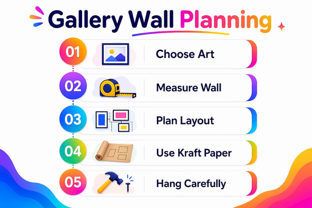
Frame variety is not optional for a polished result. Gallery walls look more refined with at least three different frame sizes and a mix of vertical and horizontal orientations. A wall of identical frames reads as a grid, which works for some styles but lacks the organic quality that makes gallery walls feel curated rather than mass-produced.
Pro Tip: Trace each frame onto kraft paper, cut out the shapes, and tape them to the wall. Live with the layout for one to two days before driving a single nail. You will almost always move at least one piece.
- Start with the largest anchor piece and position it slightly off-center.
- Add the second largest piece diagonally opposite to create balance.
- Fill in with smaller pieces, keeping consistent edge-to-edge spacing throughout.
- Mix at least three frame sizes and combine portrait and landscape orientations.
- Step back frequently and view the layout from across the room, not up close.
Grid vs. organic gallery wall layouts
| Layout style | Best for | Frame variety | Spacing |
|---|---|---|---|
| Grid | Minimal, modern rooms | Identical frames | Perfectly even, 2–3 inches |
| Organic | Eclectic, collected looks | Three or more sizes | Varied but consistent within clusters |
| Salon style | Traditional, maximalist rooms | Mixed sizes and styles | Tight, 2–4 inches edge to edge |
The grid layout works well with a single art series or photography collection. The organic layout suits mixed media, travel prints, and personal collections. Salon style, which covers large wall sections floor to ceiling, requires a strong anchor piece at eye level to keep the arrangement grounded.
How to match wall art size to furniture and wall dimensions
Art size relative to furniture is the proportion rule most people skip, and it shows. Artwork width should be two-thirds to three-quarters the width of the furniture beneath it. A 72-inch sofa calls for art that spans roughly 48–54 inches. That could be a single large canvas or a grouping of smaller pieces that together reach that width.
Rooms appear more intentional when art scale matches wall size. A large empty wall with three small prints scattered across it looks unfinished. One large anchor piece or a cohesive gallery that fills the visual field reads as deliberate. Scale is the difference between a room that looks designed and one that looks decorated.
Size-to-furniture reference table
| Furniture width | Recommended art width | Example arrangement |
|---|---|---|
| 48 inches | 32–36 inches | Single medium canvas or two small frames |
| 60 inches | 40–45 inches | One large print or three-piece grouping |
| 72 inches | 48–54 inches | Large canvas or gallery cluster |
| 84 inches | 56–63 inches | Wide panoramic or five-piece gallery |
- Avoid placing art narrower than two-thirds of the furniture below it.
- For console tables, a single tall vertical piece or a pair of matching frames works well.
- On large walls with no furniture anchor, use a gallery cluster that fills at least half the wall width.
- Choosing wall art with the right proportions from the start saves significant adjustment later.
What tools and mistakes should you avoid when hanging wall art?
The right tools prevent most installation errors before they happen. Kraft paper templates and painter’s tape let you test any layout without touching a nail. Using painter’s tape to map placement before committing to hardware is standard practice among professional installers. It costs nothing and saves significant repair work.
Hardware selection depends on weight. For art over 10 pounds, use wall anchors or mount directly into wall studs. A standard picture hook handles pieces up to about 20 pounds when mounted into drywall with an anchor. Heavier pieces, including large framed canvases and wood prints, need stud mounting or a French cleat system for safe, stable hanging.
“Hanging art too high, using inconsistent frame spacing, and ignoring the furniture connection are the three mistakes that make wall arrangements look awkward or disconnected.” — BHG
- Use a level on every piece, even when it looks straight to the eye.
- Mark stud locations with painter’s tape before hanging anything heavy.
- Keep a consistent spacing measurement written on a sticky note during installation.
- Check your damage-free hanging checklist before starting any new arrangement.
- Step back and photograph the arrangement before finalizing. Photos reveal imbalance that your eye misses in person.
Creative wall art styles and ideas to personalize your space
The arrangement style you choose should reflect how the room is used, not just how it looks in photos. A living room benefits from a strong focal point above the sofa. A hallway works well with a linear arrangement of frames at consistent heights. A bedroom calls for calm, symmetrical placement that does not compete with the rest of the room.
Mixing frame styles and colors adds depth without chaos, as long as you follow one unifying rule. Choose either consistent frame color with varied styles, or consistent frame style with varied colors. Mixing both at once creates visual noise. Black frames with varied mat widths, for example, read as collected and intentional. Choosing the right colors for your art and frames ties the whole arrangement to the room’s palette.
- Layering art over a mantel or shelf adds dimension and lets you swap pieces without new nail holes.
- Pairs of matching frames on either side of a window or doorway create symmetry without a full gallery wall.
- In small spaces, one large piece reads better than several small ones competing for attention.
- Vertical arrangements draw the eye upward and make low-ceiling rooms feel taller.
- For creative display ideas, lean large prints against the wall on a shelf or console for a relaxed, flexible look.
Key takeaways
The most effective wall art arrangement combines the 57–60 inch center height rule, furniture-proportional sizing, and consistent spacing to create a display that looks intentional and grounded.
| Point | Details |
|---|---|
| Center height rule | Hang art so its center sits 57–60 inches from the floor for correct eye-level placement. |
| Furniture proportion | Art width should be two-thirds to three-quarters the width of the furniture below it. |
| Spacing consistency | Use 2–4 inches between frames for tight clusters and 6–10 inches for looser groupings. |
| Gallery wall planning | Start with the largest piece off-center and use kraft paper templates before nailing. |
| Hardware safety | Mount art over 10 pounds into wall studs or use proper wall anchors. |
What I’ve learned from years of arranging walls
The kraft paper template method changed how I approach every installation. Before I started using it, I would hang a piece, step back, realize it was wrong, patch the hole, and try again. Now I spend more time with paper and tape than I do with a hammer. Living with a paper layout for a full day reveals things that a five-minute preview never does. You see how the light changes across it. You notice whether it feels heavy on one side. You catch the spacing errors before they become wall damage.
The proportion rule is the one I see ignored most often in client spaces. People buy art they love and hang it wherever it fits, without checking the furniture below it. A beautiful 24-inch canvas above a 96-inch sectional looks like a postage stamp. The art is not wrong. The relationship is wrong. Getting that ratio right, two-thirds to three-quarters of the furniture width, is the single fastest way to make a room look more designed.
My honest advice: do not finalize any arrangement on the day you hang it. Leave it up for a week. You will see it with fresh eyes every morning, and by day five you will know exactly what needs to move. The best arrangements I have ever done were the ones I adjusted twice before calling them done.
— Shlomo
Start your arrangement with art worth displaying

Every arrangement principle in this guide works best when the art itself is worth centering a room around. Colormelt’s wall art collection includes canvas prints, acrylic prints, wood prints, and framed artwork in abstract, weave, cyclone, and floral designs built for exactly this kind of intentional display. The pieces are made with fade-resistant colors and crafted for long-term quality. Whether you are building a gallery wall or hanging a single anchor piece above your sofa, Colormelt gives you art that holds up to the arrangement you put around it. Browse the full collection and find pieces sized for your space.
FAQ
What height should wall art be hung at?
Center your artwork at 57–60 inches from the floor, which aligns with average eye level used by museums and professional designers. Adjust slightly for rooms with very high or very low ceilings.
How far above a sofa should art be hung?
The bottom edge of the art should sit 6–10 inches above the sofa back. This creates a visual connection between the furniture and the wall without crowding the piece.
How wide should wall art be relative to a sofa?
Art width should be two-thirds to three-quarters of the sofa’s width. For a 72-inch sofa, that means art spanning roughly 48–54 inches, either as a single piece or a grouped arrangement.
How do I plan a gallery wall without damaging my walls?
Trace each frame onto kraft paper, cut out the shapes, and tape them to the wall. Live with the paper layout for one to two days before hanging anything. This method lets you adjust freely without any nail holes.
What is the best spacing between frames in a gallery wall?
Use 2–4 inches between frames for a tight, clustered look and 6–10 inches for a larger, looser arrangement. Measure edge to edge and keep the spacing consistent throughout the entire grouping.